presenting

8 tips for teaching library sessions online

We’ll all be teaching infolit online for the foreseeable future (I hope) and it is, as anyone who’s done much of it will tell you, a very different experience to being in a room with people.

I do a lot of training online already for overseas audiences, so I have some familiarity with this. For what it’s worth, here are some tips for retooling your sessions to work in a webinar type environment.

  1. Plan your session so your audience switches frequently between listening and doing

    I don’t know how you currently do your workshops, obviously, but if for example you do a 20 minute intro, then give people 20 minutes to do a task or two, then 10 minutes summing up at the end, you may find it worthwhile to rejig this a bit.

    In the online environment where everyone is learning on screen, too much of anything for too long is a barrier to engagement. Long talky bits are really hard to pull off, and long activities don’t often work either. And indeed, long sessions overall - if you had a 2 hour class booked, make it 1.5 hours max for screen-learning.

    In my experience, relatively short bursts of talking interspersed with relatively short bursts of activity works best. So take a big exercise and split it into two; introduce part one, let them try it, introduce part two, let them try that. And so on. Short, sharp chunks. (Can you have sharp chunks? Shards, maybe.)

  2. Mute participants (apart from specific times for questions)

    I always, always have participants muted as they enter the online space. If everyone’s mic is live, it quickly becomes a cacophony of noise that makes it impossible for anyone to really concentrate. (Honestly just one person having a chat with someone in the same room is enough to derail things.)

    I encourage questions at any time via the Chat (more on which below) rather than audio - however sometimes it can be beneficial for people to ask questions out loud rather than type them. If you want to do that, have a clearly designated time in the session when this will be possible, and signpost it ahead of time. “On 30 minutes we’ll pause, and anyone who wants to unmute and ask a question can do so then.” Then the conversation happens, everyone mutes again and you carry on from there.

    If you do this it’s important to wear headphones, otherwise the audience’s questions come out of your PC speakers, into your mic, and back out of the speakers again - this causes all sorts of problems and is definitely best avoided…

  3. Consider using your webcam for the intro, then turning it off

    Assuming you have a webcam and video is an option, there’s a balance to be struck there too. Webcam-on for the whole session is, in my experience, not conducive to good teaching. You instinctively present to the camera, and this means you’re worrying about that side of things rather than your slides and the Chat. Especially if you’ve not done too much online teaching before, I’d keep things as simple as possible because there are so many more things to juggle than in an online session. You can choose to not use the webcam at all (that’s fine!), or use it for the intro and then say ‘now we’re moving into the session and using the slides, I’m going to turn off the webcam so you can see my screen better’.

    This is because part of each slide is blocked by your own face with the webcam. I have done a workshop where for specific reasons the whole thing was camera-on, and I found it useful to work out exactly how big the camera-window would be and create a Shape in PowerPoint that was the exact dimensions. I then put this on every slide and made sure no content was going in that part, so nothing would be obscured by the window later (which I positioned over the Shape).

  4. The Chat function is absolutely key

    If you’re using webinar software then Chat will be a way your audience can ask you, and each other, questions. Confusingly there is also a Questions function in things like GoTo Meeting - and it’s really important to shepherd people toward Chat rather than Questions. Questions are only seen by you, but Chat is seen by all participants. Obviously if someone had a sensitive query, the DM-style Question is the way to go - but for everything else, you want to encourage active participation as much as possible. Often the difference between good online training and great online training is the Chat - the more people talk to each other and to you, the more than barriers of it being online fade away and the more useful the session becomes.

    Whether you’re using Hangouts style software or webinar software or Google Q&A, it goes without saying you need to keep the Chat where you can see it at all times. You can have particular periods of the session when you dip into it and respond to what has been asked, but seeing the questions as they come in is vital for engaging the audience. Obviously if you have a second screen this helps a lot, but if you don’t have that option it’s still worth making sure the Chat is visible to you always.

    I tell people about it at the start, and I remind them about two minutes later - I tell them about it again and again because sometimes people need encouragement to use it, but once they do everyone tends to join in. Teaching is so much richer when you respond to the audience’s specific needs, so it has to be a priority to make sure these needs are expressed…

  5. Get used to not speaking

    What separates good online teaching from boring webinars is interactivity. The Chat is key to this as discussed, but so is getting people to DO things and - trust me on this - it feels really, really, weird to give people time to do activities and exercises while you sit there in silence. But it’s better to have a couple of 5 or 10 minute activities where your audience are genuinely given time to try things out and then report back in the Chat.

    I find this really tricky because you become hyper-aware of the dead air. You’re not wandering around checking what people are doing, you can’t see them working or hear them chatting to each other. You feel faintly absurd, sitting there in front of your PC and hoping people are using the time you’ve given them to do the thing you’ve asked them to do. But it’s essential - it stops it being a classic ‘boring webinar’, one-way traffic delivered as a lecture on screen which, even if you’re great at public speaking, is not enough to truly engage most audiences.

    I find the not-speaking part so hard that I set a stop-watch for it every time. If I’ve told the group they have 10 minutes, I’ll start a stop watch and not stop them until 10 minutes is up. If I don’t take this measure, I inevitably get angsty 6 minutes in and then move things on prematurely…

    I always mute my mic for these parts - no one wants to hear the click of your keyboard etc - but check in on the mic a couple of times during the period to say ‘don’t forget if you have any questions or something isn’t working as you’d expect, ask me in the chat’. When people ask a good question I’ll come back on the mic and pick it up with the whole group, just as I would with a face-to-face session.

  6. You may wish to stand up…

    Teaching needs energy, and sometimes it’s hard to bring energy when you’re sitting down! If your mic and other equipment allows it and you’re comfortable doing so, standing up to deliver your session just as you would in a seminar room can really help. Without hand gestures and facial expressions it’s already hard to get your point across dynamically, so your delivery counts for a lot.

    Something solo radio DJs apparently do a lot is put something opposite them to stand-in for the audience - a cuddly toy or, in one studio I saw, a Policeman’s helmet - and they talk to THAT. Rather than talking just generally into the ether, addressing something specific (even something faintly ridiculous) will focus your delivery and make it more human. So grab some sort of mascot and stick it above your monitor…

  7. If you can do online teaching in pairs, take that option

    Managing an online session is quite stressful - if anyone has technical problems you really can’t help them and teach at the same time. So pairing up, with one person teaching and another facilitating, is well worth doing if you can. The Facilitator can be on hand to help participants, both with the logistics of the online session and with the exercises themselves - they can also message the presenter to flag up a Chat question if they miss it. Working as a team in this way allows you to teach better because you’re not splitting your focus. 

  8. Good slides matter more than ever

    If you’ve read this blog before you’ll know I think good slides are important. In online teaching they’re even more so, because they’re the only thing your audience can see. It’s not just that they can’t see you; they can’t even see each other. So something inspiring on the screen is really essential - especially if your online session is coming as part of many, many other sessions also online. Death by PowerPoint will not do.

    There’s plenty of guidance on this site about making good presentations. A couple of posts to start with would be the Alternatives to Bullet Points and the Sources of CC0 Images articles: but really anything with the presentations tag is potentially relevant.

    Unbelievably this general guide to slide-making is 6 years old now, but although some of the links to image sources are out of date, and, frankly, I’d make very different font choices nowadays, the basic principles are still important for producing effective presentation materials!

Accessibility and online teaching

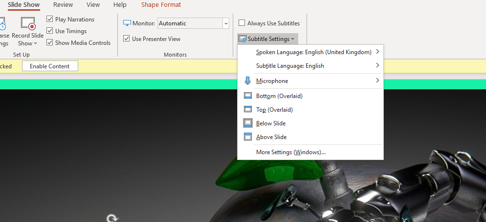
I don’t want to position myself as an expert on this but I do have advice on making your slides more accessible (thanks to Rachel fro the prompt!). The main thing is to use PowerPoint and turn on the subtitles function - if you’ve never used this you’ll be amazed at how well it works. PowerPoint provides subtitles of everything you say, as you say it. You can find the Settings for this in the Slideshow part of the menu:

The Subtitles function, found in ther Slide Show menu in PowerPoint

Otherwise all the normal rules apply.

  • Good contrast between font colour and background. It’s important to have plenty of contrast, for example black text on white background, so the text is easy to read. Purple on black for example doesn’t work. Related to this, don’t put text over a busy background.

  • Minimum font size of 24. Anything less than 24 risks being hard to read on a small screen; if you need the font smaller than 24 there’s probably too much information for one slide.

  • Use sans-serif fonts. Sans-serif fonts such as Calibri and Arial are better than Serif fonts such as Times New Roman or decorative / script fonts.

  • Don’t use colour as the only indicator of key information. You will almost always have at least one colour-blind audience member. It’s important to avoid using colour as the sole way of conveying information. For example, to have something shown in red to say stop doing it and something else in green to say start doing that, is not sufficient. Use the text, or a tick and cross or other non-colour-based-visual indicator, to ensure people understand what you’re telling them.

  • Repeat Chat questions back. This is good practice anyway: if someone asks a question in the chat, say it out loud for everyone to hear before answering it.


There’s lots more aspects of teaching online that others will be able to go into in more depth, but the 8 things above are, to my mind, key as we #PivotToOnline (as they say on twitter…) Good luck everyone!

Any questions, tips, comments, suggestions, advice? I’d love to hear it in the Comments.

A short post on preparing short presentations (for short time-slots)

This is a good question, something I've answered a lot in workshops but never blogged about. So here's what I think is really important about prepping short talks with PowerPoint presentations:

  1. Create the number of slides you think you need, then get rid of a couple! The time just rushes past in short presentations, so when it comes to your PPT (or whatever else you're using) you almost always need less than you think. Five slides for a 15 minute presentation may often be enough.
  2. Simplicity is never more important. Simple slides are better anwyay (image-rich, a little text as possible, no bullets) but are especially vital when you only have a very short window in which to convey your information. The messages need to stick, so make them easy to understand and support them with relevant images.
  3. Signpost to more detailed information. Have a blog-post already published which goes into more detail than your 15 minutes will allow, and use a customised bit.ly URL to share the post in an easy-to-remember link at the end of your talk.
  4. Structure is still important. Audiences find structured presentations easier to remember and understand, even for very short talks. So try to have a beginning, a middle, and an end clearly signalled (both in what you're saying and in your slides)
  5. Consider doing a 20:20. A 20:20 (also known as Pecha Kucha) technique involves having 20 slides, each of which automatically moves on after 20 seconds. These are acually really fun to do (the trick is to keep talking rather than stopping to wait for the slides to catch up) and force a real discipline in terms of the economy of your delivery. A 20:20 takes just under 7 minutes and it's amazing how much you can cover in that time if you practice. (I know point 5 directly contradicts point 1, but the approach is SO different with Pecha Kucha it's a whole different ball-game...) 

Upcoming presentation skills workshops and library marketing training

Just a quick post to say here's the current list of open workshops I'm doing this year - if you want to see if I'm doing something at your organisation specifically then the full listing is on the Upcoming Events page, but below are the non-in-house events currently in the diary. Hope to see you at one of them!

You can see a whole load of feedback from previous workshops via the Training page.

#UXLibs 2 | The Art of the Keynote: Matthew Reidsma


My second and third posts about the User Experience in Libraries conference are about the Keynote speeches. (Email subscribers, there's a load of embedded content in this one - here's the link if you want to read it online.)

There were three, and they were all brilliant. I found them not only very informative (as someone new to UX) but also fascinating and educational in their delivery (as someone who teaches presentation skills workshops). I want to cover both aspects here.

A keynote is very different to a regular conference talk. It has a different role. You can't just report back on a project you've done, in a keynote - it has to address wider or more fundamental issues, and be transcendent somehow. But for me the best keynotes still give people something to DO with the information they've been given. It's a real challenge. It's an art.

Matthew Riedsma | More than usable: library services for humans

All of the keynotes were fantastic. Matt's in particular, I thought, taught me a lot about the art of the keynote. He had so much TIME. He left long pauses.

He let things sink in.

He allowed us to digest what he was saying.

And of course, allowing pauses is all about having confidence in your material. When I'm doing an infolit talk a Department has asked me to do, with them selecting the content, I tend to keep the momentum up and move quickly through it, because I'm not always convinced the audience is enjoying it. It needs urgency to work. But if I'm doing a talk at a conference, a talk of my own choosing, I believe in it a lot more so I try and leave more gaps. But not as longer gaps as Matt did. This was a masterclass of pause-leaving. It was awesome. No one was shuffling their feet or wondering what was going on. We were all captivated by the talk.

Matt's slides were the perfect example of how to create a visual theme without using a template. They did what a template is supposed to do: keep the audience aware they were part of a certain landscape, that all the information they were seeing is connected and of a piece. But without all the bad stuff templates also do: because all the slides didn't actually look the SAME, they were able to express their contents uniquely, and be formatted for the best method of communicating that particular set of information.

Matt used blue, black and white as the colour scheme. This meant blue and white text, black backgrounds, pictures with a lot of black in (the night sky, for example), and, a really nice idea this, black and white pictures of the people he was quoting, behind their quotes.

A selection of Matt's slides to illustrate his visual theme. All of a piece but no template in sight.

A selection of Matt's slides to illustrate his visual theme. All of a piece but no template in sight.

The visual theme was cemented by the use of fonts:

Three fonts, which is the maximum you should use in one presentation, generally. Two of which worked together and complemented each other nicely: in effect, Raleway is for the set up and Montserrat for the punchlines, so we as the audience are being guided to what is most important about each slide. The other font, Berio, contrasted to denote that something different was happening (quoting others' words rather than creating his own).

The slides were pretty. But that was a by-product of them being EFFECTIVE. Big fonts that everyone could read, and which guided us as to the key messages. Pictures which helped us learn and told a story. One point per slide so we never had to decide if we should continue reading or continue listening. The presentation supported and enriched, and possibly prompted (although Matt seemed to know exactly what he was going to say without using the slides) - but not duplicated. Slides and presenter working together, not competing.

Here's Matt's full presentation:

If you have three-quarters of an hour to spare, there's a recording (slides and audio) on Vimeo - it's well worth watching!

Matt's talk was ostensibly about usability. It covered a lot more - philosophy, immigration videos, chair awareness, urine in space.

I've created a Storify of the tweets people wrote during the Matthew Reidsma keynote, which goes some way to capturing what is was all about, and which I won't embed here as this post is already taking up a lot of space, but I'd recommend you follow the link and have a look.

To try and boil it down, the phrase that summed up the essence of the talk for me is 'Libraries are PEOPLE, all the way down'. Usability is all about putting people and their experiences first. Experience is messy and complicated. How someone experiences something can be affected by the kind of day they're having (the kind of LIFE they're having), rather than just, as we might assume, the tools they're using in our libraries. Our users are not coming from an emotionally neutral place. A task based approach to usability assumes they are; an experience based approach better allows for an emotional experience. The Andromeda Yelton quote in the slides above is key: often people talk about libraries as being about information, and access to information, and more frequently these days we talk about people in that equation too. But not just librarians. Other users. Libraries let people transform themselves through access not just to information but to each other.  

And, absolutely crucially, we need to rethink usability from being an attempt to produce a perfect experience, to instead an attempt to design for breakdown. Accept things will do wrong. The key is the user's ability to self-right them.

Design our services (online and in person) so when they breakdown, it is intuitive to rescue them and carry on working. Matt used the analogy of using a mouse on a small table: at some point you may move the mouse too far and it falls off the table. At that point, no one goes 'oh it's broken' and seeks help - they just put the mouse back on the table and go back to work, very quickly forgetting the 'task' of using the mouse and getting back to the 'experience' of the technology being an extension to themselves. This is what we need to aim for.

This is far more revelatory to me than it probably should be. I feel I should have been more aware of this before. But I wasn't. I frequently try to get everything to just WORK - but when I think about what works for me outside the library, it's the procedures or technology which I can correct, on my own, when they break down. I've been designing everything as task based, forever. Now I can focus on transitioning to designing for experience and usability.

It was a brilliant talk. It had stories (that were relevant), humour (but no jokes), philosophy (which underpinned the practical stuff), and calls to action. Ace.

(As an aside, we also challenged Matt to get the words 'sac magique' into his presentation - a reference to 90s classic Tots TV - which he managed to do so brilliantly as to satisfy our juvenile need to get him to do something silly, but in such a way that no one else saw them so it didn't detract from the professionalism of his presentation... They were in the search box of an American Citizenship website he showed us a print-screen of. I mention this because although I was trying to spot the reference, I kept forgetting about doing so and getting engrossed in Matt's talk - which is actually a neat metaphor for a lot of what he was talking about. I had a task - spot the sac magique - but actually the experience was so good I forgot all about it...)


Top Tip: Create your PPT for the web, THEN strip it down for live presenting


In my Presentation Skills training I spend a lot of time offering different ways of presenting information and ideas visually, so you can lose a lot of the words from your PowerPoint slides. After all, it is a presentation, not a document. It's not designed to be read - or at least it shouldn't be, else you'll leave your audience wondering if your presence as a presenter is even really neccessary...

Then later we discuss the importance of uploading your presentations to Slideshare to amplify their impact and reach a wider audience. So inevitably the most common question which gets asked after that is: "But how will this make sense to people who weren't in the room to hear me talk?"

It's a tricky question because in most cases, a presentation simply can't be fit for both purposes. Good live slides won't make sense without the presenter, and good web slides won't have been an effective communication tool in a face-to-face presentation.

There are basically three answers to this (that I give, anyhow):

  1. You make a different version that goes online
  2. You upload the accompanying notes or audio
  3. You accept that the online audience will have a different experience, and that's not the end of the world

There are times when I do all three of these, sometimes all for the same presentation (bear with me...). Let's look at each of them in turn.

Making different slides for live versus web

My main advice here is twofold: first of all make two versions of the presentation - one for the face to face presentation, and one to sit on the web afterwards - and second of all, do the web version first!

It is a lot easier to start off by putting in all the detail on the slides so that the presentation makes sense on its own without you talking over the top. It helps you shape your ideas, work out exactly what story you're telling with the presentation, and can be a useful aid to learning your talk (learning your talk is actually something I wouldn't recommend, but there isn't time to get into that here).

Once that's done, save a copy to upload to Slideshare or whatever, and then save a new version which you edit to strip out all the detail. The function of slides in a conference or training situation is to enrich and reinforce what you have to say out loud, help the audience understand and engage with your message, and last - but NOT least - to prompt you as to what you need to say. Not to duplicate it. The ideal slide (in my opinion) has perhaps one sentence on it, which crystalises the key message of that part of the presentation AND acts as a jumping off point to remind you of everything you have to say on the topic. So you take your detailed web PPT, and you strip them back to one or two sentences per slide (or go entirely word-free).

The key thing here is it's a lot easier to make detailed web slides and strip them down for live presenting, than the other way around. Making your live slides and then adding all the detail in afterwards takes ages. It really adds to your prep time and so isn't practical in most situations. Doing the detail first doesn't really add that much time on at all because it's part of the process that helps you create the narrative in the first place.

Incidentally, I don't use this option all the time - because it does take some more time. If the presentation is important however, it's worth it.

Providing further content to help explain slides

If you want to leave your slides beautifully simple but consequently ambiguous, you can provide some supplementary materials to help them make sense. For example:

  • If you've made notes you could upload them to Scribd, and then link to them from your presentation (and embed the Scribd document and the Slideshare presentation on the same web-page)
  • If your PowerPoint presentation has speaker notes (in that little box below the main slide in edit view) they will be added to Slideshare below your slides. The trouble with this is you need to upload specifically a PPT file to Slideshare, it doesn't work with PDFs - and if you're using non-standard fonts, which can be really beneficial, you need to use PDFs. So potentially useful, but not ideal
  • If you literally have a script of the whole talk, just provide that alongside the slides. If you don't use a script, and again I wouldn't recommend doing so, the only way to achieve this is to record the talk and then play it into some kind of dictation software to provide you with a transcript after the event...
  • You could add audio. Slideshare discontinued their webcast functionality (being able to add audio to PPTs once uploaded) last year, so really your best option for this is YouTube. In the past I've recorded my own talks using my iPhone in my jacket pocket, then used Camtasia to add that audio to slides - as in this example from South Africa - but that's a laborious process, takes ages, and honestly I'm rarely happy enough with any of my talks to want people to be able to hear and analyse them outside the in-the-moment conference environment... I would recommend recording your talks though, just for your own use - it's amazing how much you learn about what worked and what didn't
  • (If you do go down the YouTube route, don't forget to add the YouTube video to your slides on Slideshare too. Slideshare has so much reach, you don't want to just put stuff on YouTube.)
  • You could use Storify to collect the tweets from people in the room during your presentation and link to / embed that with your presentation - this is my preferred method as I don't use notes and don't like the audio options listed above. Even if you're not on Twitter I'd recommend at least considering this option
  • And finally, my super-advanced-mega-slideshare-hack: Slideshare displays whatever text you have on each slide, in the transcript below. (That's completely seperate from the notes field thing discussedearlier - every slideshare presentation has an accompanying transcript.) So you could add a full explanation of each slide, to each slide, but then make it invisible on the slide itself! (Either by writing in white on a white background, or covering it with an image, or using font-size 0.5.) So the transcript has all the info, but the slides do not. Good eh? [High-fives the internet]

Or, of course, just not worrying about it at all. Which brings us to the other way forward.

Just having the same version for both

Sometimes a presentation is too low stakes to worry about all this stuff. Sure it's not ideal that the slides don't make so much sense online, but what's most important is that they worked for the audience in the room.

Another way of looking at it is to view it as simply a different experience for the two audiences, rather than neccessarily a compromise or a problem. Your slides aren't as easily understandable for the online audience, but the fact they get the kernel of an idea rather than the fully-formed notion can be really interesting in itself. Just as the one-sentence prompt was your jumping off point during the talk itself, it's the online audience's jumping off point for their own ideas and further learning. That's no bad thing. Barthes would approve, anyhow.

An example of combining all three

The slides I put the most effort into ever were those I created for a keynote at the BLA Conference last year. And I kind of did all three things listed above.

First of all I did a different version for the web. Not a massively different version - but I included more detail in quite a few places, skipped to the end of some pseudo-animated parts, and changed the way I displayed certain images to comply with the copyright licences. I also removed a section which contained at its climax with a category C swearword (or is A the strongest category? I never know how that works) because although I trusted the audience in the room to understand it and not be offended, I coudn't be sure The Internet would do the same...

So what you end up with is slides which first and foremost aided my communication to 60 people in a room in Leicester (the face to face audience must ALWAYS be the priority!), but which at least made sense and provided some sort of jumping off point for over a hundred thousand people online subsequently. The only upsetting thing for me is one of the two fonts I used doesn't seem to render properly on Slideshare no matter what I do, but never mind...

I also provided a Storify of the tweets from the talk in the associated blog-post. And I didn't fill in ALL the gaps, as I really do think slides are great for providing a taster of a topic, hopefully in a way which encourages people into looking into it more themselves, and forming their own conclusions.

Other peoples' perspectives

I don't want this post to just be my views and opinions, so I canvassed Twitter. Here's what they had to say - if you have anything to add, I've love to hear from you in a comment.