User Experience

Elevating voices: my keynote at UXLibs 10

You are about to read a blog-post devoid of nonchalance or professional cool… Because this summer I am delivering a keynote speech at my favourite conference of all time, User Experience in Libraries, on its 10th anniversary, in my home City of York.

I am completely thrilled about this!

UX as a tool for equity

My talk is entitled Elevating Voices. Here’s the summary:

Higher Education is facing financial crisis. When budgets tighten, services often shrink to fit the needs of the majority, and ‘maintaining core services’ can easily become a proxy for exclusion. By designing for the ‘typical’ user – those with the fewest barriers and the most flexibility – we inadvertently sideline marginalised groups with complex needs.

This keynote positions UX work as an essential tool for equity. We will explore how libraries can represent the underrepresented, elevate diverse perspectives and ensure our institutions remain inclusive, authentic spaces for everyone.

I feel really passionately about this subject, and I can’t wait to explore it and share some of the work we’ve done at York.

About the conference

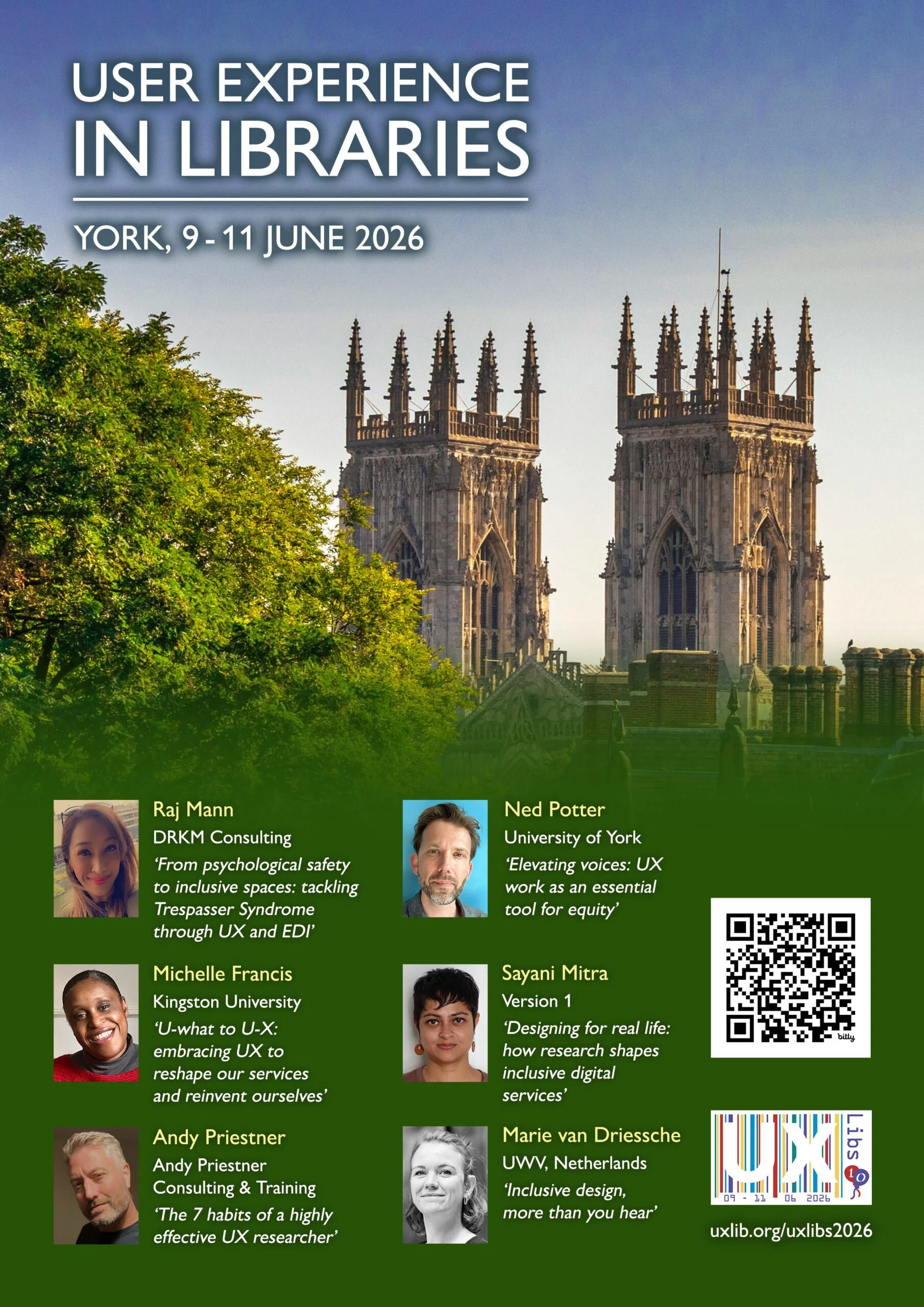
The list of speakers is fantastic, and I’m delighted Raj Mann will also be delivering a keynote: I’ve been working with her on our Inclusivity + Belonging UX Project she has been inspirational. I’ve mentioned Raj on this blog before, with regards to Trespasser Syndrome, which she’ll be talking about in her own keynote.

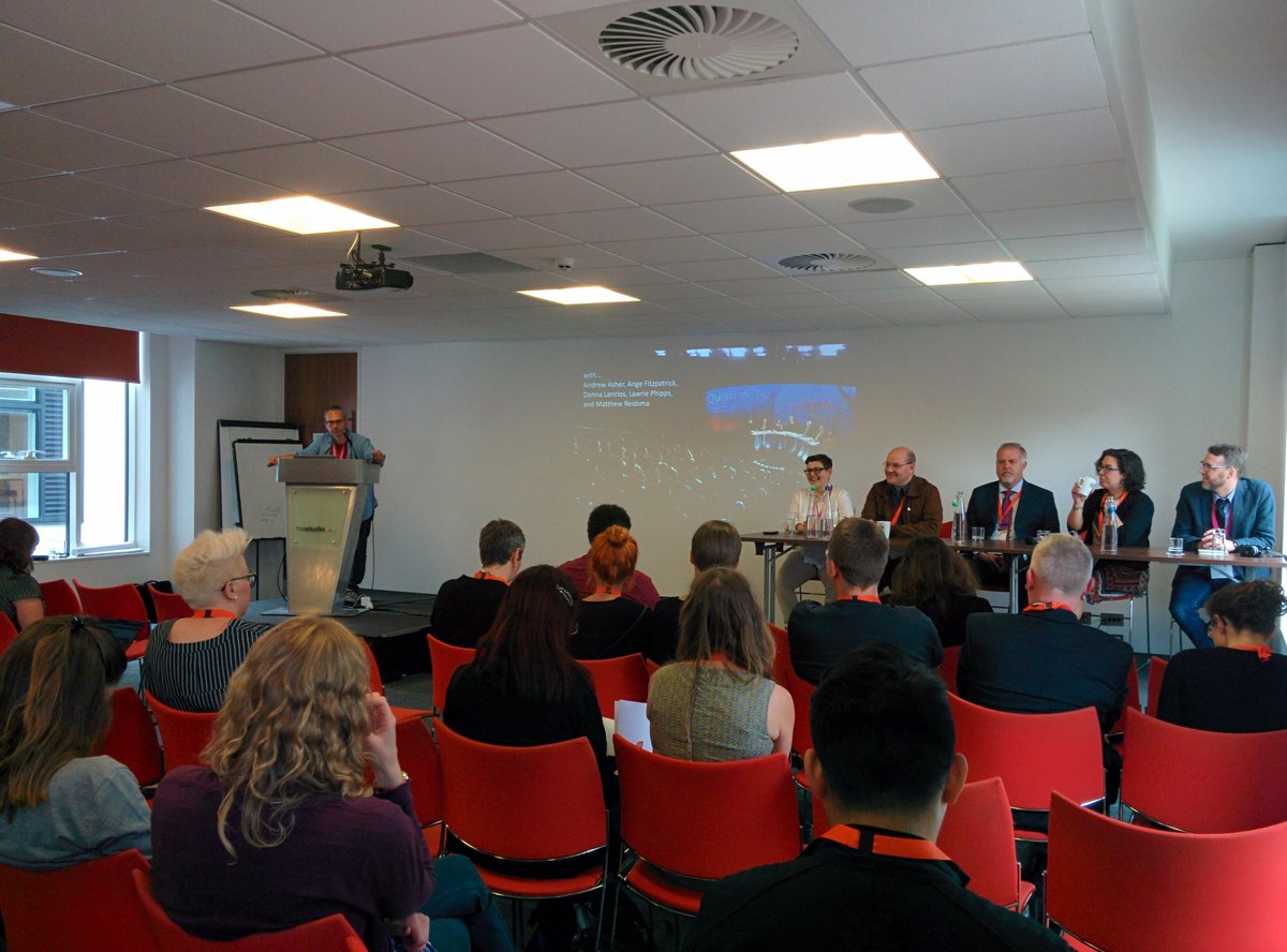
I have bored onto anyone who will listen about how much I love UXLibs. I attended the first one ten years ago in Cambridge, and it was revolutionary for me - learning about User Experience techniques beyond the app / web usability realm I’d previously understood was game-changing, and the conference format was incredibly innovative. A decade on and I have UX in my job title (Faculty Engagement Manager: Community + UX) and it’s a key part of my role.

I have also previously been on the organising committee of the conference for two years, so I know first hand how inclusive and forward-thinking the event is. The community that attends is usually drawn from 25 or more countries, and there’s no group of people who are more interested in the sharing of ideas. To want to do UX work you need empathy above all else, and 100 empathetic people in a room makes for a fantastic event..

If you have even have an inkling that UXLibs might be for you, I cannot recommend coming highly enough. You will learn so much you can USE, and have so much fun, and meet so many great people.

You can find full details of the conference, including booking, on the UXLibs website.

About York

The River Ouse at sunset

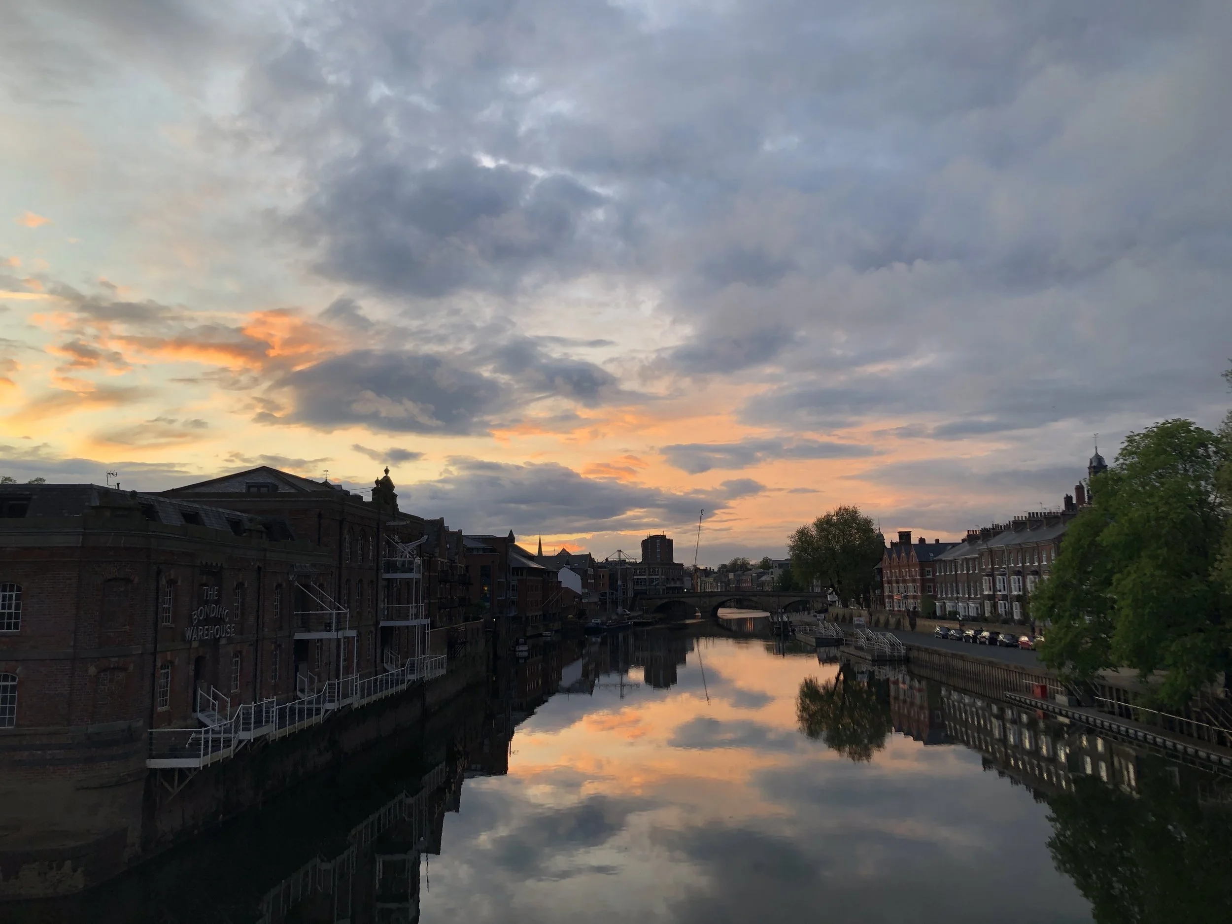
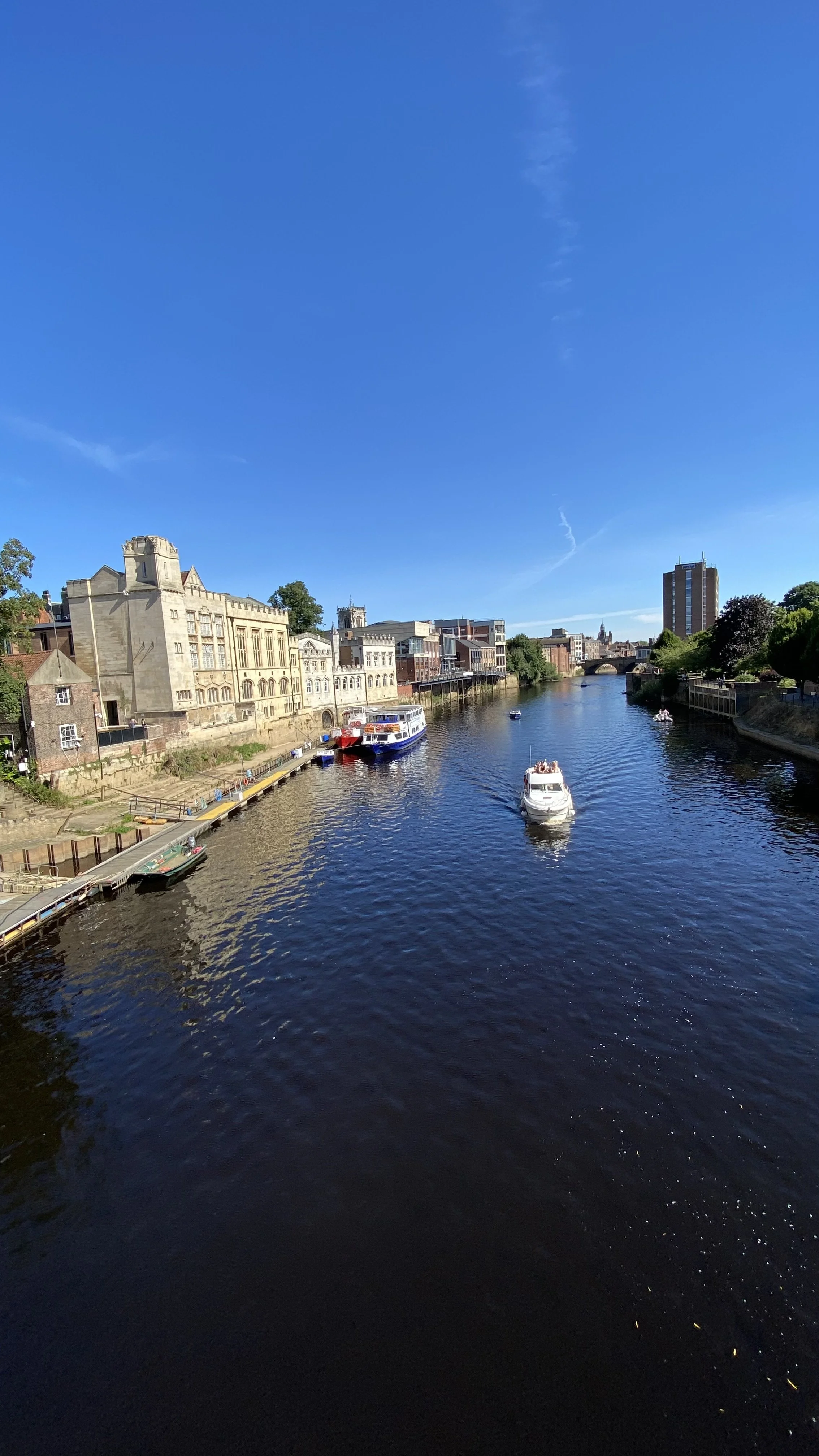
The River Ouse is pretty but very floody - hopefully in June though you should still be able to walk along the path shown here.

The River and the Guildhall in York

In the top right of this pic you’ll see the hotel at which the conference dinner takes place. Lovely hotel, but the exterior is unloved by the locals. The good thing about the Gala dinner being there is it’s one of the few places in York you can’t see the building from, because you’re inside it.

Former factories converted into flats above a canal-like river

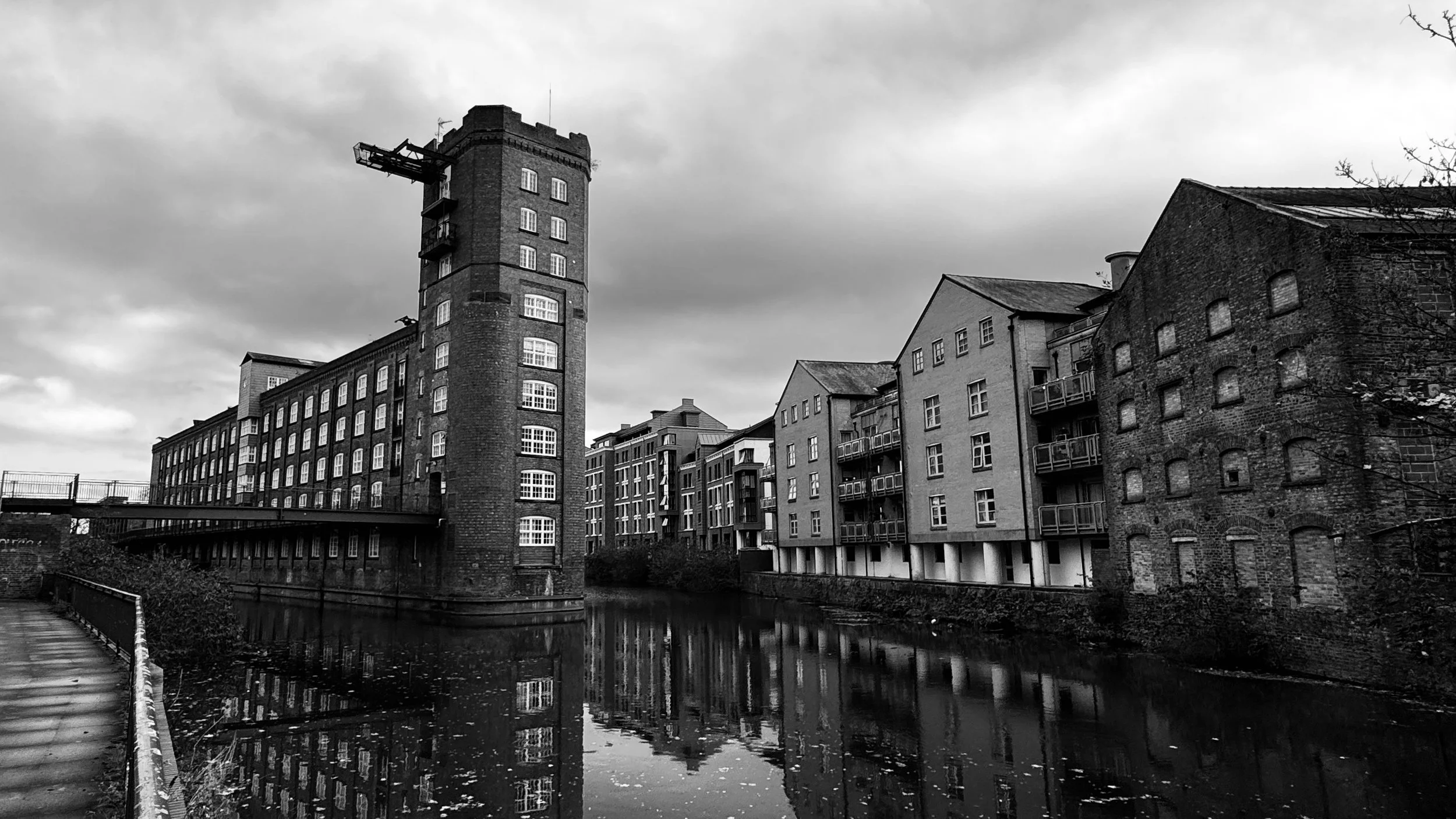
The Ouse gets all the headlines but York’s other river, the Foss, is pretty great

York is tiny as Cities go - you probably won’t need to use a bus or a taxi while you’re here as pretty much everything is walkable. It’s very beautiful. has a famously large number of pubs, and some great places to eat. For anyone who wants recommendations:

  • If you want variety and you like shipping containers, Spark York has both of these in abundance. Loads of different foods in what is, by York’s standards, a very cool and happening place.

  • If you want six million inventive varieties of beer in and industrial-chic setting with some banging Korean street food, Brew York is the place to go. It’s very near Spark York so why not go directly from one to the other?

  • If you like cake, drop what you’re doing and head to Brew and Brownie immediately. Their pancake breakfast is famous but the trouble with it is you don’t want to eat any cake afterwards, and you need to eat their cakes.

  • For fabulous sandwiches head to Mannions

  • If you like cafes head to Bishy Road where there’s a lot to choose from - the Pig & Pastry and Robinsons in particular are a delight

If you’d like any more specific local tips just send me an email. It goes without saying I hope to see you there!

Communicating the benefits of UX to everyone who needs to hear it

At the 2023 User Experience in Libraries conference I ran a workshop all about comms and UX - basically my two favourite aspects of librarianship, mashed together, at my favourite event in librarianship. It was also in Brighton were my wife and I got married, and she came down to hang out with old friends while I was there and attended the conference dinner, and the weather was great - the whole thing was A+++, would do again.

Anyway, the workshop went really well and I later wrote it up for the 2024 UXLibs yearbook, which I’d highly recommend getting your library to buy a copy of. My chapter is now available Open Access via York’s repository so please do go and have a read if this is an area that interests you. I’ve put the intro below so you can see what it’s about.

(You can also find OA chapters from previous UXLibs Yearbooks on my Publications Page.)


The introduction TO my UXLibs YEARBOOK chapter

At the end of what was known at the University of York as the ‘UX Study Space Project’, we presented our final recommendations to management. Ten months of work had gone into it and we were proposing (or in some cases had already implemented) far-reaching and wide-spread changes: new study space booking rules; new zoning for food and noise; new signage throughout the library; increasing the number of accessible spaces; creating a new ‘Zoom Room’; purchasing some interactive mapping software… We got some really useful input from the leadership team and they signed off on all the things we wanted to do – at which point it occurred to me: this was the single most impactful piece of work I’d ever done in librarianship.

Nothing else really came close – the fingerprints of our UX project were all over the actual, day-to-day user experience of our students and staff, simplifying and improving things in so many ways: it felt euphoric! But the 10 months of hard work that had made these changes possible could have been undone if we hadn’t been able to effectively and meaningfully show the value of our proposals to the audience who could give them the green light.

UX is such a complex and messy business, and it can be easy to get lost in the processes of ethnography and design. We mustn’t undervalue the comms; successful communication plays a huge part in helping our work achieve its goals, and it’s worth breaking down the communications life cycle of a UX project to ensure we’re making the most of each stage.

Part 1 is The Pitch. This is where you communicate the value of your proposed project, to get the time and resources you require to do the work. The audience here is the managers who can release funds for incentives and release staff time for fieldwork and design, and your colleagues whose input you’d like on the project. 

 Part 2 is The Recruitment. Now the audience are library users (and, ideally, non-users too) that you need to persuade to participate in the fieldwork, lending you their insight. 

 Part 3 is The Findings. This is where you need to communicate the results in such a way that you’re empowered to really act on them – it’s not UX if all you do is diagnose problems… The audience here is not just the managers who need to approve your design proposals, but wider library staff too. Keep them in the loop and get them on board. 

 Part 4 is The Legacy. Here the audience is everyone. Everyone needs to know what you’ve done, how brilliant it was, and what the ongoing impact is. Tell the participants. Then tell the world. 

All in all, UX is a comms-heavy business, so let’s explore each stage in more detail and look at some tips to enrich your UX and help make those user-centred changes your library needs. 

[Read on here]

5 UX insights for library web-design

For the last few months I’ve been leading a project to completely redo my library’s website from scratch. It has been full-on, and rewarding, and most importantly the new site is live as of midday today.

I’ll post about the project process later, but for now I want to focus on what the UX fieldwork with our users told us, as these insights will hopefully be useful for anyone redesigning their org’s website.

I’d love you to go to york.ac.uk/library (opens in a new window) and take a look, then come back here and tell me what you think!

This post focuses on the organisation of the site; part 2 will be on the content.

Use colour with intention

As you can imagine, we’re working within the limits of the University CMS (Content Management System) and don’t have a lot of control over colours - most of the content types are white, but several can be set to cream, teal or dark blue. I must admit when I first started designing the pages, I just used colour to mix things up a bit and add some visual interest - a strip of colour here, a nice accent there. But the users told us in the UX sessions that they wanted the colours to mean something - they expected consistency across the pages (for example opening times always one colour, as shown below; quotes from students always another colour) and in particular they wanted the darker colours to signify something especially significant - a call to action, or really essential information.

The teal strip showing opening hours. The fact the Help Desk opening hours are on there too, and the fact that the Easter vacation is explicitly mentioned even though the hours aren’t changed, are both as a direct result of student suggestions during the UX.

Topic based organisation beats audience based navigation

A perennial debate for designing anything for users, websites included, is: do we organise things by theme, or by who is accessing information? Do we say ‘PGs go here, UGs go here’ or do we talk about space on one page, resources on another?

In a literature review carried out at the start of the project, my colleague Alice Bennett wrote, on the topic of a particular study finding topic-based organisation to be significantly preferable: “This is potentially a more inclusive approach, as it better allows for intersectional user identities and better accommodates search behaviour, with users typically searching for specific information, rather than looking to find themselves in the menu.”

This was really borne out by the UX. I asked one distance-learner where all the distance-learning information should sit in the new structure. They said “I wouldn't separate it. Because you don't like to treat yourself as a second class [citizen] and just look for, okay, where is the info for the distant learner people?” And to Alice’s point about intersectionality, we also had an International Students guide - many of our distance learners are also international students, so where do they look? And of course the contents were extremely similar. In the end we have a nice ‘basic introduction to the library essentials’ page which is for everyone: universal design wins again.

Your users will tell you which compromises are worth making

Compromise is inevitable in this sort of process - library websites have too much complex information and too many responsibilities to our users to just make a super slick, neat website. The top-level navigation is one of the biggest changes between the old site and the new - the old site had about 15 overlapping ways in to the info down the left of the screen; the new one has just six top-level landing pages.

The top-level navigation of the new site

We thought loooong and hard about how to group the information - we spent weeks planning this before we even had access to the CMS. But still we changed it during the UX process, because our users told us the compromise we’d made wasn’t the right one.

Our info for Researchers was split across the Skills & Training page you see listed above, and a Facilities page. The Facilities page has loads of useful info, but no flow and no cohesion - and more importantly when we spoke to Researchers in the fieldwork we set them tasks to find Open Access info, and they couldn’t do it. The split of info which had internal logic for us simply didn’t make sense for the user, and they couldn’t get to what they needed.

So we now have Research and Digital Creativity. This too is a compromise because that pairing isn’t as natural as the others (skills & training, for example) but those are two important aspects of the library offer that are really easy to find, so it’s a better way to go.

KnowING it’s important to invert the pyramid isn’t enough!

We all know about inverting the pyramid, right? I talk about it all the time. But knowing how important it is and ruthlessly acting on it turned out to be two different things… Even when I actively tried to do it with the website, I wasn’t doing it enough. One participant in the UX literally said ‘this page is upside down’… It’s so tempting to try and set the scene and lead people through the information, but they just want the important stuff at the top and that’s what we should be doing.

So: invert the pyramid, and invert it hard. (And then come back later and check it’s still fully inverted.)

Pictures have more than cosmetic valuE

“I’m never going to read that.” This a common refrain from students when faced with dense, lengthy text. We tried to simplify and reduce where possible, but sometimes in libraries there just IS detail - so breaking that up with images really helps. It’s not just that the images can help illustrate what you’re talking about, it’s that they make the user more likely to read even long passages of text because it’s broken up into chunks. It makes it manageable.

We also made sure to use the same image for thumbnail links to pages, as you find at the top of the pages themselves when you click the links. This reassures the user that they’ve clicked the right thing, and creates a sense of familiarity which helps make the info less intimidating.


A part 2 post detailing what the users told us about the Content of the site will be coming soon!

UX, ethnography and possibilities: for Libraries, Museums and Archives


I spoke about UX last week at a Welsh Government event in Aberystwyth, the annual Marketing Awards for the Library, Archive and Museum sector. It was a rare chance to talk to an audience not just of information professionals, and I had a great time. I'm really hoping some of the User Experience in Libraries movement now spills over into museums and archives too...

My presentation consisted of an introduction to UX, examples of 7 ethnographic techniques, a brief section of user centred design, and then several instances of UX-led changes - things people have done to tweak or change their services, based on ethnographic fieldwork. For this part thanks to Andy Priestner, Jenny Foster, Ingela Wahlgren and Carl Barrow for their examples, and it also has in it a bunch of things we've done at my own place of work. The final section consists of some next steps, for those wishing to dip a toe in the UX waters at their own institution.

I had several interesting conversations after my talk, with some people who were already doing UX (we agreed it can really energise the workplace) and some people who wanted to try it out. Two completely independent and unrelated chats with people from the museum sector were about using UX with people in difficult situations - one was around early onset dementia, and the other was about returning to work after periods of incarceration. I don't know if ethnography is already used in these settings but it sounded potentially fascinating, and an angle to this work I'd never considered.

There was also an absolutely brilliant presentation from Mari Stevens, who is Director of Marketing - Tourism and Business, at the Welsh Government (having started off in the library sector). Her slides were ace and she was a hugely impressive speaker. The scope and scale and ambition of her marketing plans for the country I found absolutely inspiring. The presentation was half in English and half in Welsh with live translation into ear pieces for those like me who needed them - the translator did a pretty amazing job too.

It was great to see the National Library of Wales, which towers over the town like, as Penny Andrews put it, a massive BOOK FORTRESS.

Huge thanks to Jane Purdie for inviting me to Wales (we've been trying to sort this out since 2015 so it was lovely to finally make it happen) and to everyone at the event for being so welcoming and asking insightful questions, and for giving me lots of ideas for good marketing practice to take away with me... And if you DO start doing UX at your institution, please get in touch to let me know how it goes!

UXLibs II: This Time It's Political

At 9am on Day 2 of the UXLibs II conference, 154 information professionals sat in a large room feeling collectively desolate. I don’t want to be glib or melodramatic but the feeling of communal sadness at what had happened in the EU Referendum overnight felt to me akin to grief, like someone close to the conference had actually died the night before.

Was there anyone present who voted Leave? Possibly. But it seemed everyone was devastated. There were tears. UXLibs is, as Library Conferences go, relatively diverse (although it's still something we need to work on), not least because well over a third of the delegates - 60 this time around - are from outside England. Our North American and Singaporean friends felt our pain, our European friends were sad our country had chosen to leave them, and for the Brits it was already clear what an omnishambles the vote had caused.

The committee had met for an early breakfast to process how we should proceed. We agreed on two things: first that however we all felt, organisers and delegates had to deliver the best possible conference experience in the circumstances; and second that this was not time for neutrality. (In fact I was talking to Lawrie Phipps from JISC a little later that morning and we agreed that perhaps if so many libraries and educational institutions generally weren’t so neutral by habit, people might have a better idea of when they were being systematically lied to by politicians.) Conference Chair Andy Priestner was due to open the conference: say what you want to say, don’t hold back, we agreed. There had been a lot of jokes the day before - humour is an important part of the UXLibs conference as it leads to informality, which in turn most often leads to better and deeper communication, proper relationships – but there would be no attempt at making light of this. Don’t gloss over it. Don’t be glib. Don’t be neutral. But do be political.

So he was. You can read Andy’s reflections on his opening address here, and this is what he said:

Today is not a good day.

I’ve worried for several months about this moment in case unthinkably it might go the way it has gone. I am devastated. Everyone I speak to is devastated. This is a victory for fear, hate and stupidity.

But as Donna said yesterday when describing her experiences in Northern Ireland – ethnographers have to get on with it. WE have to get on with it. Perhaps it’s a good thing that we will all have less time to dwell on what has just happened. Perhaps it’s good that we’ll be busy.

What I do know for a fact is that we have to be kind to each other today however we might feel. Let there be hugs. Let there be understanding.

For me one of the most precious things about UXLibs is the networking and sharing we enjoy from beyond the UK. The collaboration across countries, the realisation that despite the different languages, cultures and traditions that we are all the same and can learn so much from each other.

But it’s too soon to be cheerful. It’s too soon for silver linings.

Today is not a good day.’

I was proud of him.

And then Day 2 happened, and I was proud of EVERYONE. What an amazing group of people. Shelley Gullikson put it like this:

“Last year I said that UXLibs was the best conference I’d ever been to. UXLibs II feels like it might be the best community I’ve ever belonged to.”

Everyone found a way to help each other, support each other, make each other laugh, and work together – after Lawrie’s keynote the first thing on the agenda was the Team Challenge so no one could spend any time sitting in dejected silence, there was too much to do… Collectively everyone not just got through the day but made it brilliant. It wasn’t a good day overall – a good conference doesn’t transcend political and socio-economic catastrophe. But it was the best day it could possibly be.


I attended the first UXLibs conference in 2015 and I was blown away by it. It felt like the organising committee had started from scratch, as if there were no legacy of how a conference should be, and designed it from the ground up. They kept some elements, the ones that work most, and replaced others with new and more engaging things, especially the Team Challenge. It was the best conference I’ve ever attended.

The follow up, UXLibs II, had something of an advocacy theme – as I put it in the conference, if UXLibs I was ‘how do we do UX?’ then UXLibs II was ‘how do we actually make it happen?’. As communication and marketing is something I do a lot of work around and, as Andy so kindly put it, he wanted to see if we’d actually get on and not hate each other if we worked together, I was invited to join he and Matt Borg as the main organising committee (although we had a huge amount of input from several other people in planning the event). This was in September last year; Andy and Matt had already been planning for a while and by October we had our first provisional programme in place.

Andy and Matt...

Andy and Matt...

Matt and me...

Matt and me...

I find organising events approximately three trillion times more stressful than speaking at them, and hadn’t got fully involved in putting on a conference since 2011 when I swore ‘never again’. But I couldn’t resist the chance to work with Andy and Matt because we are pretty much on the same page about a lot of things, but disagree on a lot of the details, which makes for an interesting and productive working arrangement. So, around 400 emails later, a couple of face-to-face meetings later, many online meetings using Google Hangouts later, we were in thestudio, Manchester for the event itself. At the end of the two days, despite the dark cloud of Brexit hanging over us, everyone seemed exhausted but fulfilled. We’d built the event around the community and what that community said it needed, and I think it worked. It’s a great community and I felt excited to be part of it – challenged, stimulated, and I’d echo the delegate who came up to me at the end and said she’d never laughed so much at a conference: it was FUN.

Several things made this conference different, for me, apart from just the content. There's the fact that all the delegates have to be active participants (they were 'doing doing' as I put it, somewhat to my own surprise and certainly to my own mortification, when introducing the team challenge), there's the mixture of keynotes, workshops, delegate talks and team challenge, there's the informality and fun but with the Code of Conduct to ensure people can work together appropriately, there's the fact we individually emailed 100 delegates from UXLibs I to find out what their challenges were so we could help shape the conference, there's the fact that 150 people got to choose which workshops and papers they attended, there's the blind reviewing process for accepting papers, there's the scoring system for the best paper prize that was far more complicated than 'highest number of votes' because different papers were seen by different sizes of audience... There's the fact there's less fracture and division than in most conferences: I truly feel we're moving forward together as a UX in Libraries community. There's the fact that the venue was not only excellent but had a trainset running around near its ceiling that you could stop and start by tweeting at it!

Turns out it's quite easy to avoid All Male Panel. What you do, conference organisers, is you don't put all males on the panel. (Pic by @GeekEmilia)

Turns out it's quite easy to avoid All Male Panel. What you do, conference organisers, is you don't put all males on the panel. (Pic by @GeekEmilia)

There's the fact that Matt made completely bespoke badges with individual timetables for all 154 attendees! I can't tell you what mine said (let's say Matt was experiencing some remorse at saying he'd do the badges by the time he got to 'P') but so many people commented on the good-luck messages he put in to all presenters for their slots...

So it was pretty great, overall, despite everything. Thank you everyone invovled.

UXLibs III planning has already begun.