ethnography

5 more UX insights for library website content

This is the second post of three covering the process of completely rewriting my library’s website from scratch. Here’s part one: 5 UX insights, and here is the new site itself: york.ac.uk/library.

Don’t try and sell the library.

In the prototype version of the site the homepage started with a section called ‘Plan your visit’, with opening times and other details. One student told us ‘It feels like I’m a visitor not a member, or like an Open Day rather than something for current researchers and students. You’re selling the library, rather than making it usable [for the people already here].’ I loved this. Because I was finding the line between ‘information dump’ and ‘promoting the library’ a really hard one to judge, and she told me where I wasn’t getting it right.

In the University context specifically, a lot of the website is external facing rather than inward facing. It’s aimed at potential users rather than existing ones. This means that the way the website is set up and designed to be used, and the language we’re encouraged to employ, is often better suited to external comms too - and we have to be aware of this and resist it, to ensure we’re speaking to OUR audience as they wish to be spoken to. Of course, the audience I’m aiming this website at is external too - but it is primarily internal. So: no more ‘plan your visit’ (but the opening times are still really easy to find!).

anticipate needs, and make it clear you’ve done so.

On the subject of opening times, the banner at the time we did the UX work said ‘the library is open 8am to midnight’. A problem with the previous site is it mentioned opening hours on multiple occasions all over the place, and rarely would we get them all up to date at once when the times changed. In the new version, there’s one banner and it’s mirrored onto the Visit & Study page - so we only edit in one place for the whole site. Much better.

The UX took place just before Easter, and I was planning to change the banner during Easter itself to say ‘the library is open as usual over Easter’ but students wanted this info to be present already. They said we can see the opening times now but what about the bank holiday? So now, our opening times banner tries to anticipate and answer follow-up questions - so for example right now it says ‘The Library is currently open 24/7 until midnight 3 June.’

No one knows what ‘Collections’ means.

We have changed our Collections pages to Featured Collections pages because people didn’t know the difference between the significant books or groups of books that we wanted to make a song and dance about, and just All Our Stuff. We used the word ‘collections’ to mean quite a few different but closely related things, and it confused everyone. So now we’ve tried to remedy this and use the word with intention, or not at all.

Students want bridges.

A perennial problem for all library marketing is we’re too close to what we’re promoting, so we assume other people get why it’s important. We list features not benefits. Our student intern who worked with us on this project said they wanted bridges so that our resources were more explicitly connected with their academic work. “For example the large collection of exam papers - it would be a big help to students if there were some guides on how to make the most of these, how to use and learn from them. Don’t assume that that departments are providing this information or help.” So now we’ve got guidance on how to use exam papers, rather than just a list of them - and we’re trying to incorporate more bridges going forward, so our site is not just ‘here’s what we have’ but ‘here’s what we have and how you can use it’.

Don’t link to the catalogue, embed it.

A simple one, this. We had a mixture of links to the catalogue and embedded search boxes. The students assumed there must be a good reason for this, and that one method would offer one function while the other method would offer something else - so we asked them which we should keep to make things simple, and the embed was the preferred option (see the Where to start in the library’ section of this page for an example).

Part 3 will be about the way we organised the project. As always, any comments and questions are welcome below!

Sharing UX Findings: York's strategic approach

Reblogged from Lib-Innovation, updated with some new statistics and links.

For the 30th post on Lib-Innovation it seemed appropriate to celebrate the milestone by talking about dissemination of our UX work at York. Although the Lib-Innovation blog covers lots of other things too, the topic of UX was the main reason we created it in the first place.

We've tried to take a strategic approach to dissemination, proactively looking to share what we're doing with as many different types of audience as possible rather than just hoping it will happen. We're excited by what we're learning both from and about the ethnography, and the design, that we're undertaking, so we want people to know about it. In the ideal scenario, we'd spark ideas off that others take on and apply in their own contexts. And we want feedback and ideas to improve our own work. So we're telling people about the work across multiple platforms, and in this post we'll explore some of the ways we're doing it, and why.

Internal audiences

Our rule of thumb is that anyone who gives their time to take part in our ethnographic fieldwork should be the first to hear what we've done with the information. So for the last major UX project we did, the 100 or so participants go an interim report (along with library managers), and they will be the first to see the final report, before it is more widely circulated within the University.

The Library industry in general

The blog is open and anyone can read it, but it is aimed primarily at those in the library industry. (There's a separate blog which we aim at staff and students who use the library.) We hope to reach as many people as possible this way. Not everyone will end up caring too much about UX but hopefully for some it will stick. We put pretty much everything on here - the idea is you don't have to be at a certain event or to speak to any of us in person to learn everything there is to learn about what we're doing.

I tweet about it, we ask the people in the University's Central Marketing who deal with the library to tweet about it, and I sometimes reblog UX articles on my own website.

We've been pleasantly surprised by how much people have read the posts: the most popular article on this site (Vanya Gallimore's overview of our Understanding Academics UX project) has been viewed over 1800 times at the time of writing, which is more than the readership of the majority of subscription journals. What we've not had, however, is comments! I love blog comments. There was a period around 2011 or so when everyone left comments on each other's blogs, and as an author of a post it was so gratifying to be able to interact with people reading. That doesn't seem to happen any more (or maybe that's just our blog!), which is a shame.

We've also presented at a couple of non-UX related library events, for example at the Libraries, Archives and Museums Marketing Awards organised by the Welsh Government.

The Library UX community in particular

An obvious avenue for sharing our UX findings is conferences aimed wholly at libraries interested in UX. With that in mind I presented an overview of our UX activities so far at the Northern Collaboration Library UX event earlier in the year, and Vanya presented at UXLibs III, the biggest conference in this area, in June. You can see her slides here. My colleague Martin Philip also solicited feedback on our work so far during the UXLabs part of that conference, where delegates share work in progress.

UX Specialists from outside the world of libraries

We've only done one talk in this category so far but it's been incredibly beneficial. I presented to the Human Computer Interaction research cluster in York's Computer Science Department. There is a huge amount of knowledge and experience in the area of UX there, not just in terms of academic research but a lot the academics spend time in industry too.

They have a regular seminar series so we asked if we could take a slot in it. We approach this opportunity a bit like we'd approach a UX project: we didn't have a specific agenda or goal in mind but we were pretty sure we would learn something useful. My talk was very much 'here's what we've done, what would you advise we do next?' and it turns out they had a lot of extremely useful advice. I ended up writing pages of notes from the discussions that happened during the talk and afterwards.

A slide from the Computer Sciences presentation:

Among many positive outcomes, that particular day ended up shifting our future approach to UX to a less generative and more evaluative research process, to us changing the way we deal with customer profiles and personas entirely, to us putting together a bid (still in progress) for an intensive design workshop, and to the Department kindly offering to allows us use of their eye-tracking software for future projects. We hope to speak to more non-library audiences in the future. Talking of which...

Audiences outside HE and libraries entirely

I was invited by the Good Things Foundation, a charitable organisation who do a lot of work around digital inclusion and with public libraries, to talk to their staff at their Sheffield HQ. It was a great opportunity to exchange views and experiences with a completely different group of people, facing different challenges.

And finally: Slideshare 

I used to love Slideshare as a dissemination method. Recently however it's gone from being brilliantly useful to rather more hit and miss. It's always great for uploading your slides for others to find, and that can lead to all sorts of opportunities. But until recently Slideshare would 'feature' around 10 slidedecks each day on its homepage - if your slides got selected for this it would boost the views by 20,000 or so. Because of this it has a reach that we can't hope to match by any other channel. We have a lot of methods listed above which are about reaching quite specific audiences; Slideshare was our way just to reach far and wide and hope some relevant people were among the inflated audience.

In the last year or so Slideshare have stopped regularly updating their homepage, so the chance to get featured has reduced almost to zero. The overview of our UX activities so far hich I presented at Northern Collaboration has not been featured, but nevertheless 3,200 people have viewed it at the time of writing. My slides from the LAM Awards event mentioned above DID get featured however, and in fact as still there on the homepage of Slideshare, four months later. As such they've now been viewed just over 400,000 times, which is ridiculous. Clearly only a small fraction of those people are relevant to us at York.

However, 2,400 people have downloaded the slides, suggesting they want to study what we've done a little closer. And these slides led directly to the invitation from the Good Things Foundation, as well as a visit to York from librarians overseas to discuss our UX work - so although Slideshare's reach is unfocused, it's still been relevant and useful for us.

UX-led changes at York and beyond

Reblogged from Lib-Innovation

As anyone who has embarked upon User Experience work will have learned, ethnography is actually the easy part. For all its messy, complicated, time-consuming complexity, getting the go-ahead for fieldwork and undertaking it is relatively straightforward compared to designing (and getting approval to put into place) changes to our services. It is vital to have a cut off point where we as UX practitioners stop collecting data, bite the bullet, and move on to phase 2 of the process. After all, it's the design and service tweaks that make this UX - otherwise all we're really doing is ethnography.

I think it's really important to a) push as many small tweaks through as possible, and then learn from them and assess their impact, and b) make details of the changes publicly available so others can get not just inspiration but a use-case to push through their own change.

So - what have institutions been doing as a result of what they've learned from ethnography? I have several examples from the University of York and some from further afield too.

I thought it might be useful to group the examples of UX-led improvements into categories. In all these instances ethnographic fieldwork has either instigated the change or supported the change - it's interesting that often UX can be the trigger to get something done which library staff and users have been considering and / or suggesting for a while. Often the fieldwork is one source of feedback alongside a couple of others in the examples below, which combined to be a strong enough argument to make a change.

Catalogue improvements

At York we've made several small changes to Yorsearch, the (Primo-based) library catalogue, in addition to the full user-interface change which will arrive shortly.

  • The classmark for books now appear in the search results screen, rather than the user needing to click on a title to reveal its location. It's only a small change but we get around 25,000 views a day for Yorsearch - that's a lot of people now having to make one less click to get what they need. This particular change came from our first UX project with Postgrads, along with work from the Discoverability Group, and from seeing that that Imperial had successfully achieved the same thing with their Primo interface already, following their own UX work...
     
  • Talking of Imperial, they've made the full report of their 2016 UX work available for anyone to download [*applauds*] - have a read, it's fascinating and useful material.
     
  • We changed the terminology in the catalogue on the buttons you press to access books and ebooks - from Get It and View It, to Find in Library and View Online. Again this came out of several sources of feedback, including the Discoverability Group, and front-desk staff reporting that users simply didn't seem to get it when it came to View It and Get It.

Library space and environment improvements

  • We made a hot-water tap available 24/7. Our UX work revealed that particularly in winter  students from Asia like to drink hot water in the way that in the West a lot us like to drink chilled water; this gave more context to previous requests for a hot drinking water tap. One has now been installed alongside the chilled water fountain.
     
  • We made the Burton Library accessible 24hrs a day. Our library is open 24 hours, but previously only the main Morrell Building (the one with the books) and the Fairhurst (lots of study space) stayed open all the time; the silent reading room in the Burton closed at 10pm. Our UX work constantly demonstrated that the Burton was not as highly valued as we imagined it was - for example several students left it out of their congnitive map of the building, almost no students included it in their touchstone tours, and in our behavioural mapping we even observed students wandering up to the entrance, peering in to the stairwell that led up to the reading room, then just turning around and coming back, apparently not feeling like they wanted to cross the threshold. As part of the UX unstructured interviews we discovered that even some students who knew about the Burton didn't like using it because even if they had no intention of working past 10pm, they loathed the idea of setting up all their work and devices etc and then having to move them to another building at 10pm if they were still there at that time after all.

    So we upped our promotion of the Burton, it had a very nice re-design (although that wasn't directly related to anything we'd done with UX, it was happening anyway) and we made it accessible 24 hours a day. We're now monitoring the space as part of a new UX Project and the initial impressions are that it's already busier.
     
  • We've given the students blankets. A pile of blankets in a basket near the entrance - people can help themselves and deposit the blankets back there when they leave. I cannot tell you how popular this has been... There are examples of effusive tweets and feedback on our graffiti wall in the presentation below - it's so nice to do something simple but effective! Temperature is always a problem in libraries, and there's often a more or less even split between people who are too hot and too cold. My History of Art students came to me to say they found working in King's Manor (our City-centre site which is nearly 500 years old so not overly warm) really hard when it was so cold. So we managed to get Estates to get some more heaters, and we bought blankets - this idea came from some UX work undertaken at Cambridge in 2015. We also bought blankets for our main library and the Minster library too. 

    (Top tip: buy really drab and unexciting looking blankets. They keep people just as warm but are much less likely to go missing...)
     
  • Thanks to Ingela Wahlgren and Andy Priestner who gave me examples of their (current or former) institutions having changed the locations of digital screens as a result of behavioural mapping, in order to put the screens somewhere people will actually look at them. This could be displaying key info in areas where people have to queue, or it could be as simple as putting them in the direct line of site as students move forward through a space, rather than off to the side in people's peripheral vision.
     
  • Sometimes students describe an area as noisy even though it's ostensibly a silent study zone. Truly observing the space can often solve the mystery of why this is happening - Jenny Foster gave me an example of her institution realising the beep of the self-issue machine could be heard four floors up! So they found the volume and turned it down. At Cambridge they discovered there were loud hinges on office doors so they oiled them...
     
  • Like with the noise examples above, small changes really do add up. Carl Barrow told me some of the changes his HEI had made based on their fieldwork: additional signage (both analogue and digital), more printers, phone charge stations (why aren't we all doing these?) and a new coffee cart. Together all those minor tweaks will have a significant impact on the user experience, which is the name of the game after all.
     
  • UPDATE: At the #NCLXUX event I've just heard Carl say they also re-positioned digital screens, having noticed no one looked at most of them. One, which was positioned in the entrance as people came through the turnstiles, DID get looked at - so they used that exclusively to promote the Skills Team's workshops, and as a result saw a much bigger uptake for those sessions... I love this - a great example of the impact UX can have in unexpected ways...

Library service improvements 

  • At York we've moved academic staff onto our part-time package for borrowing books, giving them a little longer to return items without impacting too heavily on the rate of circulation overall
     
  • We've changed the way we run our annual review of subscriptions to allow for more time and stop it clashing with other key things in the academic calendar
     
  • We've changed the way we communicate key information to academics
     
  • We've used academics' detailed views on our current reading list system to inform the choosing and customisation of the new one
     
  • At Cambridge the FutureLib developed a whole app for finding study space

UX and Impact

I'm excited to hear a load more examples of UX-led change at UXLibs III (the third annual User Experience in Libraries Conference). The paper submissions we've had this year are fantastic, and the emphasis of the conference this year is on the impact of UX.

Finally, here are the slides from my Wales talk which mention a lot of the examples above, along with some next steps if you want to try ethnography at your own institution, and introductions to ethnography and design:

Embedding Ethnography Part 5: Understanding Academics with UX

This is the 5th post in a series about using UX and ethnography as regular tools at the University of York. We're treating these techniques as 'business as usual' - in other words part of a selection of tools we'd call upon regularly in appropriate situations, rather than a stand-alone or siloed special project. If you're interested you can read Part 1: Long term UX, and two guest posts from our UX Interns in Part 2 and Part 4, plus my take on planning and delivering a UX-led project in Part 3.

Having focused our first two uses of UX on students - specifically postgraduates - the third time we've used it in earnest has been with the academic community.

One of the consent forms from the project

One of the consent forms from the project

The Understanding Academics Project

The project to better understand the lives and needs of our academics was an existing one in the Library: we knew we wanted to tweak our services to suit them better.  After finding the UX techniques so useful we decided to apply them here and make them the driving force behind the project. All other useful sources of info have been considered too - for example feedback to Academic Liaison Librarians, comments from the LibQual+ survey etc - but the body of the project would involve using ethnography to increase our understanding.

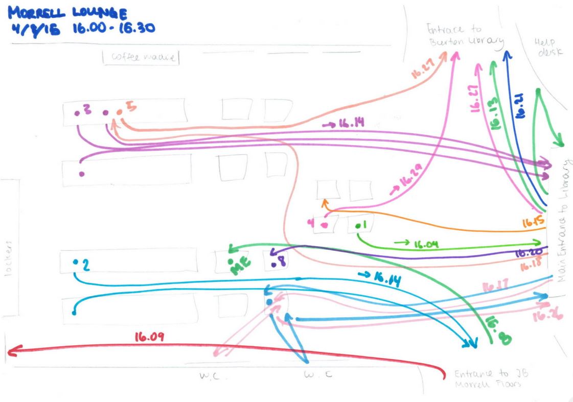
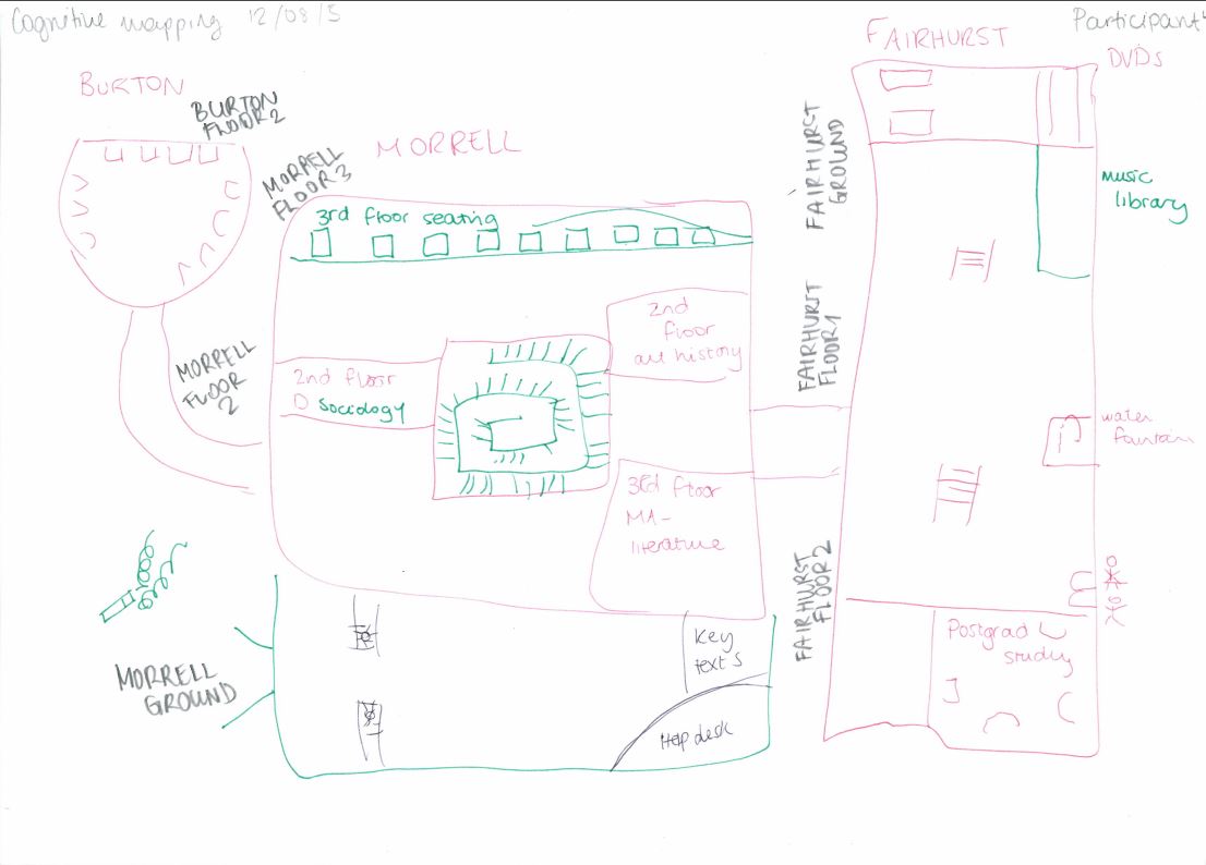
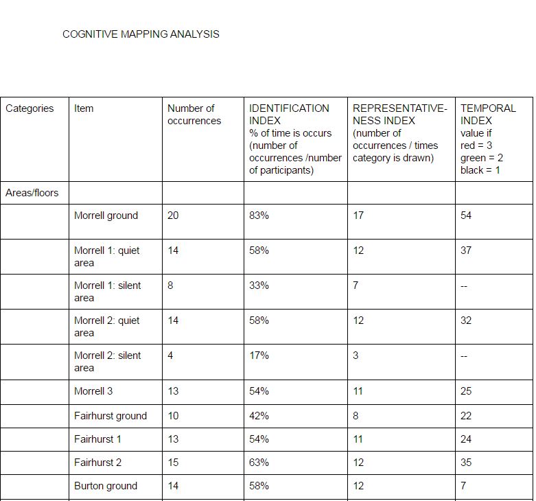
We've used five main ethnographic techniques at York (six if you count the feedback wall we now have near the exit of the library) but decided to limit ourselves to two of them for this project: cognitive maps, and semi-structured interviews. We aimed to meet 4 academics per Department, and ask them to draw a cognitive map of either their research process or the process for designing a new module - so unlike our previous UX projects which involved maps of physical spaces, this was literally 'mapping' the way they worked. Some interpreted this very visually, others in a more straightforward textual way. In all cases though, it proved an absolutely fascinating insight in to how things really work in academia, and provided a brilliant jumping off point for the interviews themselves.

These interviews were semi-structured rather than structured or unstructured; in other words they were based largely on the map and a natural flow of conversation rather than having any pre-set questions, but there were areas which we'd bring up at the end of they didn't come in the conversation without prompting. So for example most people in drawing the teaching-related map mentioned our reading list system, either in the map or in conversation - if after 50 minutes of chat it hadn't come up at all, we'd ask as open a question as possible to prompt some insight into their thoughts on it.

Vanya Gallimore has written a great overview of the project on the Lib-Innovation Blog, which we set up in the library to document our UX work among other things. In it she writes about the background to the project, the methods used, staffing it (in other words, who was doing the interviews) and then briefly about processing the data. It's the most popular post on our new blog and I'd recommend giving it a read.

For now I want to focus on something that post doesn't cover so much: actually doing the ethnography.

Ethnography fieldwork in practice

What is the verb for ethnography? Is it just 'doing' ethnography, or performing ethnography? Ehtnographising? Whatever it is, I hadn't done it in earnest until this project. In the two previous projects I'd been involved in setting things up, helping with the direction, interpreting the data and few other things, but we'd had interns out in the field, talking to people and asking them to draw maps etc. For Understanding Academics, it was agreed that the Academic Liaison Librarians (of which I am one) should be doing the fieldwork, for various reasons described by Vanya in her post linked above - ultimately it came down to two things: the need for a proper familiarity of the HE context and our systems in the Library in order to understand everything the academics were saying; and the sheer opportunity of talking in amazing depth with people in our departments.

One of the most common quesitons about the project is: how did you get the academics to take part? The answer is, we asked them all individually, by email. No mass emails to the whole department, but no incentives either (we've offered post-graduates cake vouchers and the like, in previous UX projects) - just an email to a person selected with care, often in conjunction with the Library Rep and / or Head of Department, explaining what we were doing, why we were doing it, and our reasons for approaching them specifically. We asked around 110 academics this way, and 97 said yes: the other 13 either didn't want to do it or couldn't make time within the duration of the project.

There was a roughly even split of research focused and teaching focused conversations (although in either case there were no limits to the conversation, so some interviews ended up mentioning both). I look after three Departments from the Library: I interviewed three academics from one, and four from each of the other two, plus I did two of the three 'warm-up' interviews.

Prep

The warm up interviews were just like the regular interviews, and their data included in the project, but they were with partners of library staff who happened to be academics... The idea was to refine our processes and see how things worked in practice, on an audience who wouldn't mind being subject to our first attempts at ethnographic fieldwork. This was really useful, and we changed things as a result - for example the message written on the top of the piece of paper assigned to draw cognitive maps on was made clearer, and we extended the time we'd set aside for each interview after the try-outs used their 60 minute slots before the conversations had reached a natural conclusion. 

For the remainder of my interviews the prep consisted of reading up on each academic on their staff profile page, printing out the various bits of paper required, and charging devices. 

Accoutrements

There were a lot of things we had to bring with us to each interview.

  • a device to audio-record the whole thing on (my phone);
  • a device to write on (ipad with keyboard, or laptop); 
  • the paper with the map explanation on; 
  • the paper with the areas to cover if they didn't arise naturally listed; 
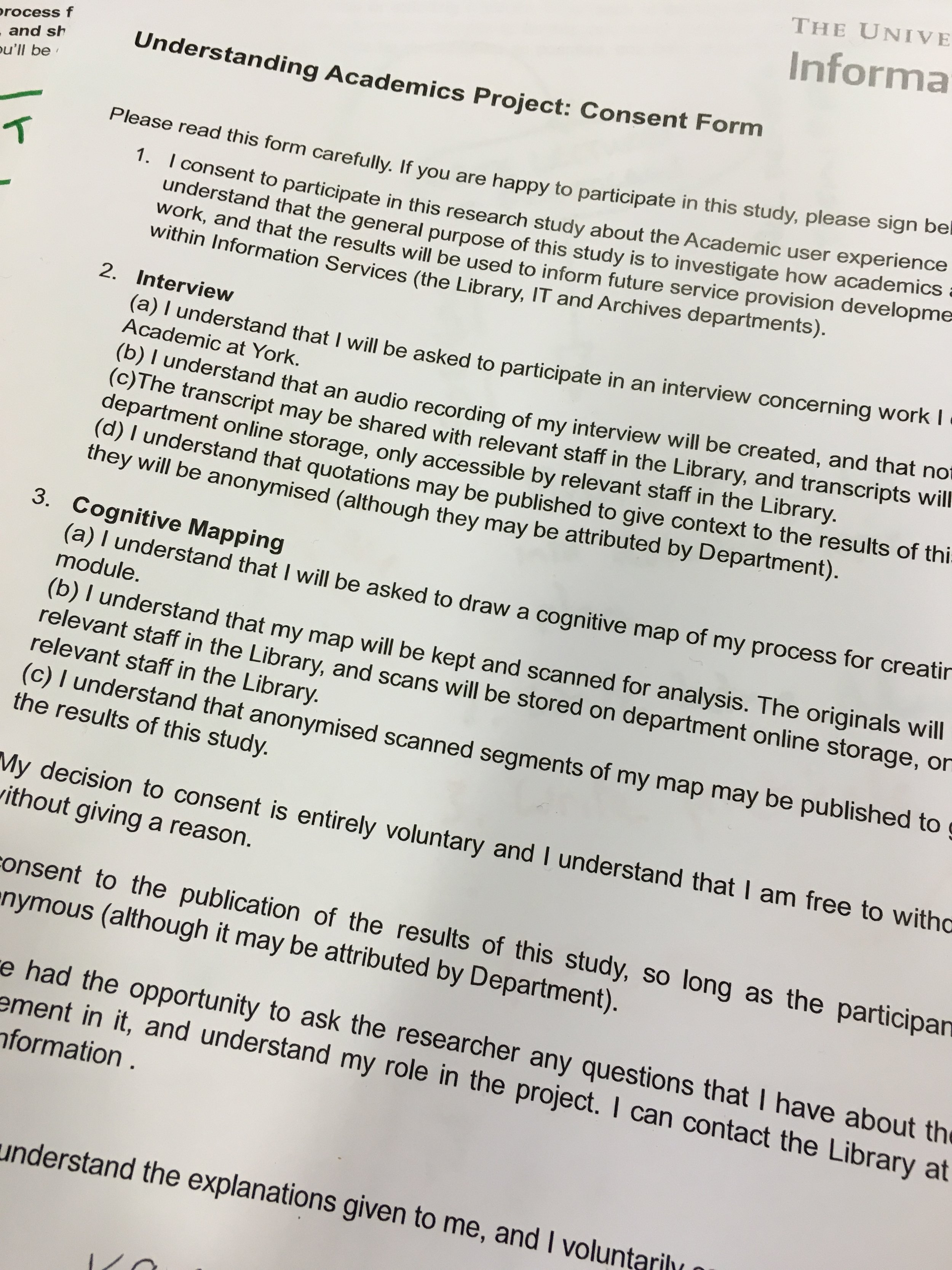
  • two copies of the consent form - one for us to keep and one for the subject to keep
  • a set of four pens (we ask users to draw cognitive maps over a period of 6 minutes, giving them a different colour of pen every 2 minutes)

Of the above, the cognitive map, conversation topics and consent forms were all either teaching specific or research specific - largely the same but with subtly different wording in places. 

The Map

Each session began with an explanation of what we were doing here. The emails sent to invite each academic had covered some of that, but it's always good to talk it over. We discussed what the library wanted to do (change things for the better) but that we didn't have specific things in mind - we wanted to be led by the data. Then we talked about the format of the interview, the fact it would be recorded, and went through the consent forms. I particularly stressed the fact they could withdraw at any time - in other words, an academic could decide now, several months later, that they wished they hadn't been so candid, and we'd take all their data out of the study.

Finally we explained the map, the use of the different colours of pen, the fact it didn't have to be remotely artistic. None of my interviewees seemed particularly put off or phased by drawing the map. Then there was a period of silence as they drew the map (not everyone needed all six minutes; if people took longer than six minutes I didn't hurry them), after which I turned on the recorder and said 'Now if you can talk me through what you've drawn...' 

The Interview

Once the subject had described their map - with me trying not to interrupt unless I didn't understand something, but jotting down potential questions as they talked - the interview commenced. I can't recommend highly enough using either a cognitive map or another ethnographic technique such as a love/break-up letter or touchstone tour as a jumping off point for an interview. It means you instantly have context, you're in their world, and there's no shortage of meaningful ideas to talk about. 

I have to say that during the main body of the interview, I didn't actively try and think about what the project was trying to achieve, I just asked questions I was interested in. Sometimes this meant spending a long time discussing things which weren't library related at all - but that's part of what this project is all about, to understand the academic world more holistically rather than in a library-centric way. 

Some interviews came to a natural end after around 40 minutes; others I felt like we could have gone much longer but I didn't want to take up more of their time than I said I would.

Writing up

One of the changes we made after the initial interviews was to just listen and not try and write notes whilst the protagonists described their map. We didn't have time to transcribe each interview (that would mean we'd have spent more than 500 hours on the project before a single piece of analysis) but we did feel the map description was key, so we listened without writing during that bit and transcribed it fully later. We then wrote notes as we conducted the interview, using the recording to go back and fill any holes or make clear anything from our notes that didn't make sense. Sometimes during a particularly long and involved answer I'd just write go back and listen to this in my notes and stop writing until the next question. 

We blocked out time after each interview to write it up immediately while it was fresh in our minds - so in my case this was mainly going through and correcting all the mistakes from my high-speed typing, then referring to the recording where necessary, then noting down any immediate conclusions I could draw outside of the project framework - things I could learn from and change the way I worked because of. I didn't write these down as part of the notes from the interview because I didn't want to bias the analysis in any way - I just wrote ideas down elsewhere for my own use. 

Conclusions

I absolutely loved doing the fieldwork for this project. It was fantastic. I learned so much, I deepened existing relationships, and I got to know staff really well who I'd barely met before. Every time I came away from an interview I was absolutely buzzing. 

I don't think everyone enjoyed it as much as I did. Some people felt like they didn't know enough about a subject's research project to be able to ask intelligent questions about it - personally I just asked unintelligent questions until I got it - and there was the odd instance of the conversation being stilted or awkward. For me and a lot of my colleagues, though, it was eye-opening and actually really exciting. 

The question of what we do next - how we process all the data, and then act on what we learn - is covered in the following post.

A UX Intern writes... Emma Gray on ethnography

This is the second post in a series about Embedding Ethnography at York. The introductory post is here; the next post will be on the same project as this one, but written by me and focusing on the logistics of organising the whole thing, rather than undertaking the ethnography.

This is Part 2, written by Emma Gray, who was our first UX Intern. At the time of her work with us she was a 2nd year undergraduate at another institution. She did an absolutely brilliant job here, and we learned a lot through her work - about our students but also about ethnography itself. Here's her take on the project. It's a great intro to what we think of at York as the Big Five ethnographic techniques in libraries. There are plenty more, but so far we've focused on these ones, in various combinations, across all our UX work.


UX TECHNIQUES IN A LIBRARY SETTING – INTERNSHIP REFLECTION

In August 2015, I began an intern project looking into how several ethnographic UX techniques can be applied to a library setting and used to investigate possible improvements of the library user’s experience in the University of York library. As the project took place outside of term time, there was a focus on the experience of postgraduate students, who were still using the library over the summer break. The techniques covered over the internship include cognitive mapping, love/break-up letters, interviews, behavioural observation and touchstone tours.

BEHAVIOURAL OBSERVATION

Behavioural mapping is the first technique that I tried out at the beginning of the project. Being unfamiliar with the library before the project began, it was a valuable experience to observe how students behaviour in different spaces in the library. Firstly, I made a grid to record observations over the six week period in different locations within the library, increasingly concentrating on the more busy areas. Using the AEIOU framework, I recorded action (how the students are working in the space), environments (noting atmosphere, for example noise levels), objects (which services are used, e.g. technology and printed resources) and finally users (it is useful to note who is using the space, be it students, staff or external users). Secondly, it was also useful to record pathway maps using coloured diagrams of how individual students move in the space. In the York University library, it was particularly relevant to record pathways in the entrance foyer because the result show which building of the library students head when they enter.

An example of one of Emma's pathway maps

An example of one of Emma's pathway maps

COGNITIVE MAPS

Participants were given six minutes to draw a map of the library, and I asked participants to change the colour of their pen every two minutes so that it could be easily remembered in which order things were drawn. It was a good starting activity because it allowed students to think about how they use the library and its services as whole. This visual representation of the spaces seems to also get the students thinking about how they use the library because I asked them more detailed questions during the interview.

The idea is that students would instinctively begin by drawing areas of the library they area most familiar with. However, I found that most participants started drawing the entrance in detail, maybe because the layout of the library as a whole is quite complex. I therefore encouraged participants to begin by drawing the area of the library they are most familiar with and use the most. This gave stronger results because it showed which objects and areas are most used.

A Cognitive Map drawn by one of the participants of the study.

A Cognitive Map drawn by one of the participants of the study.

In order to process the results of these maps, I divided the library into each floor of each building, and for each noted number of occurrences on the maps, its identification index which reflects the percentage of time is occurs (number of occurrences /number of participants), its representative index (number of occurrences / times category is drawn), and its temporal index (3 points for first pen colour, 2 points for the second and 1 point for the third). This process was then repeated for each individual object that is drawn on the maps, which for example included desks, computer areas and other library services. The advantage of this technique is that is gives a visual representation of how the students view the library, and it can also yield quantitative data. However, it is also a very time consuming technique, so the practicality of the data very much depends on the size of the library.

A screengrab of part of Emma's coding of Cognitive Maps

A screengrab of part of Emma's coding of Cognitive Maps

INTERVIEWS

I began the interview by asking the participants to describe and elaborate on their cognitive maps. Many participants elaborated on how they use certain spaces, which provided useful context for the cognitive map. I also asked participants to explain the process of how they use library services when working through an assignment. I asked general questions about the students’ experience with various services that the library provides, and encouraged to give their opinion on how their experience could be improved.

I found that being an intern and a student myself was invaluable to the interview process because the students did not shy away from being honest about their experience and more comfortable being critical than they might have been with a member of staff. Following the advice from Bernard’s ‘Research Methods in Anthropology: Qualitative and Quantitative Approaches’, I occasionally paused after a short answer was given, and often the participant would continue talking in more detail after a few moments, which kept the conversation flowing.

The major advantage of interviews is the breadth of information they yield, especially because things that individuals bring up can be elaborated upon and questions can also be adapted for future participants (e.g. finding out whether students had similar experiences with aspects of the library mentioned by other participants). Having a few standard open-ended questions is key, but participants seem to much more at ease if the interview flows like a conversation, rather than reading off a list of questions.

The only downside is that transcribing long interviews (they usually lasted between ten and fifteen minutes) takes a long time, but is definitely more valuable than making notes at the time because you are free to focus on what the participant is saying.

LOVE / BREAK-UP LETTER

Participants were asked to write either a love or break-up letter to a specific service that the library offers, so that the students can more emotively express how they feel about this service. I encouraged students to write about they feel (either negatively or positively) passionate about.

The participants were given a maximum of ten minutes to complete their letter. I definitely found this technique the most interesting because many participants wrote very imaginative, emotive letters that gave real insight into how library services and staff are perceived, and how this affects their daily university life. I did not find that this technique had any real disadvantages, only that some students preferred to write a wish list on what could be changed in the library. This also gave insightful information, but often did not show the reasoning behind these requests.  

An example of a usefully insightful Break-up Letter... Participants write these by hand but Emma wrote them up for ease of searching / reading. 

An example of a usefully insightful Break-up Letter... Participants write these by hand but Emma wrote them up for ease of searching / reading. 

And for balance, here's a Love Letter...

And for balance, here's a Love Letter...

TOUCHSTONE TOURS

For touchstone tours, I asked participants to give me a guide of the library. I voice recorded the tours to be transcribed later, so that every detail of the tour could be recorded.

Before the tour began, I usually encouraged participants to give as much detail as they could about how they use the services and different spaces, and also to point out their favourite space in the library. During the tour, I tried not to interrupt the participants or ask any more questions so that they could speak freely. Occasionally, I asked questions after the tour was over if any clarification was needed, or to enquire why the tour hadn’t included a certain area of the library.

The touchstone tours were interesting because the participants were very free to take me wherever they want, and point out anything they want, meaning that the participants brought some things up which I hadn’t thought to mention in the interview. It is notable that the quality of the tour heavily depended on how comfortable the participants were speaking out loud and narrative as we went along.

CONCLUSION

All of the techniques describe above have their own advantages and disadvantages, but they also each contributed to a more multi-faceted insight into how each participant engages with library services. I found the cognitive mapping the most interesting technique because I think it was the most unfamiliar to the participants and therefore got them thinking about how they use the library in a new way. As was the case in this particular library, it also highlights any areas that are being underused. Conclusively, having an intern collect UX data for a university library is a great idea, because the students are definitely more comfortable making their feelings known than they would be with a staff member.