social media for libraries

It's time: how to get your organisation off Twitter / X

In previous posts on becoming ex-X I’ve stopped short of saying *everyone should* leave the hellscape formerly known as Twitter. Mainly because people have built up networks which may not be re-creatable elsewhere, and they were there before Musk came along, so why SHOULD they have to move? But recent events have made me question this, especially when it comes to libraries, museums, archives and Higher Education.

I saw this post from Kevin Gannon on BlueSky which sums it up about right:

I have been leery about unilateral declarations on what people should or shouldn't do about Twitter, bc I know there are networks that have been built there which are irreplaceable. But at this point, I just don't see any way one can ethically use that site. www.independent.co.uk/news/uk/poli...

[image or embed]

— Kevin Gannon (@thetattooedprof.bsky.social) Aug 7, 2024 at 15:15

Musk is actively encouraging division, and helping to incite riots. He’s spreading far-right conspiracy theories. He’s talking about civil-war in the UK. There is simply no other circumstances in which our organisations would be complicit in using, and therefore encouraging use of, a platform whose owner not only espouses such dangerous views but uses the platform itself to amplify them. Our presence on X is an implicit endorsement. We shouldn’t be there.

So how do you get off Twitter? For what it’s worth here’s what I’ve done with my library.

1: Set a date, and tell people

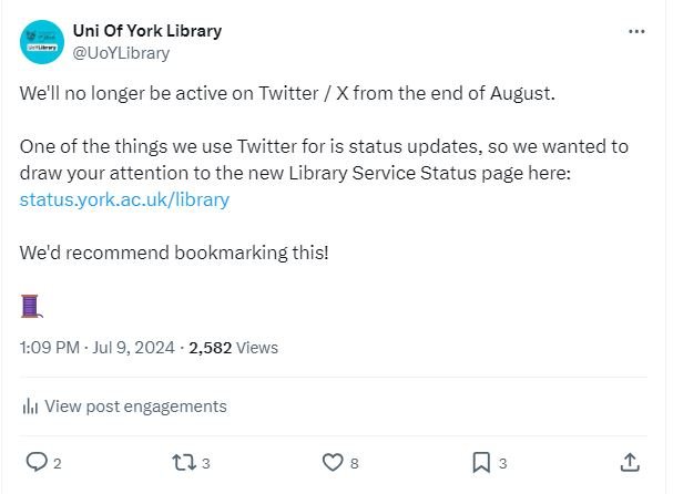
Tweet: We'll no longer be active on Twitter from the end of August. One of the things we use Twitter for is status updates, so we wanted to draw your attention to the new Library Service Status page here:  status.york.ac.uk/library.

As tempting as it is to leave now, we need to give our users time to hear that we’re leaving, digest this, and make alternative plans to get news from us. In January this year I decided @UoYLibrary would leave Twitter by the end of August, so we had a clean break for the new academic year.

The long lead-in time has been helpful. I wrote a briefing paper for senior leadership in February explaining why we were doing this, and shared it with the comms group, which led to some really good suggestions as to how to mitigate the impact, more on which below. We also announced our intention to leave Twitter on Twitter itself in July, so our audience there had time to get used to the idea and follow us on alternative platforms. It says it in our bio as well as our pinned tweet.

We’ve since reposted about this news, and have now done a nice little ‘favourite twitter moments’ round-up thread of some semi-viral tweets and nice interactions we’ve had over the years. These were nice to revisit in and of themselves - we’ve loved being there for 99% of the time - and will also serve to get the word out to more Twitter users before we go.

2. Consider creative ways to mitigate the impact on your Twitter audience

What do we lose by leaving Twitter? You can think about it in terms of both content (we tweet about this, and that) and audiences (those people will be fine because they follow us on Insta, these people won’t because they don’t see messages elsewhere).

Content-wise, we’ve had some lovely creative times with Twitter over the years, but as it’s become more broken and less functional we’re really reduced use of it to basic status updates - building A is closing early today, resource B is now available, service C launches today etc. So we’ve built a library status page (which we’re encouraging people to bookmark) that tells them this info without needing Twitter.

@uoylibrary So is #SatisfyingLibraryUpdates going to catch on? Well here’s one: with info on student curators, 24/7, a new exhbition and our sensory rooms which are opening soon. #unifyork #library #sensoryrooms #libinspo #librariesoftiktok #studytips #UoYTips #satisfying ♬ original sound - Uni of York library

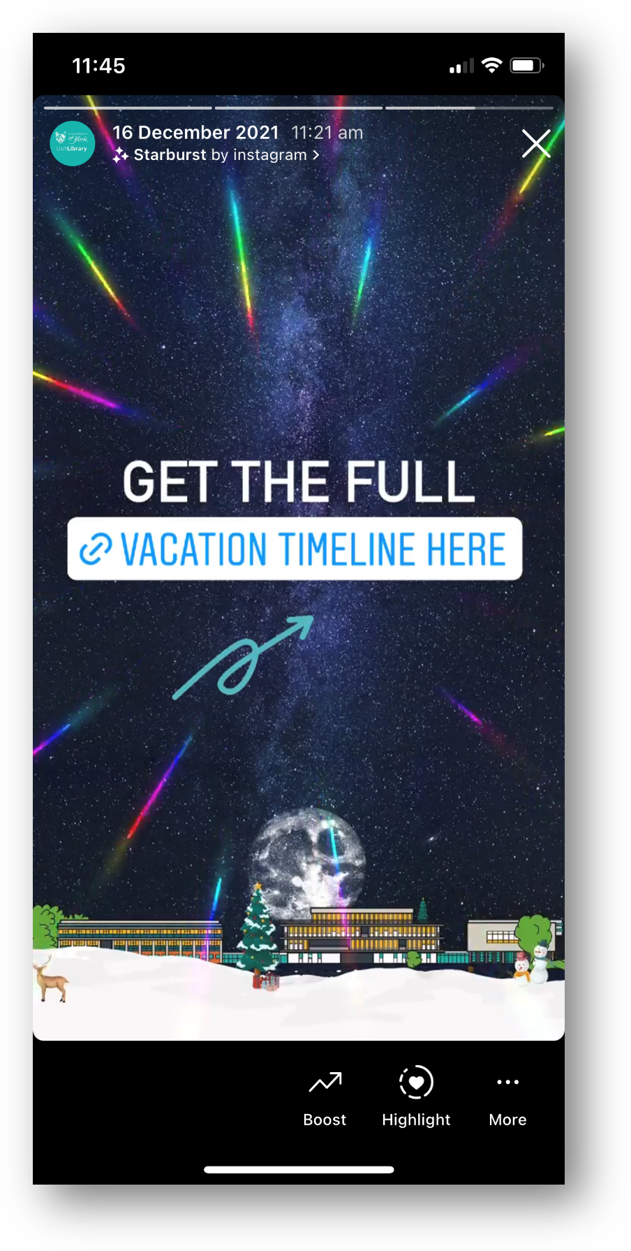
We use Instagram Stories (see the pinned examples on our profile here) to say the sort of things we’d previously have put in Tweets, and occasionally use TikTok for general updates too, so of course we’re encouraging our Twitter audience to follow us there if they use those platforms.

[Sidenote: I’ve invented - actually I’m sure I didn’t really invent it and lots of people to do this - a way to get news updates via the video medium called ‘satisfying updates’ where I use the duet function on TikTok to give the students something satisfying to look at whilst sticking around long enough to hear key updates from me…]

Then we come to audience - in very simple terms almost all of our undergraduates are on Insta and TikTok between them so we know they’re well covered. PGTs are increasingly on Instagram too, and more and more Researchers are heading there. Academics are, for us, the problem audience that we can’t reach easily without Twitter - they’re not all going to the same place when they leave Twitter, and while BlueSky shows promise it isn’t there yet in terms of a critical mass of York academics using it. So we’ve spoken to the central University comms team and asked if they’d be willing to tweet perhaps three or four really important things about the library each year (things like 24/7 opening for exams) which they’re happy to do, and we’ll make sure our more internal marketing routes, such as the ones offered by the Faculty Librarian Team I co-manage, step up too.

Obviously your audiences may be completely different to ours if you’re not an academic library - so use all the data you have to try and work out which demographic is most reliant on Twitter for info about your org, and see if there’s any other way to reach them. Don’t rule out non-social media options too - one of the things we’re going to do is put more posters up in the colleges where all the PGRs are!

3. Make sure you turn off Grok data sharing

Twitter recently activated an on-by-default, unannounced, data-sharing setting where everything you’ve ever tweeted can be used to ‘train’ Grok, Twitter’s stupid LLM AI bot thing. You don’t want that. No one wants that. Get it in the bin.

If anyone's wondering how things are going on the hellsite: This setting was just turned on by default for everyone. if you still have an account with content, go log in and disable this so Grok can't use your tweets as training data. Direct link: twitter.com/settings/gro...

[image or embed]

— Corey (@coreyjrowe.bsky.social) Jul 26, 2024 at 03:17

Here’s the direct link to the Settings to turn data sharing off - it works on desktop but not, I hear, on mobiles.

4. keep the account

I’ve wrestled with this a bit - any social media account that is out there in the world is, in effect, a front window for your organisation. So keeping an account alive even when it’s not active is problematic - people may still send DMs which will go unanswered; people could find old tweets and reply to them and we wouldn’t see it, etc. However, I don’t want to lose the account name and let someone else take it and potentially impersonate the library, and there is of course a tiny, tiny possibility that Twitter may one day be habitable again, so I’ve decided it’s better to keep the account.

A final decision I need to make on this whether to lock it when we leave. At the moment I’m leaning towards locking, to reduce the chances of new people seeing the account, missing all the ways we’ll try and flag that it’s not active, and then trying to get help or guidance we can’t give by asking questions on the platform. Which brings us to…

5. Make it really, really obvious the account is no longer active

Subtlety is not your friend here. I’ve seen professional accounts who’ve left without changing their bio - we really need to make it unquestionably obvious we’ve left.

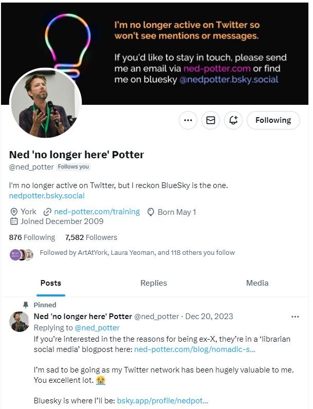
Here’s what I did with my own account when I left Twitter:

So that checklist of ways I’ve tried to flag I’m not there, in full:

  • Says it in my name

  • Says it in my bio

  • Says it in the banner pic

  • Says it in the pinned tweet

I must confess I don’t know if this has worked or not, because I’ve not logged back in since I left. I tried recently, to disable to the Grok AI LLM thing mentioned above, but it requires 2FA I can’t get without logging in, so I’m stuck… I don’t know, therefore, if there are loads of DMs or people @ing me and thinking I’m rude for not replying - I hope there aren’t, and I’ve done everything I can to avoid that. I’ll be doing the same with @UoYLibrary in a couple of weeks.

finally: How much do we explain why we’re leaving?

A decision I’ve not yet made is, do we write a library news post where we fully go into the details of why we’re leaving? I’d be genuinely interested to know what people think about this, if you fancy leaving a comment below.

Obviously the pro is, we’re a library, we’re taking an ethical stance, and we want our users to know about it. We want them to get the reasons why. I was speaking to a librarian at another organsiation whilst doing some social media training recently, and she said as a parent she’d be really proud of her kid’s University doing this.

The con is, quite honestly, opening up the possibility of a prolonged debate with some Musk fans, and using up comms bandwidth we REALLY need for other things on the sort of conversations where everyone gets angry but no one changes their mind. (Classic Twitter-these-days conversations, in fact.) It’s also hard to talk about why you’re leaving without sound judgemental towards the people choosing to stay, and we have no wish to be judgemental. So as of right now, I don’t know if there’ll be a big rationale-reveal type post, or we’ll just leave it at ‘Twitter is no longer working for us’.


Since we announced we’re leaving Twitter we’ve not had any negative feedback about it. We left Facebook a couple of years back - with not a single complaint from anyone - and it is genuinely freeing to be on one less platform. As pretentious it sounds, social media benefits from your creative energy needing to be split fewer ways, in my experience. I was confident becoming ex-X was the right thing to do for our library when I first decided it at the start of year, and I’m still confident now - what’s more we’ve done some really useful things to lessen the negative impact on our users.

I’d recommend taking the steps above, and doing the same. If anyone is interested in the rationale briefing paper I wrote for our Leadership Team send me an email and I’ll share it with you; here’s how it ends.

By stopping our use of X from September, we will be upholding our values, adapting to the changing landscape of social media by jettisoning a platform no longer delivering value, and freeing up capacity to work on more impactful communications. 


Everyone is posting pictures of words to Instagram... and nobody should

Part 5 in the Instagram Series. Read Parts 1 - 4 are here. If you want. No pressure.

If there’s one social media rule that is universal across platforms, industries and sectors, it’s this:

Learn what your audience likes, and do more of it.

The other side of this coin is, of course, to do less of what your audience doesn’t engage with. It’s incredibly easy to follow these maxims; you don’t need pay for any tools or be an analytics guru. Just click on your posts and compare their views / reach / impressions and you’ll quickly learn what works for your community, and what doesn’t.

With that in mind, cultural orgs please, please, please:

Stop posting pictures of words to instagram

I see it happening all the time and it never gets engagement - which means, essentially, almost no one sees the message. You know the sort of thing - photos of book covers, or motivational quotes, or graphics, or photos of signs, or ‘resource of the week’ posters. And in every single case, there’s a massive drop in Likes compared to when they post ‘captured’ images (rather than created ones) of buildings, or spaces, or interesting objects.

If you visit any Instagram profile on a PC (rather than on your phone) you can hover over a post to see how many Likes it has so you can see for yourselves. Go to literally any library, HE or museum Insta account and do some hovering. A new account still finding its feet might get 20 Likes for a picture of a building, but only 4 Likes for a Picture of Words. A really, really successful account with a big following might get 200 Likes for a Picture of Words! But hover over the captured picture of the interior of their building next to it, and you’ll see that has 780 Likes. It’s the same everywhere.

Why does it matter?

In short: if you want a message seen, it needs engagement from your followers because Likes equal Reach.

Instagram is not as straightforward as Twitter. If you follow me on Twitter and I post at 1pm and you’re online at 1pm, you’ll see my post. Instagram is a lot fuzzier, and will not just show your posts to your followers in a simple way - the more people engage initially, the more of your followers will see it.

Likes, Comments and Shares are vital as the more you get, the more people Instagram’s algorithm will show your post to. A really important message about the library closing early simply won’t reach anyone if it’s just a screenshot of the words ‘the library is closing early today’ because no one will hit Like. So no one knows you’re closed early!

Have a look at this comparison from my library’s Insta account. This isn’t quite a full ‘pictures of words’ because we don’t post any, but it’s an example of an unsuitable picture for Instagram and shows you the impact engagement has on reach. For various reasons that I won’t bore you with now, I posted a picture of a case that I absolutely knew wouldn’t get much engagement. It’s a great photo but it’s not OF the kinds of things our audience respond best to, so as a result it got a very low number of Likes. Next to it is a more regular post, of our buildings looking dramatic at night, which got many more Likes.

A briefcase pic with 15 Likes and reaching 392 accounts. A building pic with 95 Likes, reaching 834 accounts.

The heart symbol represents Likes, the Quote symbol is Comments, the Arrow symbol represents people Forwarding the post, and the Bookmark symbol is people saving the post to their Favourites.

The key thing to look at is of course Accounts reached: 392 for the case, and 834 - over twice as many - for the building. So it’s not just a bit of a shame we didn’t get more Likes for the briefcase post; it’s ineffective communication that is only getting to a fraction of the target audience.

We all have key messages. We all have things which we need our audiences to hear. Not all of them have suitable visual metaphors. So how do you get those messages out?

Use Stories Instead

Option 1 is to take the words and put then into a Story.

Words work fine in Stories, people expect them. Especially anything time-sensitive, pertaining to events that day - just use a Story to spread the news.

The more you use Stories (for the kinds of things you might use a tweet for) the more your audience comes to expect you to use them and looks out for them.

When we ask our students how they get updates from the Library, every single undergraduate - every one - says Instagram Stories.

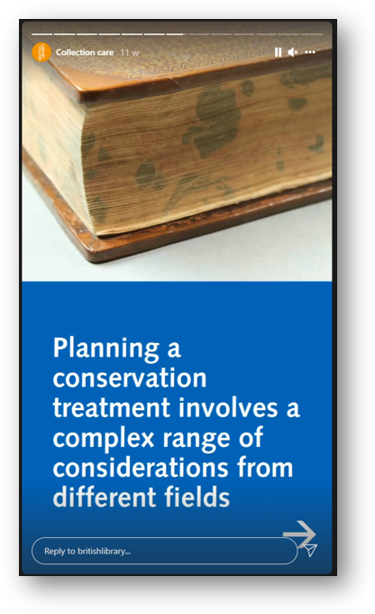
Screenshot: planning a conservation treatment involves a complex range of considerations

Here the BL are using several Stories in a row for a larger narrative - most users are happy to tap through a few Stories in a row if your message is too long to fit in one screen

Remember Stories can have URLs in, unlike Grid posts - so you can post a few words and a link to more information

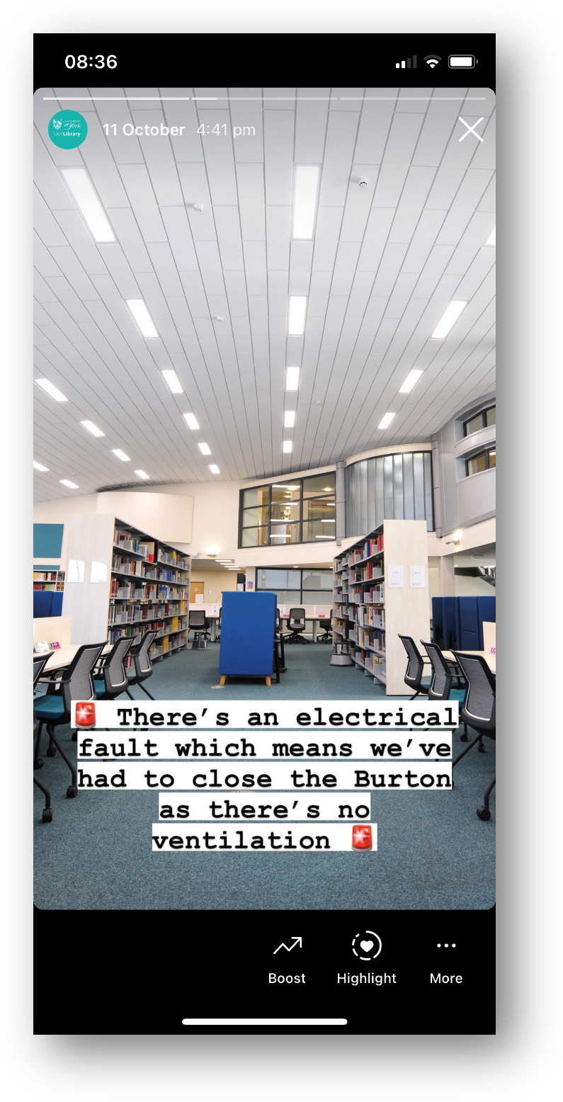
Screenshot of a Story - picture of a library interior, with 'there's an electrical fault so we've had to close the library' written across it

A classic Not That Interesting But Still Important post, which wouldn’t work on the Grid but is perfect for Stories

Use the caption

Option 2 is simply to pair the message with a good picture and more people will see it. Obivously Instagram is a visual medium but you can use the caption for detailed info if the situation warrants it - just phrase it in an engaging way!

Does the picture have to match the news in the caption? No it doesn’t. It’s better if it does, but it’s not essential - what’s essential is choosing a pic people will Like, so more people get the news you need them to hear.

Here’s an example from my library of using a pic for reach, but the caption to deliver important messaging. I was so pleased with this picture when I took it - the colours were just good that day with the bright sun and blue skies and green grass - that I didn’t post it right away, I saved it for exactly this kind of situation where we needed Reach.

Post multiple images, and keep the words of the ‘front cover’…

Option 3 is to get creative by smuggling Pictures Of Words in as part of a post with multiple images. Here’s an example of this - I took a nice picture of the library in the sun, and then used multiple further pictures with words on, and the caption, to tell the audience the info I needed them to know. It got lots of Likes and so lots of people saw it - which absolutely would not have been the case if I’d just posted the Zones-related graphics.

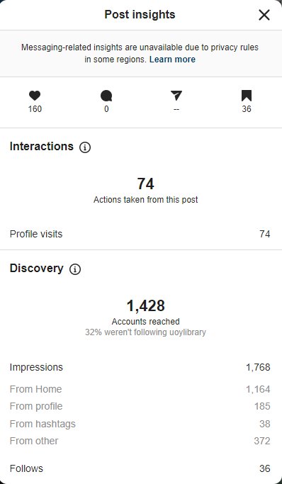
Here are the Insights for that picture. As you can see the accounts reached figure is higher than the previous examples - 1,428 - because of the higher levels of engagement. It’s not just the 160 Likes, it’s the fact that 36 people Bookmarked it, 74 people visited our profile after viewing the picture.

You can also see that 32% of the views were from people who weren’t following us, and that 36 people followed us directly as a result of seeing this post - so Reach helps you find users who didn’t yet know you were on Instagram, as well as ensuring as many existing followers see key messages as possible…

Insights, showing 1,428 accounts reached, 160 Likes, 36 Saves, 36 new follows

I really hope I’ve convinced you not to post ‘created’ images or pictures of words from now on! If you’ve been doing so up till now don’t feel bad, because EVERYONE does it. But do yourself a favour, reach more people, and do more of what your audience likes.


I’ve run a lot of in-house workshops for various cultural organisations, in which I audit their social media and come up with recommendations, working with staff on what they feel comfortable implementing. If you’d like to discuss social media training, get in touch!

A library social media manifesto

Last night at quarter-past-midnight, I sat in my kitchen and was live-streamed into a #VALA2022 conference room in Melbourne. The hybrid thing worked really well, more on which below, but first things first, here are my slides.

The presentation

A library social media manifesto

When I was invited to present on the topic of social media I wasn’t initially sure how to frame it. I talk about social media in workshops all the time but that’s a different thing, really - 3 hours instead of 30 minutes, hands-on rather than a talk, and normally quite focused so for example just covering one tool or approach. In the end I submitted an abstract I was not quite happy with, and then about a month later was struck by the ‘manifesto’ framing for the info and asked the organisers if I could change my plans! They kindly said yes, updated the website etc, and so the slides above are the product of all that.

I’ve tried to create something universal, so whether you work in public, academic, health, school, law or business libraries this should apply equally. I’ve also tried to create something that will help libraries feel refreshed and re-energised - some people I’ve spoken to have talked about a bit of a lull in their social media progress, after making some real progress a year or so into the pandemic… Anyway, check out the slides and see if the ideas help you. The video of the talk will be available in due course.

I absolutely love, love, love this sketch-note of my talk from Kim Williams. It captures all the key points and works as a companion piece to the slides above. Thank you Kim!

The hybrid experience

I realised on the afternoon of the presentation that my slide theme of slate grey and yellow matched my kitchen… What hadn’t twigged at that point was that I’d be presenting in that same kitchen! (The main ‘home office’ space is in our bedroom, in which my wife was asleep due to it being 12:15am, so the kitchen was really the only opion for this.) The people of #VALA2022 must think I’m REALLY serious about slide design and always match it to the room…

A slate grey and yellow kitchen

He’s not wrong…

ANYWAY the hybrid experience worked really well for me, and gave me hope for the future of conferences. I just attended UXLibs in person and, of all the conferences I’ve ever attended, I think that is the least doable online - we absolutely HAVE to be in the space together to make it work. So it’s a stark choice of, either have it in person or don’t have it at all. But for most conferences, hybrid can work well and VALA2022 is a great example of that.

I was on Zoom, and both my webcam and my slides appeared on the big screen in the room in Melbourne. I could also see and hear the room audience through Zoom, which makes a huge difference to how connected I felt - when I said I was drinking gin while presenting for the first time, and heard people laugh, I settled in right away.

The other key thing to all this was the conference app. People could ask questions the whole time on the app, whether they were watching online or in the room. I had these up on my second screen and responded to them in real time, which I really enjoy. Interactivity all the way through is always my preference over ‘questions at the end’.

Anyway, I had a great time, people said nice things on twitter so I’m assuming it worked well from their end too (much as I would have LOVED to be there - libraries of Australia, please invite me back over to your wonderful country! Running marketing workshops a few years back in Sydney, Brisbane and Melbourne was on of the best things I’ve ever done professionally). If you’re thinking of running a hybrid conference, talk to the VALA2022 people, they know what they’re doing!

(And if you’re wondering why hybrid is necessary, read Fobazi Ettarh’s post on the subject, and have a look at the Twitter conversation it sparked.)

Thanks to VALA for inviting me, thanks especially to Sam Gibbard, thanks to the organisers for letting me change my talk details and also for recording the session, and thanks SO much to the audience who came along - making your way early to the earliest session of Day 3 no less, and knowing it was a streamed presentation: I appreciate you!

Instagram guidelines for libraries

After a brief departure last time to mark the 10th anniversary of my becoming a library trainer, this time we’re back to the Instagram Mini Series. Click that link for the previous 3 entries, all of which focus on why to have an account.

Sharing our own Insta guidelines

For this post we’re moving on from the Why to the How. Specifically, how my library - @UoYLibrary on Instagram - does things: an org approached us and asked to share our internal guidance doc with them, and after some discussion amongst ourselves (and a senior manager) to check everyone was comfortable with this, we did so.

At that point we thought why not share them more widely for anyone else who is interested? So here they are - there are some caveats and context below but if you just want to see the doc, this is the doc:

>>> University of York Library’s Instagram Guidelines.

There’s a lot of stats towards the end of this post on the impact adopting these principles has had on our own account, but in short, using these guidelines we’ve increased our Instagram reach by 1149% in 12 months. This stuff really works!

The caveat

This is an internal doc. It’s literally just the guidance I wrote for York staff who help me do the Instagram. So that means it’s not a definitive all encompassing guide! There are probably things we’ve talked about internally which everyone knows, so it’s not codified here. Also, we’re an academic library so it may be skewed towards that sector. Generally speaking though, I think pretty much everything here is applicable to any non-profits using Instagram.

Another small caveat is, I’m not trying to present York’s Insta as the finished article, the account to which everyone should aspire… We’re still learning, still improving, still trying to increase our reach. We don’t nail everything, we still post things people don’t respond to. We’re a work in progress, and this post is really about how to make that progress happen.

The context

Our Instagram was created in 2016 by a Comms Team rather than by us in the library. We finally got control of it ourselves in mid-2017. From that point on it went okay, gradually building up followers and levels of engagement but not setting the world on fire.

From the time of the pandemic starting, I started to spend much more time actively involved in the social media rather than just writing the guidelines, and our Instagram use increased accordingly. We posted a lot more to the Grid, essentially tried harder and, frankly, started to do more of the things I was always telling other libraries to do in social media workshops. It worked well, but it was still very much in the shade of our Twitter account, and not quite hitting the heights we wanted.

Exactly a year ago, I decided that we needed to invest more time in Instagram and make it work better.

Instagram is absolutely essential for reaching undergrads

It is THE communication channel on which to get messages to undergraduates, nothing else comes close. Our Twitter was doing really well and was where we put the most time, and all that time paid off with lots of growth and engagement - but I did some follower analysis and, at least among those who engaged by replying and quote-tweeting us, it was clear that our audience there primarily consisted of PostGrads , Researchers and Academics. So our key social media messages were not getting through to UGs, and Insta is the answer to that problem.

In 2021 I co-presented at an event with Liverpool Uni Library, whose social media really is something of a gold standard in academic libraries, and before the event we chatted on zoom - they had grown their Instagram massively in recent times, which made me think perhaps we could do the same. So I asked my colleague Rebecca Connolly to go on a little fact-finding mission and check out Liverpool, Glasgow and other Uni libraries with good Instagram engagement went about their business and what we could learn. Rebecca produced a brilliant report and we set to work on transforming our Insta into something much more effective for getting key messages out to UGs in particular - a process which is still ongoing.

How we changed our Insta

Some things we tweaked right away, like following more York based accounts, and using Stories a lot more. Using Stories is key and I really feel like it was something I didn’t understand well enough before Rebecca became involved with the account at York; she is an essential part of the progress we’ve made. Stories are so good for newsy items, and the more success you have with Stories the better things seem to go on the Grid too.

Other things evolved over time, like avoiding the use of words and graphics on the grid (only using them on Stories), and making sure to pair big announcements in the captions (NOT the picture) with visually arresting pictures of the library.

If you’ve not read the guidance doc linked at the top of this post, have a look - we basically did all the things in that document! In addition to all that, we’ve created and posted a lot more Reels (you can see all our Reels videos here), and also tried some fancy split photography, that involves dividing a wide-angle shot up into even squares so it can be seamlessly swiped through. Here’s an example of that I posted yesterday which I really like…

The results: our increased Instagram engagement

With any kind of social media, I’m always looking for engagement rather than follower numbers. I want more followers of course - a larger audience of students and staff for our key messages - but they come naturally as a by-product of posting stuff which gets engagement. So for Instagram I’m looking at Likes, Comments, Shares, and Reach, and hoping that if we increase those our followers will increase at the same time.

As it happens, our followers have increased by about a thousand people in the last twelve months. That’s great. More excitingly for me, is that the number of Likes has gone up 42%, despite us posting slightly less frequently overall, so the Likes Per Post has actually gone up 69% - in essence meaning we’re posting stuff the students actually respond to, more of the time. Over 2 years, our total number of Likes have increased by over 350%.

Shares are way up, and Comments also increased which is great because we want that interaction and chance to answer questions - up over 600% over the two years. What isn’t captured by the analytics is the amount of DMs we’ve had - either just messages out of the blue or responses to questions in our Stories. I can’t get figures on this without manually counting but the increase is huge - people love feeding back one-to-one on Instagram.

The reach is the thing that most amazed me though - an increase of over one thousand percent in the 12 months is just fantastic. And the reason is because if people don’t Like your posts, Instagram doesn’t share them widely - so now we’re posting content that gets engagement, a much higher proportion of our followers are seeing our posts. This means our key messages are reaching more undergraduates, and that was the whole aim of this focused attempt to increase engagement.

Like with all social media, the key thing is to learn what your particular community responds best to, and do more of it.

Finally… Do check out Liverpool, they’re so good

So that’s it! There was a lot to get through in this post; if you’ve made this far, I salute you… I hope people find these guidelines useful, and if you have any questions leave me a comment below.

I’ll leave you with a recommendation to look at Uni of Liverpool Library’s Instagram account - however good our numbers are I know theirs will be astronomically better! They’re really good at this stuff, and you’ll find them @livunilibrary.


Interested in Instagram training for your library or cultural org? Details of my social media workshops here.

Instagram for Libraries

If you do one thing differently with your library social media this year, what should it be?

The local knowledge you have of your library and your community always beats generic advice online - this article included - so if you already know what you want to focus on, I’m not telling you what you should do instead. Go with your instincts. But if you’re wondering about where to put your energy over the next twelve months, I’d suggest Instagram.

Twitter / X remains pretty vital to libraries, but for how long? It seems to be imploding, and people are leaving it in droves. Plus, many libraries have been developing their twitter accounts for years, whereas Instagram is still (relatively) new and can often benefit from some strategic attention.

Facebook remains essential for most public libraries, and continues to offer diminishing returns for the other sectors. I recently ran a marketing workshop for an academic library who’d lost their Facebook account through no fault of their own and were planning on starting again; don’t bother, I told them. I’d love to be free of Facebook - it’s such a problematic site and its increasingly difficult for libraries to get enough return on the time they invest in it.

Another reason not to worry too much about Facebook is it frees up time to spend on social media platforms with more impact. We only have so much time and we shouldn’t spread ourselves too thin; it’s better to do a small number of things well than be everywhere but not have time to do anything with full commitment. Which is also the reason I’m not recommending a focus on TikTok. It is the coming platform for sure: as of September 2021 it reached 1 billion users (becoming the fastest social network to do so, beating Instagram by 2.5 years) and a scarcely believable 167 million videos are watched per minute on the platform. But TikTok is something which takes a lot of time and energy, so perhaps it’s one to focus on if you’re absolutely nailing all your other social media profiles already… My biggest issue with it from a library point of view is that I can’t see a way of using it really well without the need for someone to appear on camera. If you look at @ToonLibraries (my favourite library TikTok and the best example I’ve found on how to do it well) it’s clearly the brainchild of a particular librarian with a real affinity for the platform - she’s in most videos because TikTok is a very personal medium, unlike Instagram or YouTube which can be both personal and impersonal. It requires a physical presence on screen. I’m not prepared to do that, nor ask anyone else to, so for that reason I’ve registered my library’s username so no one else can claim it in the meantime, while I wait for a suitable use case to present itself!

So to Instagram, then. It’s the third most popular social network (behind Facebook and, if you count it as social media, YouTube) with 1.4 billion active users. It is full of creative people. It is photo-and-video led but doesn’t JUST contain images. And it is, fundamentally, a nice place to market your library! It’s fun. The community are responsive. Instagram is an ever-growing site and very popular with younger people. For public and academic libraries it is essential - for school libraries it can be brilliant. For special libraries your mileage may vary.

So how do you go about using Instagram as a library, or indeed any cultural organisation? I’m starting the year with a series of posts about this: find the Instahacks mini series here.

Firstly how to make the case for creating a library profile if you don’t have one already, then getting started and how it all works, before moving onto the specifics: how to use Stories, and how to use Reels.

In the meantime you can see if I’m running any social media workshops online, or get in touch to book some training / a workshop for your organisation.