Part 5 in the Instagram Series. Read Parts 1 - 4 are here. If you want. No pressure.
If there’s one social media rule that is universal across platforms, industries and sectors, it’s this:
Learn what your audience likes, and do more of it.
The other side of this coin is, of course, to do less of what your audience doesn’t engage with. It’s incredibly easy to follow these maxims; you don’t need pay for any tools or be an analytics guru. Just click on your posts and compare their views / reach / impressions and you’ll quickly learn what works for your community, and what doesn’t.
With that in mind, cultural orgs please, please, please:
I see it happening all the time and it never gets engagement - which means, essentially, almost no one sees the message. You know the sort of thing - photos of book covers, or motivational quotes, or graphics, or photos of signs, or ‘resource of the week’ posters. And in every single case, there’s a massive drop in Likes compared to when they post ‘captured’ images (rather than created ones) of buildings, or spaces, or interesting objects.
If you visit any Instagram profile on a PC (rather than on your phone) you can hover over a post to see how many Likes it has so you can see for yourselves. Go to literally any library, HE or museum Insta account and do some hovering. A new account still finding its feet might get 20 Likes for a picture of a building, but only 4 Likes for a Picture of Words. A really, really successful account with a big following might get 200 Likes for a Picture of Words! But hover over the captured picture of the interior of their building next to it, and you’ll see that has 780 Likes. It’s the same everywhere.
Why does it matter?
In short: if you want a message seen, it needs engagement from your followers because Likes equal Reach.
Instagram is not as straightforward as Twitter. If you follow me on Twitter and I post at 1pm and you’re online at 1pm, you’ll see my post. Instagram is a lot fuzzier, and will not just show your posts to your followers in a simple way - the more people engage initially, the more of your followers will see it.
Likes, Comments and Shares are vital as the more you get, the more people Instagram’s algorithm will show your post to. A really important message about the library closing early simply won’t reach anyone if it’s just a screenshot of the words ‘the library is closing early today’ because no one will hit Like. So no one knows you’re closed early!
Have a look at this comparison from my library’s Insta account. This isn’t quite a full ‘pictures of words’ because we don’t post any, but it’s an example of an unsuitable picture for Instagram and shows you the impact engagement has on reach. For various reasons that I won’t bore you with now, I posted a picture of a case that I absolutely knew wouldn’t get much engagement. It’s a great photo but it’s not OF the kinds of things our audience respond best to, so as a result it got a very low number of Likes. Next to it is a more regular post, of our buildings looking dramatic at night, which got many more Likes.
The key thing to look at is of course Accounts reached: 392 for the case, and 834 - over twice as many - for the building. So it’s not just a bit of a shame we didn’t get more Likes for the briefcase post; it’s ineffective communication that is only getting to a fraction of the target audience.
We all have key messages. We all have things which we need our audiences to hear. Not all of them have suitable visual metaphors. So how do you get those messages out?
Use Stories Instead
Option 1 is to take the words and put then into a Story.
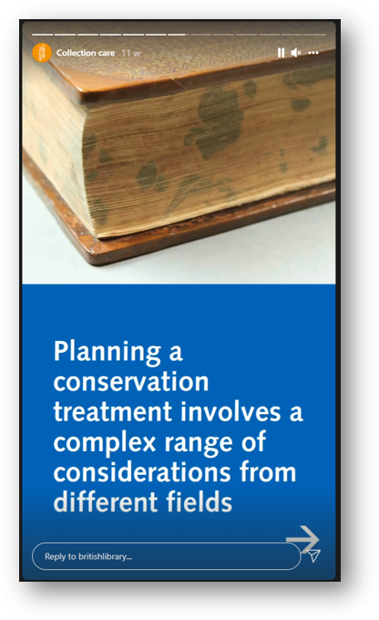
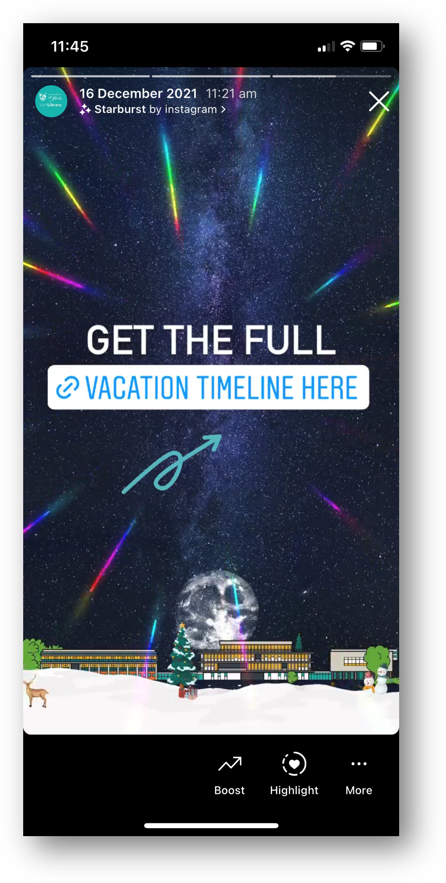
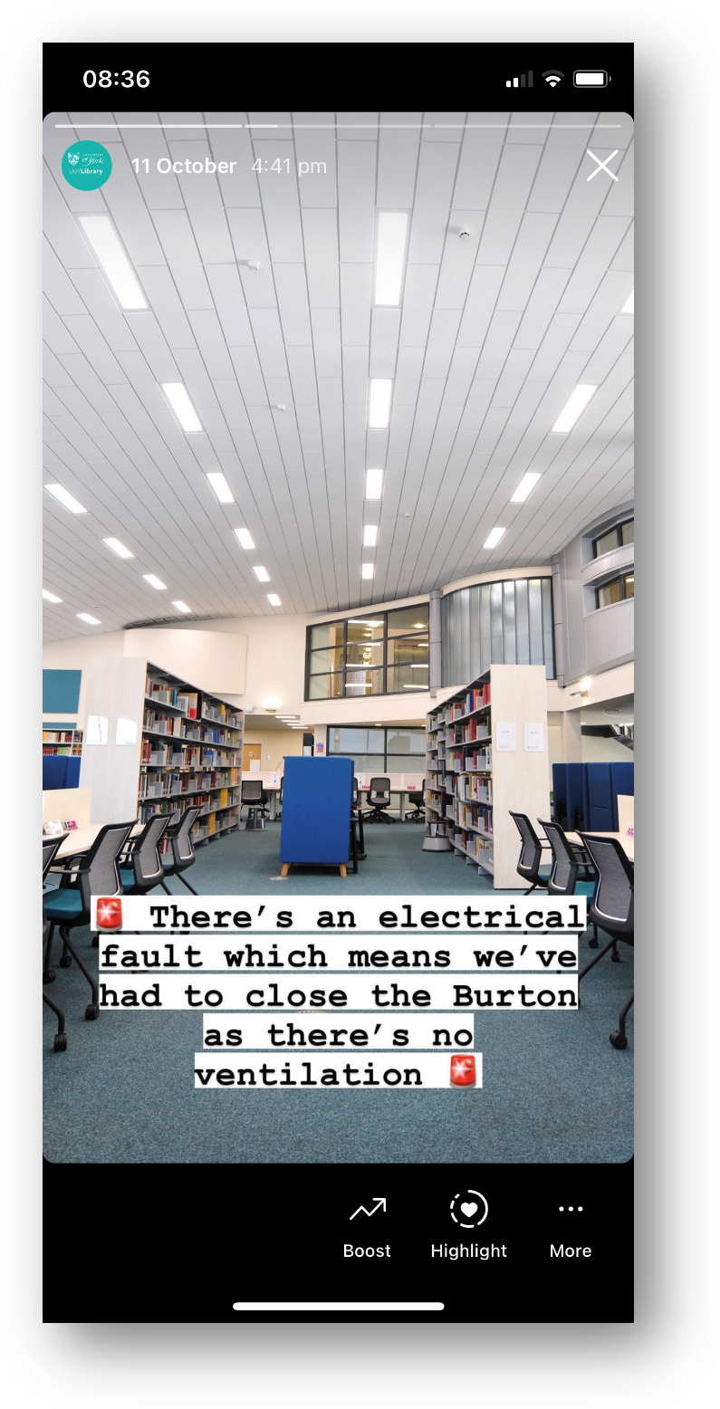
Words work fine in Stories, people expect them. Especially anything time-sensitive, pertaining to events that day - just use a Story to spread the news.
The more you use Stories (for the kinds of things you might use a tweet for) the more your audience comes to expect you to use them and looks out for them.
When we ask our students how they get updates from the Library, every single undergraduate - every one - says Instagram Stories.
Use the caption
Option 2 is simply to pair the message with a good picture and more people will see it. Obivously Instagram is a visual medium but you can use the caption for detailed info if the situation warrants it - just phrase it in an engaging way!
Does the picture have to match the news in the caption? No it doesn’t. It’s better if it does, but it’s not essential - what’s essential is choosing a pic people will Like, so more people get the news you need them to hear.
Here’s an example from my library of using a pic for reach, but the caption to deliver important messaging. I was so pleased with this picture when I took it - the colours were just good that day with the bright sun and blue skies and green grass - that I didn’t post it right away, I saved it for exactly this kind of situation where we needed Reach.
Post multiple images, and keep the words of the ‘front cover’…
Option 3 is to get creative by smuggling Pictures Of Words in as part of a post with multiple images. Here’s an example of this - I took a nice picture of the library in the sun, and then used multiple further pictures with words on, and the caption, to tell the audience the info I needed them to know. It got lots of Likes and so lots of people saw it - which absolutely would not have been the case if I’d just posted the Zones-related graphics.
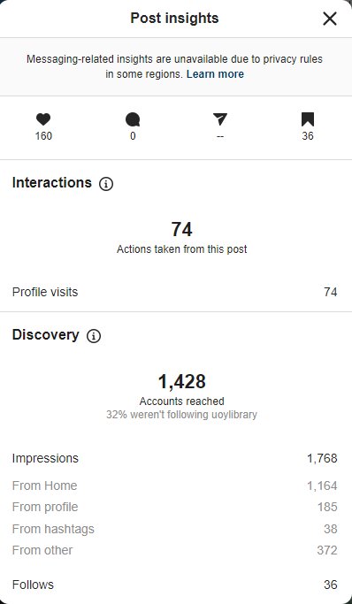
Here are the Insights for that picture. As you can see the accounts reached figure is higher than the previous examples - 1,428 - because of the higher levels of engagement. It’s not just the 160 Likes, it’s the fact that 36 people Bookmarked it, 74 people visited our profile after viewing the picture.
You can also see that 32% of the views were from people who weren’t following us, and that 36 people followed us directly as a result of seeing this post - so Reach helps you find users who didn’t yet know you were on Instagram, as well as ensuring as many existing followers see key messages as possible…
I really hope I’ve convinced you not to post ‘created’ images or pictures of words from now on! If you’ve been doing so up till now don’t feel bad, because EVERYONE does it. But do yourself a favour, reach more people, and do more of what your audience likes.
I’ve run a lot of in-house workshops for various cultural organisations, in which I audit their social media and come up with recommendations, working with staff on what they feel comfortable implementing. If you’d like to discuss social media training, get in touch!


