Professional Development

A short post on preparing short presentations (for short time-slots)

This is a good question, something I've answered a lot in workshops but never blogged about. So here's what I think is really important about prepping short talks with PowerPoint presentations:

  1. Create the number of slides you think you need, then get rid of a couple! The time just rushes past in short presentations, so when it comes to your PPT (or whatever else you're using) you almost always need less than you think. Five slides for a 15 minute presentation may often be enough.
  2. Simplicity is never more important. Simple slides are better anwyay (image-rich, a little text as possible, no bullets) but are especially vital when you only have a very short window in which to convey your information. The messages need to stick, so make them easy to understand and support them with relevant images.
  3. Signpost to more detailed information. Have a blog-post already published which goes into more detail than your 15 minutes will allow, and use a customised bit.ly URL to share the post in an easy-to-remember link at the end of your talk.
  4. Structure is still important. Audiences find structured presentations easier to remember and understand, even for very short talks. So try to have a beginning, a middle, and an end clearly signalled (both in what you're saying and in your slides)
  5. Consider doing a 20:20. A 20:20 (also known as Pecha Kucha) technique involves having 20 slides, each of which automatically moves on after 20 seconds. These are acually really fun to do (the trick is to keep talking rather than stopping to wait for the slides to catch up) and force a real discipline in terms of the economy of your delivery. A 20:20 takes just under 7 minutes and it's amazing how much you can cover in that time if you practice. (I know point 5 directly contradicts point 1, but the approach is SO different with Pecha Kucha it's a whole different ball-game...) 

Coming up: online marketing workshops for New Zealand and Australia libraries!

I'm absolutely thrilled to say I'm working with PiCS again, this time to deliver online training. With PiCS I've previously run marketing training in Sydney, Melbourne and Brisbane, and an emerging technologies in Auckland, and they always go all out to put on the best possible day.

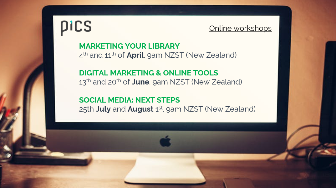
If all goes to plan I'll be back in Oz in 2018 to deliver some face-to-face workshops on Presentation Skills (aimed specifically at information professionals), and in the meantime we're collaborating on three workshops online: Marketing your library (running across March, April and May), Digital Marketing and Online Tools (running in June) and Social Media: Next Steps (running across July and August).

It's all quite complicated because of running them at different times for different time-zones. Each course takes place in two sessions - 2 hours one week, then 2 hours the next week at the same time. There are New Zealand versions and Australia versions... Here are the details:

For me and Viv at PiCS trying to work out timings here has been brain-meltingly complicated, not least because in the case of the New Zealand timings I'm actually delivering them at 10pm the previous day, UK-time, for them to run at 9am Auckland time! The Australian ones are slightly more straightforward, with the training happening at 6am for me...

Anyhow, I'm really looking forward to this. All the courses are tailored for the online environment and I promise we won't be in the standard 'death by webinar' mode here: these are interactive, participatory, and hands-on workshops: you'll be DOING as well as watching and listening. It's going to be ace.

For info on the content and booking etc see the individual workshop pages linked above - for the rest of this post I'm going to use a Q&A format to explain some more about how these sessions will work.

How long are the workshops?

Each session is 2 hours long - any more than that is too much screen time in my experience. There'll be a 5 minute break in the middle, and pratical exercises throughout so it's by no means listening to me for 2 hours. Then there's a week off and a second session of 2 hours, and in between there might be some activities to explore and report back on. So in total each set of workshops will take 4 hours.

Will I be able to ask questions and interact with fellow attendees?

Yes absolutely. I use two screens, one of which has the discussion window open the whole time - so I can pick up questions as they come in rather than needing a section of the training where a moderator coordinates the questions. You can also talk to each other in the discussion. And you can message me in the session if you want to ask a non-public question.

Could I attend all three courses or is there overlap in content?

All three courses are about communciation so certain themes run through each, but none of the fundamental content is the same and none of the tasks and exercises are the same.

I came to your LIANZA marketing workshop on marketing - should I still sign up for the online version?

The workshop at LIANZA was a super-condensed version of the workshop, crammed into 1.5 hours and needing to work for 130 people! Places on these new sessions are limited to small numbers, and over more than twice the time, so the marketing one does contain a lot of material that wasn't included at LIANZA. I've also added a few new sections to the training since late 2015. However there is some overlap! So you'll hear a few things you heard previously. But I'd say there's enough new and additonal content to make it worthwhile.

I came to your Digital Marketing & Online Training full day in Auckland - should I still sign up to the online version?

I'd say 'no'. Although there's new content since the Auckland workshop, a lot of it will cover similar topics so you'll find yourself repeating exercises. Of course you're more than welcome to attend anyway! But I'd recommend attending one or both of the other two workshops (Marketing your library service, and Social Media: Next Steps) instead.

I came to your Marketing Your Library full day in Brisbane / Sydney / Melbourne - should I still sign up for the online version?

The workshop does have some new sections in since the sessions I ran in Australia but a lot of the content is similar, so I'd recommend signing up for one of the other two online workshops instead.

Can I see just the workshops listed for my time zone?

Yes you can!

Or there's more details including links to booking below:

I have more questions!

No problem, either leave them in a comment, or send me an email.

I look forward to seeing some of you online!

A guide to joining twitter now it’s an unremittingly bleak document of how awful everything is

burning twitter.gif

As a librarian using Twitter, my experiences follow the classic three act structure of a movie. (Not a feel-good film. One of those more grown up films where you leave the cinema feeling depressed.)

Act 1: Hope and expectation

You take your first few steps into the online world. It turns out to be AMAZING! There are so many like-minded people there, and they’re so helpful! Ideas are shared, collaborations begin. Real life progress is catalysed by Twitter conversations. Cheers!

Act 2: Growing up

Twitter makes more and more things possible. But the community is fracturing. Was this inevitable? Progress still happens, among so much infighting. Nothing is allowed to be unequivocally good anymore – anything previously thought of as positive now comes with a handily placed fellow twitter user who is cleverer than you and so can tell you how actually it’s all terrible after all. It’s better to know, right? Although naivety felt great compared to this. Things got real.

Act 3: An unending garbage fire where joy goes to die

The world is divided into two types of people – those who know how horrible humans really are, and those who steer clear of social media. Twitter is a mirror to society and what it shows is ugly as hell. Twitter shows humans for what they really are in the way that previously Science Fiction stories did. We are past the point of allegory; who needs it?  Brexit, Trump, Katie Hopkins, fear, anger, sorrow. Libraries are in trouble? The WORLD is in trouble. We’re all doomed. “Name something that shows your age, which the younger generation wouldn’t understand what you’re talking about” goes the meme. Everyone tweeting about winding back unspooled cassette tapes with a pencil. And you’re thinking: hope? Decency? The Labour Party? Check Twitter. Go to sleep feeling sick. Wake up feeling sick. Check Twitter again. Rising panic. Repeat to fade.

<end>

So how do you answer this question?

I’ve written guides on ‘if you’re new to Twitter, here’s what you do’ before – they’ve been among the most read posts on this site. But all that seems very quaint and a little moot now. Like reading a guide to the eatery options on board the Titanic after it’s hit the iceberg.

Here’s my attempt at giving this a proper go.

What advice would you give someone who’s just joining Twitter now?

1.      Lay down some ground-rules and stick to them. Twitter works when you are in control of it rather than it being in control of you. It needs to be something you DECIDE to engage with, rather than getting into a cycle of dependence, checking it listlessly until all hours even though you don’t even want to, getting ever more scared or depressed. So, don’t check it after 9pm or before 8am for starters. No one needs to start their day with that shit. Think about whether you really need it on your phone at all – and if you do, consider deleting it (the app, not your account) during holidays and over Christmas.

2.      CURATE. Find the good people. Use the search box to look for people tweeting about stuff you care about. Follow the ones talking sense. Find the community you want to be part of and join in. You need to curate Twitter, proactively following and unfollowing to make it work for you. That said…

3.      Get out of the echo chamber. If you follow 1000 people who all think the same you’ll be in an echo chamber and that’s no good to anyone. Everyone will reinforce your view of the world and then Brexit will happen and you’ll be all, WTF? But if you follow a bunch of people who really wind you up, you’ll be wound-up all the time. So a middle ground must be found. To quote, well, me, in a thing I wrote for the University of York’s MOOC: “Make sure your online social circle doesn’t consist entirely of People Like You - follow and interact with people from different professions, socio-economic demographics, locations, nationalities and ethnicities. This at least builds a more rounded picture of the way the world thinks.” I’ve have learned SO MUCH from people on Twitter. Not just about my profession, but about society, about behaviour. That’s why I still love it even though it’s a shit-show now, by and large. Look to be challenged as well as supported, but if someone is hateful or obnoxious, mute, block, lock your account - do what you need to feel comfortable.

4.      Trust that the right people will find you, rather than changing to please the wrong people. Better to give of yourself, be yourself, present an unvarnished version of yourself, and take your time to find a network who is happy with you as you, than to try and adapt to be like everyone else. I know this sounds like a self-help book. But honestly, Twitter is huge. Your people WILL be there. Wait for them rather than watering yourself down. Everything is fragmented now. Find your fragment.

Twitter, yesterday

Twitter, yesterday

5.      Don’t slow down to look at the car crash. Of course it’s compelling. Of course you want to know what’s going on. But you don’t NEED to see it. You don’t need images that are going to haunt you and still be there when you close your eyes to go to sleep tonight. If certain world leaders are tweeting horrifying things, block them then you won’t see them ReTweeted. Do it. Add a load of words to your mute list – use the advanced mute options. You need to take care of yourself to get the most out of Twitter. Self-care is vital.

6.      For celebs and politicians Twitter is a broadcast medium. For the rest of us it’s still a conversation. Tweet about your work. Tweet about your life if you’re comfortable doing so. But tweet about other people’s work too. RT stuff. Reply. Get involved in chats. Back and forth. Twitter is the social media platform that is most like just chatting to people in a room.

7.      Make Twitter the best place it can possibly be. While the world falls apart around you, make your part of it a place where good things happen. Be positive but realistic. Be supportive. Don’t RT nonsense or propaganda or lies. GO TO THE SOURCE. Don’t be unquestioning. Think about your role in other people’s echo chambers too. Help people out. Be approximately 30% nicer online than you are in real life to allow for the potential misinterpretations of un-nuanced written text. Don’t make people’s days worse. Make things a little bit more Act 1 (above) and a little bit less Act 3.

8.      Don’t be afraid to quit. No one ever regrets shutting down a social media account. If it’s not having a positive impact on your life, get rid.

The tl;dr version of this post

It's a little late for that unless you've scrolled right to the end, but basically find the right people and Twitter can still be great. I still love it. It's still useful. It's still enriching. And that's because of the people I follow and interact with.

Using PowerPoint as a design tool

If you're a graphic designer you probably use a professional tool like Adobe InDesign or Photoshop to make leaflets, posters, infographics and other digital images. If, like me, you're not, and those tools are beyond both your budget and capacity to learn complicated programmes you're not going to use that often, you need an alternative.

I've written on here before about Canva, which is excellent for more than just presentations, and I like Phoster in the iOS app store for designing digital posters. But an under-rated tool for Design is PowerPoint. The main reasons are it's a lot more flexible than it's often given credit for, and it's incredibly easy to layer content (to put text over images, etc) - something which is maddeningly difficult to do in Word, for example.

So here are the key aspects to using PowerPoint for design.

1) You can make a slide ANY size, and save it as a JPG or PNG file

Go to Design, Slide Size then Custom Slide Size to get to this menu

Go to Design, Slide Size then Custom Slide Size to get to this menu

PowerPoint defaults to a 4:3 or 16:9 slide - but you can edit the slide to be any shape, size and proportions. Open a new presentation and go to Design then Slide Size and choose Custom Slide Size you can bring up this drop-down menu, or just put in the custom dimensions of your choice.

Everything becomes easier with design when your canvas is the perfect dimensions to start off with. Sizes like A3 and A4 are self-explanatory if you're designing flyers or posters, but also think about digital image sizes. For example:

  • A Twitter image (which is to say a perfectly sized image which doesn't require users to click to expand when viewing it's tweeted) is W: 116 mm x H 232mm
  • An Instagram image can be any square, but optimally is 134mm x 134mm
  • A Facebook image is 317mm x 317mm
  • A YouTube custom video thumbnail is H: 190mm x W: 338mm

(You can work out any pixels to mm dimensions using an online converter: I used this one for the above.)

Once you've created blank slides in a variety of useful sizes, save them to use as a template more quickly in the future.

2) You can install fantastic typography

As anyone who has attended my presentation skills training will attest, I'm always banging on about how Typography is a hugely underrated part of design. Fonts matter a lot, and can make the difference between something looking and the same thing looking really professional.

As always, I'd highly reccomend fontsquirrel as a souce of fantastic (and free to use) fonts - and see the previous post for more info on font-pairings.

Click to go to the font-pairing post

Click to go to the font-pairing post

3) It's easy to manipulate images in useful ways

You can find the ideal image from a CC0 site like Pexels, and make it easier to use - to layer text on top of, for example - using PPTs editing tools. They're nowhere near as sophisticated as those in Photoshop, but it's still really useful. Particularly darkening images using the Brightness slider so that white text clearly shows up on it, or blurring images. Both of these techniques are explained in more detail here.

You can also Crop images to specific shapes, circles for example, which can help with really striking design.

4) You can follow the basic principles of good design, and that's more important than the tool

I've found that I really like design without truly understanding it like a proper designer would, but certain rules apply across the board and help me with whatever I'm doing:

  1. Images AS the background most often works better than images against a background (unless you're using icons).
  2. Space is good. Leave space.
  3. No more than three fonts per design. And use fonts that help you communicate your message - or, to use a phrase I'm not altogether comfortable with for some reason, but it seems to apply here: use fonts intentionally.
  4. The most important thing about text is legibility. Make sure text is large, and the contrast is high between the text and the background.
  5. Left-align text unless there's a specific reason to Centre-align it (or very occasionally right-align or justify).
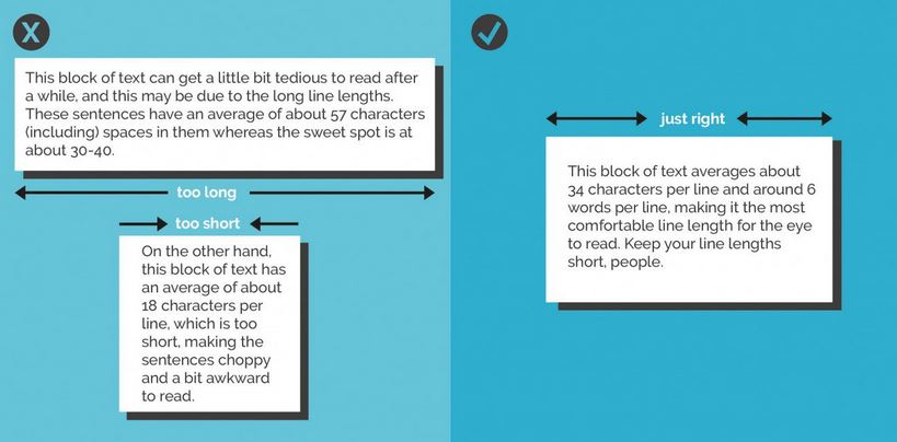
  6. Avoid orphan or widow words. Just stretch your text box a little more, or narrow it, so words aren't left on a line of their own. Canva's helpful design rules also have this to say on line length:

5) Save slides as images

You can save your PowerPoint as a PPTX to come back to the design later, but you can also save a slide as an image, or a whole bunch of slides as seperate images.

When you go to Save As, choose JPEG or PNG from the drop-down menu - it will then give you the choice of saving just the slide you're on at the moment as an image, or to create a folder into which it will save all the slides in the presentation as individual images.

Saving slides as JPEGs

Saving slides as JPEGs

And finally, while we're on the Save As function, here's a brief guide to which format to save regular presentations in depending on your situation...

NLPN's Useful Resources

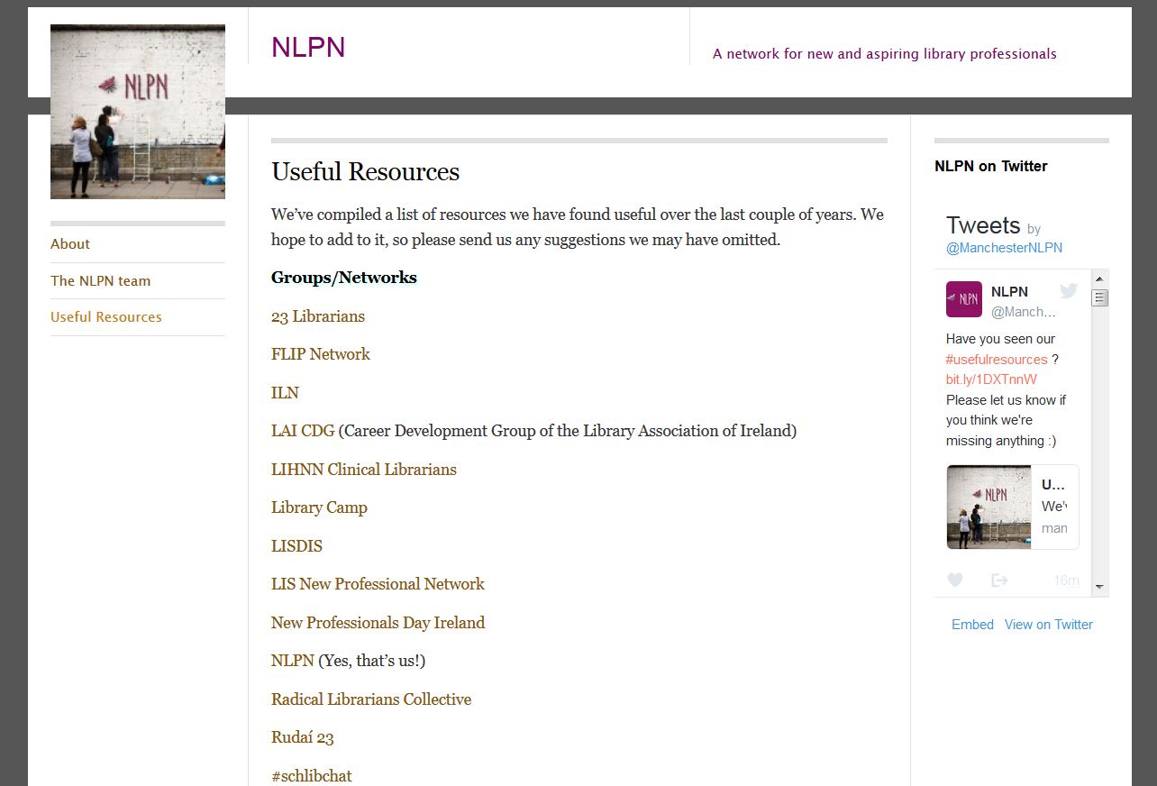
Just a very brief post to say check out the fabulous NLPN's Useful Resources page. They've brought together a list of professional library bodies, groups and networks, blogs, job sites, journals and databases and even institutional repositories. 

It's aimed primarily at New Profs but it's useful for everyone in interested in the wider profession. If I'd had this kind of curated list of useful stuff when I came into the profession I would have found it so much easier to understand the wider context and become part of a bigger conversation. You really could get through years of librarianship before you needed more than what NLPN've put together on this list. Get to it!

Click the pic to go to NLPN's site

Click the pic to go to NLPN's site