Presentations

6 Alternatives to Bullet Points


First things first: bullet points are not inherently bad. They can be very useful in written documents. When used in presentations, however, they stop your presentation being as effective. (They often turn presentations into written documents) In fact, your audience engages less, remembers less, agrees less and likes you less when you use bullet points in your PowerPoint presentations. (International Journal of Business Communication, 2015)

So why take that risk?

Usually the answer to that question is one of: 1) It's what I've always done, 2) It's the easiest way thing to do, or 3) Because what else would I do?

For me, 'we've always done it this way' is not a reason to do something. 'This is the best way to do it' is a reason to do something, and sometimes that overlaps with that we've always done, but not always. 

Presentations are often huge opportunities. You have a room full of people giving you your attention (with potentially thousands more online afterwards) and you're there to talk to them about something significant. So although bullets may be easy, why not make the most of the opportunity? Why not do everything you can to not only get your message across but to get it to stick in people's minds? And finally, the 'what else is there?' issue - well, here are five alternatives to using bullets.

(Subscribers, there's LOTS of images in here, some of them stacked up as slides. It's probably going to be a lot easier to view this on the website itself rather than in an email / feedreader - here's the link.)

1) Just put fewer words on the slide

An example of using fewer words without reducing the impact

An example of using fewer words without reducing the impact

An obvious and straightforward place to start. Take away everything you don't need - if it's surplus to requirements, if you can remember to say it out-loud, or if it doesn't really matter whether you say it or not, just get rid of it!

The example here is a slide I used in a recent workshop. I could of course have listed all the ways in which marketing is changing, using bullet points to separate them. But I felt the slide would have more impact with just a single sentence written on the screen, me listing examples out loud, and a visual metaphor as the background image.

2) Cascade the key messages across multiple slides

Rather than making four or five points on one slide (and risk your audience reading ahead and getting out of sync with you the presenter), make one point per slide over four or five slides. This gives each point room to breathe, and helps with signalling to ensure your audience understands and remembers you.

If you're making several points on a theme you don't have to make new slides from scratch for each one - just do the first slide, right-click and Duplicate it, then edit the text on the duplicated version. I've used this technique in the examples below (use the arrows to switch between slides):

If you've got the most recent PowerPoint you can use the Morph transition between the slides, which works really nicely.

People worry that this method will mean a longer presentation but this isn't the case - you take the same amount of time overall, but cycle more quickly through the slides.

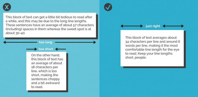
3) Use colour to make lists readable, rather than use bullet points

An example of using colour to differentiate chunks of text

An example of using colour to differentiate chunks of text

There are times when you need several points on a slide - for example when you're showing an audience what you'll talk about, or are summarising something, or making comparisons. In these instances neither of the first two techniques are appropriate; you need all the text on one screen. So just write it out like you normally would, but get rid of the baggage and negative associations of bullet-points by not using them - and recreate the POINT of them (making text easier to read) by using alternating colours.

In the particular example shown here, I've actually built up to what you see over three slides. The first just says has the alternating colours text list much larger and in the centre of the screen, then the second is as you see above but with the Bodleian's reply hidden, and then lastly the slide you see here.

4) Highlight key sections of your slide, one by one

I do this a lot - sometimes by building the content of the slides one animation at a time, or by changing the colour to highlight each section, one at a time. Again it means you can have all the points on screen, but you're not using bullets and you're in sync with your audience.

In the example below I've got all three points on screen but each one is highlighted yellow (picking out the yellow from elsewhere on the slide) while I talk about it - again use the arrows to move between them:

5) Turn your bullet points into something visual

An example of using icons instead of bullets

An example of using icons instead of bullets

A fifth option is to basically use bullets without people thinking 'Aargh, bullet points, death by PowerPoint here I come' etc. Use icons (for example from iconfinder.com) as bullet points - the images will help your audience learn. A basic example is shown here.

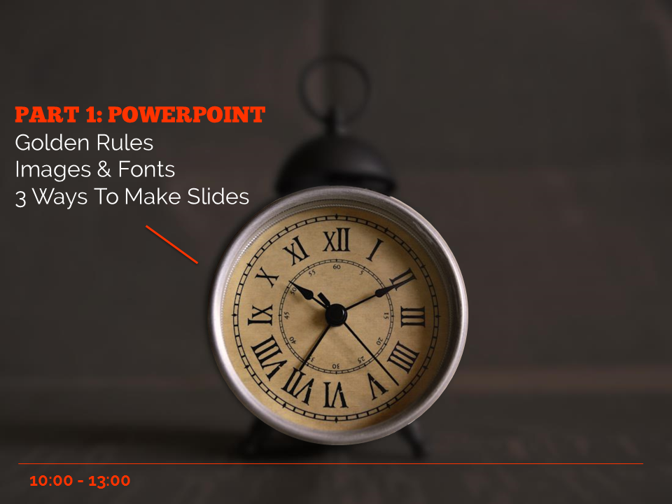
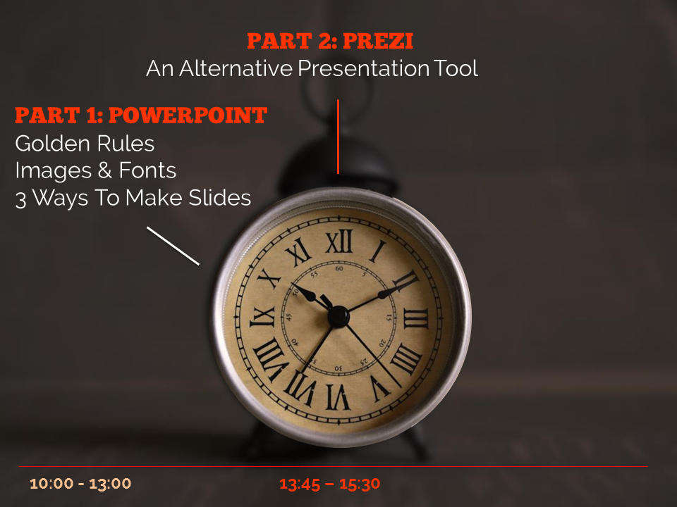
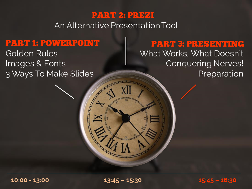
6) Combine several of the techniques above

The final example below is how I introduce the timings for my Presentation Skills training days. It does what a single slide with bullet points would do, but uses colour and visual elements over three slides to introduce the information in a more engaging way. Part of the reason I bothered doing this is the slides allow me to talk about each part of the day in turn, whilst staying in sync with my audience, AND it allows the audience to see the full day's timings in one go on the final slide of the sequence.

So there you go! Several ways to avoid bullet points. It's really worth taking a small amount of time to rewrite presentations to avoid bullets: your audience will thank you for it...


You’ll find details of my Presentation Skills or PowerPoint workshops here: you can book an all-day or half-day session for your organisation, online or in person.

Using PowerPoint as a design tool

If you're a graphic designer you probably use a professional tool like Adobe InDesign or Photoshop to make leaflets, posters, infographics and other digital images. If, like me, you're not, and those tools are beyond both your budget and capacity to learn complicated programmes you're not going to use that often, you need an alternative.

I've written on here before about Canva, which is excellent for more than just presentations, and I like Phoster in the iOS app store for designing digital posters. But an under-rated tool for Design is PowerPoint. The main reasons are it's a lot more flexible than it's often given credit for, and it's incredibly easy to layer content (to put text over images, etc) - something which is maddeningly difficult to do in Word, for example.

So here are the key aspects to using PowerPoint for design.

1) You can make a slide ANY size, and save it as a JPG or PNG file

Go to Design, Slide Size then Custom Slide Size to get to this menu

Go to Design, Slide Size then Custom Slide Size to get to this menu

PowerPoint defaults to a 4:3 or 16:9 slide - but you can edit the slide to be any shape, size and proportions. Open a new presentation and go to Design then Slide Size and choose Custom Slide Size you can bring up this drop-down menu, or just put in the custom dimensions of your choice.

Everything becomes easier with design when your canvas is the perfect dimensions to start off with. Sizes like A3 and A4 are self-explanatory if you're designing flyers or posters, but also think about digital image sizes. For example:

  • A Twitter image (which is to say a perfectly sized image which doesn't require users to click to expand when viewing it's tweeted) is W: 116 mm x H 232mm
  • An Instagram image can be any square, but optimally is 134mm x 134mm
  • A Facebook image is 317mm x 317mm
  • A YouTube custom video thumbnail is H: 190mm x W: 338mm

(You can work out any pixels to mm dimensions using an online converter: I used this one for the above.)

Once you've created blank slides in a variety of useful sizes, save them to use as a template more quickly in the future.

2) You can install fantastic typography

As anyone who has attended my presentation skills training will attest, I'm always banging on about how Typography is a hugely underrated part of design. Fonts matter a lot, and can make the difference between something looking and the same thing looking really professional.

As always, I'd highly reccomend fontsquirrel as a souce of fantastic (and free to use) fonts - and see the previous post for more info on font-pairings.

Click to go to the font-pairing post

Click to go to the font-pairing post

3) It's easy to manipulate images in useful ways

You can find the ideal image from a CC0 site like Pexels, and make it easier to use - to layer text on top of, for example - using PPTs editing tools. They're nowhere near as sophisticated as those in Photoshop, but it's still really useful. Particularly darkening images using the Brightness slider so that white text clearly shows up on it, or blurring images. Both of these techniques are explained in more detail here.

You can also Crop images to specific shapes, circles for example, which can help with really striking design.

4) You can follow the basic principles of good design, and that's more important than the tool

I've found that I really like design without truly understanding it like a proper designer would, but certain rules apply across the board and help me with whatever I'm doing:

  1. Images AS the background most often works better than images against a background (unless you're using icons).
  2. Space is good. Leave space.
  3. No more than three fonts per design. And use fonts that help you communicate your message - or, to use a phrase I'm not altogether comfortable with for some reason, but it seems to apply here: use fonts intentionally.
  4. The most important thing about text is legibility. Make sure text is large, and the contrast is high between the text and the background.
  5. Left-align text unless there's a specific reason to Centre-align it (or very occasionally right-align or justify).
  6. Avoid orphan or widow words. Just stretch your text box a little more, or narrow it, so words aren't left on a line of their own. Canva's helpful design rules also have this to say on line length:

5) Save slides as images

You can save your PowerPoint as a PPTX to come back to the design later, but you can also save a slide as an image, or a whole bunch of slides as seperate images.

When you go to Save As, choose JPEG or PNG from the drop-down menu - it will then give you the choice of saving just the slide you're on at the moment as an image, or to create a folder into which it will save all the slides in the presentation as individual images.

Saving slides as JPEGs

Saving slides as JPEGs

And finally, while we're on the Save As function, here's a brief guide to which format to save regular presentations in depending on your situation...

Creating images with copy-space for text

This post originally appeared on the Lib-Innovation blog.

As always things have changed in my library over the summer, and we needed some new images to reflect our reconfigured rooms, new signage and new services. We're very fortunate to have easy access to the University photographer Paul Sheilds, who is based in our Morrell Library building, so we booked a morning with him.

We had very specific needs in mind, based on a list we'd drawn up to suit what I wanted for our Induction Project, what my Academic Liaison colleague David Brown wanted for the new LibGuides and what the Comms Team needed. In particular I was really keen to get photos with copy-space.

Copy-space literally means a space to write 'copy' in the newspaper meaning of the word - in other words an area of the image which is less busy and which could be written upon without obscuring a key part of the picture.

In essence I wanted to be able to write directly onto the images (for use in slides, posters, digital screens and social media) without having either a separate area for text, or a back-filled text box - because I think it looks smarter that way and because it allows the images to be full screen at all times. It's a lot easier to do this when the images are captured with that in mind from the outset.

Here are some examples - these are works-in-progress that I'm playing around with for the forthcoming #UoYTips Induction campaign for 2016/17 at my institution. They won't look exactly like this in the final versions but the copy-text principle will remain.

We have borrowable laptops which I wanted to showcase. I've added a piece of text to the copy-space:

Here's an example of an image of the same lockers which is a great pic but which doesn't have copy-space built in (making it a little less flexible to work with in marketing):

It would be possible to write on this of course, but you'd need to manipulate the image to ensure the text was legible, or used a back-filled text box.

Next up is a picture of the copy-print-scan machines - the copy-space in this case being the underside of the lid. I did experiment with having the text at an angle to match it but it looked a little clunky so I went with good old fashioned horizontal text for this one...

Here's a picture of a student - by not putting her centre of the frame (and by conforming to the rule of thirds) we've made space for the text.

Finally here's an example where despite leaving copy-space the background is too busy to write directly onto - the text wouldn't be clear enough. There's a neat divide where the wall ends, so I've inserted a shape over everything to the left of the wall, to make the copy-space more clearly defined. I did this in PowerPoint - inserting the rectangle, filling it black, then making the fill 19% transparent. The white text is clearly visible against it, and the focus of the image (the walls you can write on) is still clear and uncluttered.

Type Genius: the joys of font-pairing

I'm a little bit obsessed with nice fonts - I love how they can impact on design and help tell your story. An aspect of design which is often undervalued is the combinations of fonts: pairing up fonts (or sometimes mixing groups of three fonts, ideally not more than three in one design) for posters, or social media campaigns, or PowerPoint presentations.

I've just found a great site called Type Genius that helps out with choosing fonts, more on which below.

Here are four font combinations I like, three of which I've used, and all the fonts for which can be downloaded individually from Fontsquirrel:

BEBAS NUEUE AND MONTSERRAT

The first combination is what is used for the blog and much of the rest of site. The blog title is Bebas Nueue and the body text is Monstserrat. (Whenever I use Heading 2 in the formatting that's also Montserrat, but in all-caps - the Heading 3 used in this post os back to Bebas Nueue again). I chose them mainly because when I rejigged the design of the site recently I wanted a thicker body text font, so chose Montserrat which I've been using since I saw Matthew Reidsma use it for his UXLibs I keynote. Bebas compliments it for titles because it a tall and narrow font in contrast with Montserrat being thick and more rounded.

LATO AND ROBOTO SLAB

The second combination I've not used at the time of writing, but got from Type Genius - which you can find at typegenius.com. You tell it what font you want to use, and it gives you a number of potential companions to pair with it (as it happens when you put in Montserrat it suggests Bebas Nueue, as used on this site).

In the case of Lato and Roboto Slab, I've actually not used the Regular Lato in the example above at all - I used Lato Thin for the first part and Lato Heavy for 'titles'. I do like the contrast of light and heavy.

RALEWAY AND... RALEWAY

Which brings us to the third combination, which isn't technically a pair as it's just Raleway used in three different ways. I love Raleway beyond all other fonts. As long as you have both Raleway Regular and Raleway Bold installed (although PowerPoint will try and Bold non-standard fonts when you highlight them and click the Bold button, it's not the same as actually installing the Bold version that the typographers intended) they work so beautifully together, especially in all caps. The intro to UX presentation I blogged about recently used Raleway in all possible combinations (Regular and Bold in both lower and upper case) with no other fonts involved:

The other joy of Raleway is it renders perfectly on Slideshare. Some other fonts, even when you save and upload your presentations as a PDF, go a bit blocky on Slideshare, for example my LIANZA Marketing Manifesto slides, which use Raleway along with ChunkFive Roman - the latter looked great at the conference but not so good on Slideshare, but Raleway was perfect in both situations.

MATHLETE BULKY AND CAVIAR DREAMS

I used this combination for my Tuning Out The White Noise presentation which became the most popular thing I've ever put on Slideshare (despite Mathlete Bulky not rendering properely on the site) and I use it in some of my training materials, so I've become slightly bored with it due to over-exposure! I also over-used Mathlete and have since changed it round so it gets much less use in my slides, because it's a little too quirky for any kind of long-term reading. I like the way it looks but usability has to come first.

Further reading

For more info and guidance on font-pairing, check out this article from CreativeBloq, and Canva's Ultimate Guide to font-pairing.

If you have a particular pairing you'd recommend I'd love to hear it in a comment below.

What is UX and how can it help your organisation?

User Experience - UX - is still relatively new to libraries. I've been writing about it a lot on here of late: there's now been 4 posts in the Embedding Ethnography series about what we're doing at York.

I thought it would be useful take a step back and create a slide-deck to introduce UX - ethngraphy and design - in this context. Here it is:

One of the most popular pages on this site is the Structured Introduction to UX and Ethnography and I wanted something to go on there, and also for a new blog from the University of York.

Introducing Lib-Innovation

The Lib-Innovation blog is an attempt to capture some of the more creative stuff we do at York, and especially as a channel to disseminate ideas and results around our UX activities.  I'm reposting my own articles from Lib-Innovation on here, but not those written by my colleagues: if you're interested in the results of the UX studies I've written about on here so far, the Head of Relationship Management at York, Michelle Blake, has written about the projects on Lib-Innovation. What we learned what absolutely fascinating and we've already started to make the changes to help both students and staff.

More on UX

Here is a (continually updated) list of the latest posts on this blog that feature User Experience in some way.