Post 4 about the UXLibs Conference. This one is about the actual ethnography we went there to learn about. If you're interested, there's a post about the conference organisation and format here, plus a post about the Usability keynote here, and a post about the Ethnography and Design keynotes here.
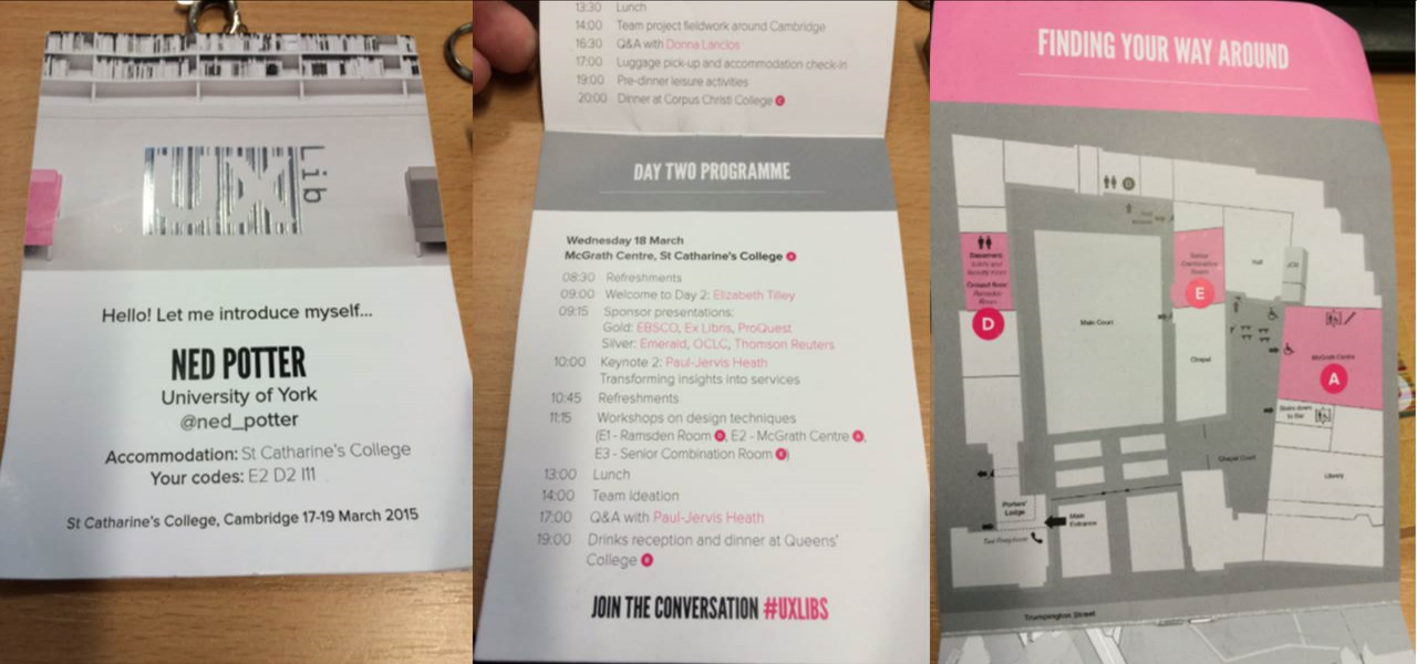
But first, the Conference badge. This genuinely was the best user experience I've ever had from a badge. The attention to detail was symptomatic of the whole approach to the conference, I felt - it was designed to be a good experience. Timetable, maps, where your accommodation is, which parallel sessions you were in, name, institution, Twitter name, the conference hashtag AND it was reversible so it could face either way and still be useful. All little things but together they made a real difference.
Before attending this conference my knowledge of ethnography was limited to having read about it. I'd not done any. I knew it was useful, and I knew why I felt we needed to make use of it - but if someone had caught me by surprise with the question 'So what IS ethnography in libraries?' I would have crumbled... But not anymore!
Here are some of the techniques we learned about ethnography - in the final post next time I'll cover the process of designing a service or product off the back of what you learn.
Cognitive Mapping
I've put this one first because it's my favourite. I didn't actually get to do this one (on Team Space Grey we all went to different workshops, and mine was the Observation one), but I really loved the results of it. If you're reading this thinking "I did do this and you've misunderstood it" then correct me in a comment!
Cognitive Mapping is in essence asking your subject (student, staff or whoever) to draw a map of the library - or, ideally, of their wider learning landscape - in order to understand how they perceive the space, what they actually use, what they value and see as most important and so on. Often the subject is asked to change colour of pens every 2 minutes, for a total of 3 colours over 6 minutes, so you can later see which order the items were drawn in, an indicator of their importance.
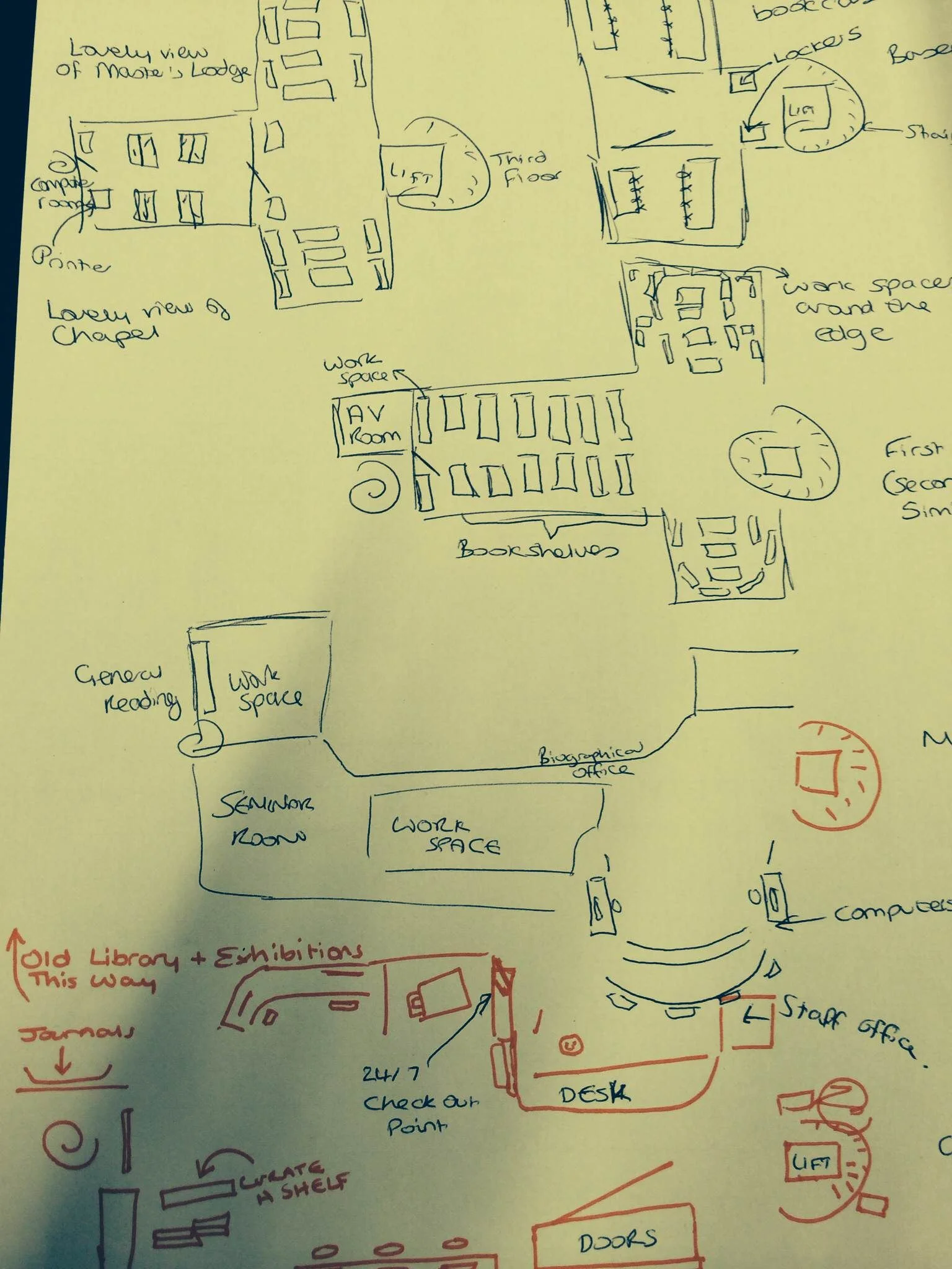
Here's a map which Team Space Grey got one of our students to draw (thanks for sending me this Kristin!):
We got two maps overall - what was particularly interesting for us is that one of them mentioned the basement area of the library as being dark and scary, and another didn't put the basement on the map at all! This was a big part of the idea we later pitched (which I'll cover in the next post).
There are some examples from Donna Lanclos of congitive maps, here.
What we didn't really have a chance to do at the conference itself was code the findings. To quote library anthropologist Andrew Asher - one of only two people to hold that position in libraries, the other being Donna Lanclos - here's how you might go about it:
“Coding these images basically involves counting the elements drawn in order to construct two indexes: a identification index, which is the number of times that an element is drawn divided by the total number of individuals participating (i.e. the percentage of the time the element occurs), and representativeness index, which is the number of times an element is drawn divided by the number of times that category of element is drawn (e.g. the number of times a study room on the first floor is drawn divided by the number of times all study rooms are drawn) (See Colette Cauvin’s “Cognitive and cartographic representations : towards a comprehensive approach” for additional discussion). I also constructed a temporal index for each element by coding the three colors in order (1 = Blue, 2 = Green, 3 = Red) and calculating the mean value for each element (you could do more complicated things by combining the indexes if you are mathematically inclined, however, I’ve found that these three get at most questions).”
Observation
Observation is exactly what it sounds like - you occupy a space in the library or wider campus and you note exactly what's going on and how people use the space. In our workshop we were encouraged to focus on the location itself, the pathways users took through it, the interactions they had (both with other people and the objects and machinery), and the tools they used.
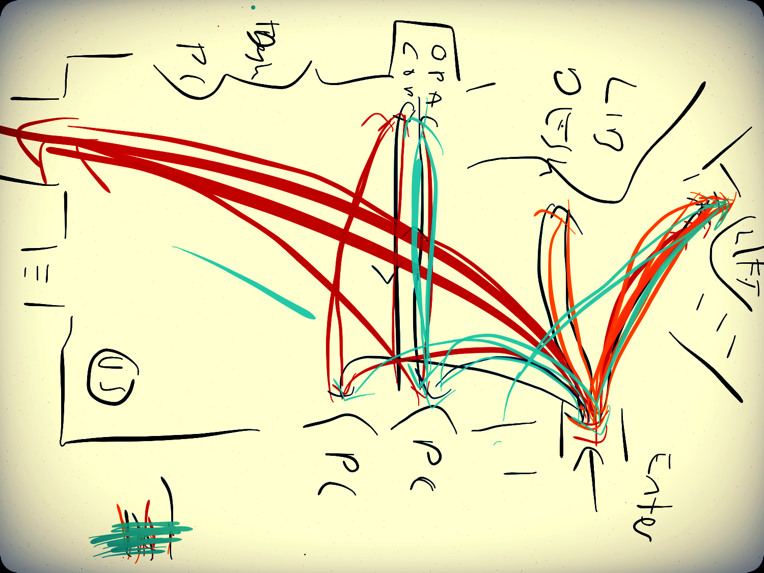
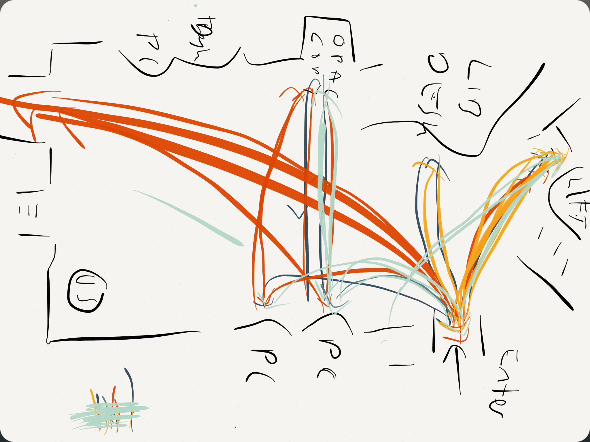
I drew a heat-map, or rather a behavioural map, using the Paper app on my iPad - tracing the lines of every single user who came through the library over a set period of time. You quickly get a picture of how people move through the space. (Not a single person went down to the basement...)
I can't draw at the best of times, and this was done using my finger - so my handwriting which is usually terrible is now completely unusable, and the weird mass of colours near the bottom left is me repeatedly trying to get the action right to bring up the colour selection tool - but I really enjoyed making this!
The idea of course is to build an understanding of how the space is used, and then adapt the space to better suit the reality for the users. For example, at Judge Business School they moved the digital display screens so they were easily viewable from the 'desire line' - the path most students took through the library. There's more on this in slides 13 - 19 of Andy Priestner's deck here. (That presentation is also a great introduction to ethnography generally.)
Interviews
The key thing about interviews in this context (as opposed to the more traditional focus group methods libraries often use) is asking completely open ended questions. I mentioned this in my post about Donna's keynote: if you ask how a student writes an essay, you get a potentially more illuminating answer than if you ask 'what library resources do you use for an essay' or 'how do you use the library'. All of this makes the data you get messy and harder to process, but ultimately in my view more worthwhile.
Touchstone Tours
Just as the Cognitive Mapping gets the user to draw the map rather than view the library's own, Touchstone Tours ask the user to take the librarian on a tour of the library, rather than the other way around. By the user telling you how the tools, systems, building and spaces work, you get to truly understand how it feels to be a user without the in-built knowledge and understanding we have as library staff. (Our tour subjects didn't take us down to the basement because, for them, it really didn't matter.)
Love-letter / break-up letter
I'm reluctant to try and describe this one in too much detail as I wasn't in the relevant session and we didn't end up using it in my team. But it involves writing a love-letter to the library if you like it, or a break-up letter if you don't. When it works well it gets to the heart of the user experience, and helps understand the emotions Matt Reidsma talked about in his Keynote on usability.
There is more info on interview techniques, touchstone tours, and the love letters, in Georgina's workshop slides.
Anything I've forgotten, let me know!


