events

The key to good library marketing is *campaigns*

The title of this blog post is the opposite of click-bait: it says everything. It's the tl;dr not just of this post, but of successful library marketing per se.

One-off marketing almost never works, because people seldom act on a piece of marketing the first time they see it. When you see an ad, even a good one, you don't rush out and buy / do the thing right away. If you have Netflix for example, think about when you got it. Was it the first time you saw an ad? Or did you become more and more aware over time, and then eventually circumstances were right and you signed up?

In Library marketing terms we have to try and achieve the same thing. Build awareness over time of relevant services. Appeal to people at the right time. If we just push out lots of different messages all the time, this is too much information and its too dispersed - there's nothing for anyone to hold on to, and think 'this is for ME'. So 9 times out of 10 (at least) the successful marketing, the things which have impact and make a tangible difference to the Library, are in the form of campaigns. What does this mean in practice?

Campaign marketing consists of delivering the same message, tailored across different platforms, for a sustained period of time.

So your users see the message once, and they register it. They see it again somewhere else and they decide to act on it. And then perhaps a week later they see it again and that's when they change their behaviour, and do something they weren't going to do before. You need a week or two of focus on the same message to make that change happen.

Examples of great campaign marketing

I was at the PPRG Marketing Awards Conference last month, and the one thing which united virtually all the award winners was campaign marketing. You can see all the presentations on the PPRG website but here's some key examples.

Hampshire Library Services. Hampshire undertook a really comprehensive campaign to promote the free digital magazines service they had, which wasn't being used enough. You can view their Prezi here - it's well worth a look. Here's an example of their campaign visuals:

Hampshire Library Services campaign visuals, taken from their Prezi linked above

Hampshire Library Services campaign visuals, taken from their Prezi linked above

The key thing about these four ads is the visual style is so striking, you'd easily associate one with the other if you saw them seperately. So again, perhaps the first time you see the ad you think 'oh that's great, free magazines at the library!' but that still isn't enough for you to ACT. Then you see the second one and it reminds you of the first one, you associate the two, and it's the second push you need to go and actually download an e-magazine.

And downloading e-magazines is exactly what people did based on this campaign. Here's a key stat:

Hampshire stats.PNG

That's the thing about campign marketing: it really, really works.

Another great example was from Islington Library and Heritage Services. Take a look at the #islington50s slides here. They had a one-month campaign, with a set number of social media outputs each day, a clearly defined set of objectives, and both a library-user and non-library-user audience in mind.

Here's the slide on the impact it had:

Click the pic to open the entire presentation in a new window

Click the pic to open the entire presentation in a new window

I love the details that their Local History Centre was rushed of its feet as the impact of the campaign spread through the community!

The final example is local to me - York won a bronze award for our UoYTips marketing campaign. We ran our academic induction as a marketing campaign in 2016, and it worked so well we've built upon it for 2017. There are all sorts of reasons why we did this and why it worked - but again the key thing is, it was a campaign. Key messages over a concerted period of time. Here's a video I made that has the audio from my talk, plus a more video-friendly version of the slides:

Or if you'd prefer, just the original slides...

Next steps

If you want to run a campaign, here are some things to think about.

  1. Your campaign needs to be the primary focus of your comms for a concerted period of time. It doesn't mean you don't talk about anything else, just that you keep talking about the subject of the campaign
  2. The same message needs to go out across multiple platforms, but it may work better when tailored for each - you wouldn't neccessarily use the same phrases, words or images for twitter, an email, a poster on the Digital Screens, and Facebook
  3. A strong call to action is important. It's not enough just to pique people's interest - they need to know how to easily take the next step to engage with your campaign (visit a website, come to an event, fill in a form, whatever it might be)
  4. Don't just measure outputs (tweets, posters etc) but outcomes - what happens as a result of your campaign? This takes time but it's worth it because you can build on what works

If you need a conference / event / project website, Strikingly might be the option for you

 
The short version of this post is: if you'd like a clean modern website for your online presence, and aren't looking to do anything too complicated, Strikingly may well be the right choice for you. It's easy to use for both author and viewers of the site, and it's free as long as you don't get TOO much traffic.

Over the past couple of months I've been tinkering around with the website builder Strikingly in spare pockets of time.

I really like the vertical scrolling style websites you can make in Strikingly - I first saw that style when Matt Borg used it for stuff like the UXLibs site. You can use normal navigation to skip to whichever page you like, or you can scroll down and they all appear below the homepage - meaning you never have to load up a new page to explore the website. This long-form one-page style saves time and works well.

Where it doesn't work so well is if you have a lot of complicated information to display on many different subjects - in that setting a traditional website may work better. But if you have just one story to tell Strikingly can do it with an uncluttered, stylish, and very mobile friendly site. For example for a conference, an event, a project, a collaboration, or even a personal website to act as a CV or something for the Googlers to find.

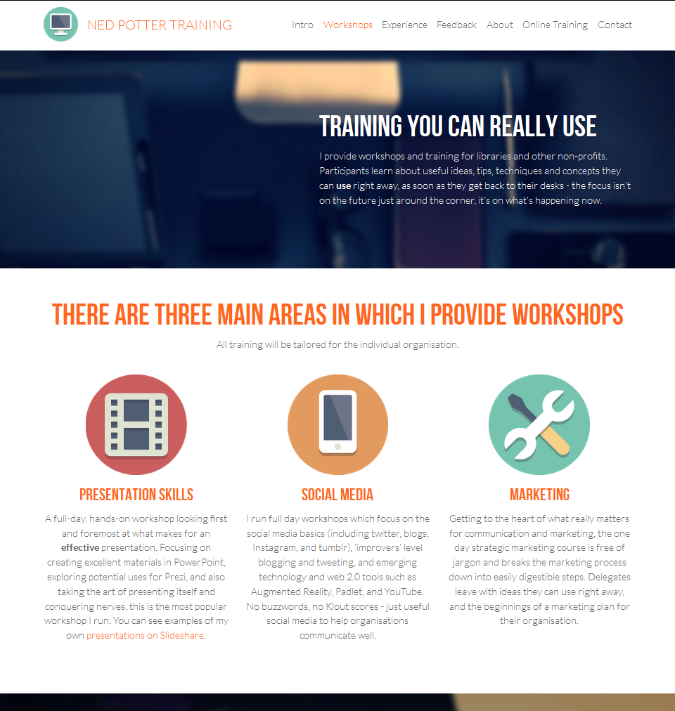
I already have this main website made in Squarespace (which I reviewed here), so in order to have a reason to sign up and play with Strikingly in earnest I built a site for my Training offering. You can find it here if you're interested - the top part looks like this:

Click the pic to open the website in a new window

Click the pic to open the website in a new window

At the moment this feels some way ahead of Blogger and even Wordpress in terms of the interface - it's pleasant to interact with a Strikingly site. You can actually blog using Strikingly, but if you do that and achieve success with it, you're going to exceed the 5GB of bandwidth that comes with the free version of the service. You can upgrade to the 8-or-16 dollar a month packages but I doubt anyone reading this would want to that - so to my eyes, Strikingly is a good option for someone who wants an online presence, perhaps to document some projects you've worked on, an online CV, or to showcase your skills if you're job-hunting, but who doesn't want to commit to blogging. Or, as mentioned, for an event, conference or collaborative project.

The editor looks like this:

As you can see you choose the type of section you want, then edit the content to your own. You edit the actual site - so what you see is truly what you get, rather than there being a seperate Editor interface. This makes it easier to see exactly how the changes you make are going to affect your design.

PROS OF STRIKINGLY

  • It's fairly fool-proof in terms of making things look nice. You are set up to succeed and would have to out of your way to make a duff site, even if you have no experience of web design or blog-building etc
  • It's very easy to create a site. There are nice templates which are relatively customisable
  • It's free, as long as your site is not too popular! (See below)
  • It's Responsive Design, so everything about your site is retained when viewing it on mobiles - it's just re-ordered to best fit the size of screen. Below is a screen-grab of Preview mode where you can see your site in tablet or phone view:

CONS OF STRIKINGLY

  • If you exceed 5GB of bandwidth per month, you'll need to upgrade to a paid-for package. There's more on understand bandwidth requirements here but to 5GB ought to be enough unless you're blogging and building an audience. I don't know what my bandwidth usage is anymore as the Squarespace package I have is unlimited, but in my old wordpress days I used between 10 and 20GB a month - had I not been blogging and thus creating traffic I think 5GB would have been more than enough
  • You need a lot of imagery. As with all modern website designs, it's a lot about pictures - so you'll have to use some. There's plenty of inbuilt options to choose from but in making mine I had to hunt around for things which were relevant, and not just stylish for the sake of it
  • Following on from that, all these new website builders (like Squarespace too) are really aimed primarily at start-ups and freelancers; sometimes it feels like an effort to find the options which aren't all about a: the hard sell or b: vaguely trendy lifestyle stuff that may work in a San Franciso web design office but is hard to imagine having any meaning elsewhere
  • It's not THAT flexible - as mentioned above, a more complicated site is better off with a different website builder. The editor is easy to use but a little constraining so you can't micromanage the finer details of how each section is arranged
  • And the usual disclaimer as with any new site-builder - who knows how long the company will be around? Unlike Wordpress which is open-source and sustained by the non-profit community, Strikingly exists as a business, and businesses go under... There's no reason to expect Strikingly to stop existing, but you never know.

So could Strikingly work for you or an enterprise you're involved with? If you do decide to give it a whirl let me know what you make with it.