Information Professional

Email Communication Part 2: Measuring Impact, Subject Line Length, Email Frequency & More


Earlier in the week I wrote about the basics of good email communication, the three Ts. In this follow-up I want to cover a few more complex things which didn't fit in the previous post, particularly around the theme of an email newsletter.


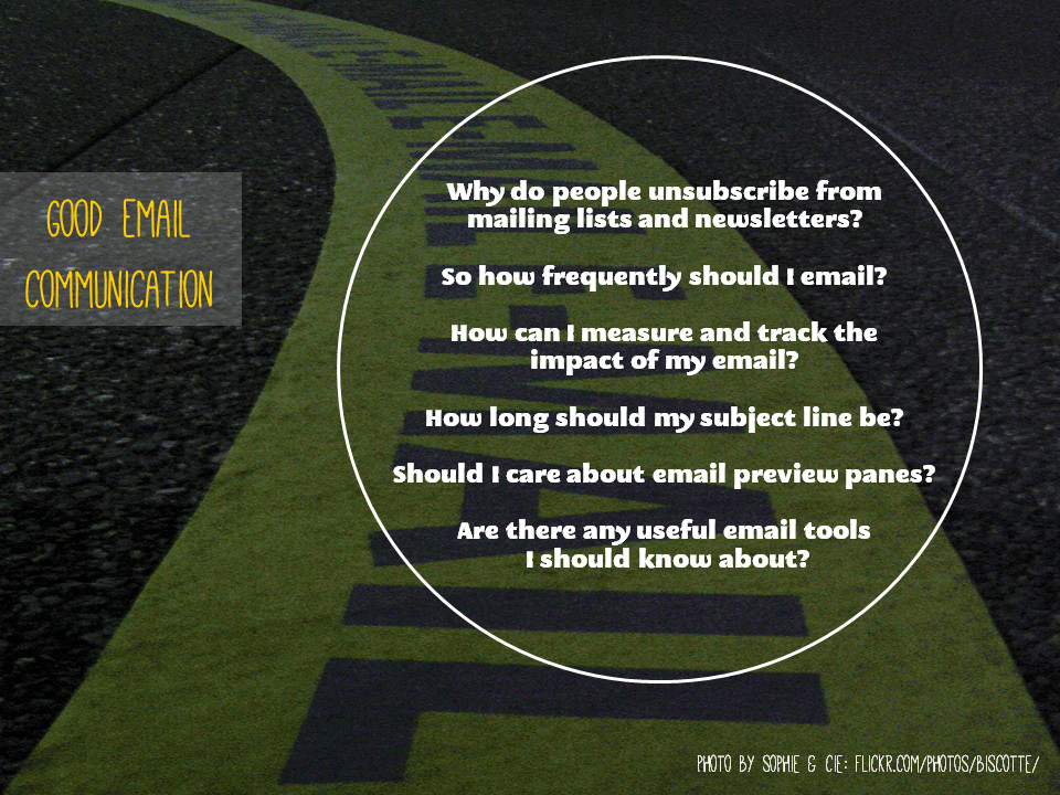
Why do people unsubscribe from mailing lists and newsletters?

Reasons people no longer want to receive a regular email from an organisation include, in ascending order of importance according to Litmus: Found an alternative way to get the same info, Preferred to seek out info on their own, Found the content irrelevant, Received too many emails generally, Found the content to be repetitive or boring over time.

And in First Place? 54% of people said the reason they unsubscribed was this: Emails came too frequently. Don't over-saturate your audience - pick your moments, based on THEIR needs, the lifecycle of their work, and on how much vital information you have to impart. Which leads us to...

So how frequently should I email?

In Part 1 of this post I talked about the importance of being Timely - emailing at the right time of the day so that your email is received both at a time when people actually read emails and when yours isn't buried under a pile of other emails coming in at the same time. 3pm appears to be the sweet spot.

There's another aspect to being timely though. Firstly, Monday appears to be the best day on which to send an email newsletter - for all the reasons you'd imagine (people are still full of vim and vigour early on in the week, and not yet weighed down by all the things they wished they'd got done but ran out of time to do).

Secondly, I believe it's really important NOT to email to a fixed schedule, for example the first Monday of every month. A vital aspect of good communication is not wasting opportunities by communicating when you don't need to - it reduces the value of your communication overall and edges you closer to becoming part of the white noise. So send your newsletter or other 'important updates' email only when there's a weight of useful things to say, rather than just when it's the time you usually send it. Communicate because your audience NEEDS to hear what you have to say, rather than because you need to send a monthly update.

How long should my subject line be?

Click to view this as part of a larger (and very useful) article on EmailAudience

Click to view this as part of a larger (and very useful) article on EmailAudience

Click to view this as part of a larger (and also quite useful) article on MailChimp

Click to view this as part of a larger (and also quite useful) article on MailChimp

I mentioned in Part 1 that I think the Subject Line is hugely important, and that calling your email 'Newsletter' is a recipe for being completely ignored. You need a decent title, one which gives people a specific reason to open the email; a benefit to them.

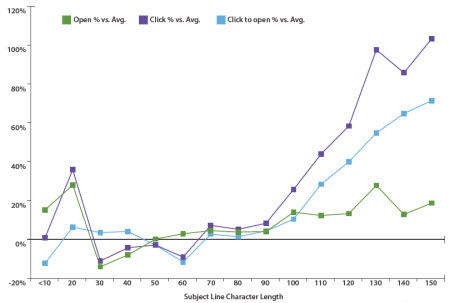
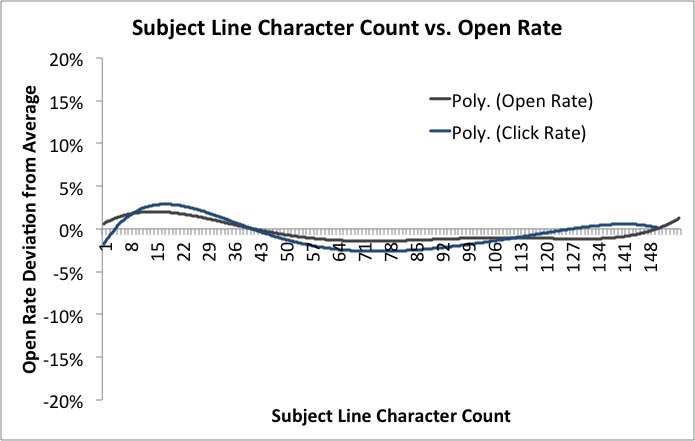
As to how long this subject line should be, there is conflicting evidence about this. EmailAudience found that very short worked well, medium length worked REALLY badly, and very long (tweet length subject lines, basically) worked fantastically.

However MailChimp analysed 12 billion emails and concluded 'Subject line length means absolutely nothing'! If you compare the graphs showing the two companies' findings, they do actually follow broadly the same pattern - short and long are good, medium length doesn't do much for anyone. It's just that how much of a difference this makes is clearly reflected as being much smaller by MailChimp. 

They conclude with this very sensible statement which makes a good point about Subject Line length and the kinds of devices and platforms your audience are reading on.

Your audience is chock-full of individuals with different reading habits, interests, and demographics. Maybe my audience is full of Apple fanboys and every one of them reads my newsletter on their iPhone. Well, then the subject line they see might need to be shorter for their small screen. Or maybe my newsletter is geared toward businessfolk who mostly run Outlook. In that case, maybe a longer subject is more acceptable.
— MailChimp

Like so many things, it comes down to understanding your audience. Which takes us neatly on to...

How can I measure and track the impact of my email?

There are elaborate things you can do with Gmail to track open-rates of emails, but I think that's much more important in traditional business than it is in non-profit comms. More important is to measure and track the impact - essentially, do people ACT on the email, and can I influence how often this happens by changing when I send the email, the subject line, the tone, the length and so on?

If your email is a just general update, measuring impact is very hard to do. If, however, it includes a Call to Action, and that action has a website involved - e.g. 'Try our new online resource [link to resource]' or 'Come to our workshop [link to booking form]', it becomes possible to see how effective the email is by measuring the Engagement Rate. This is the number of clicks on the link divided by the number people who received the email - so take a really basic example, if you email 100 people and 30 click the link, the Engagement rate is 30%. 

How do you find out how many people click on the link? You use a unique URL created especially for the email via bit.ly. Bit.ly is a URL shortening service (useful in itself) which provides two fantastic functions for Comms purposes - it allows you to customise the URL, and it counts the number of times that specific customised URL is used.

(So for example, at the end of the 10 Tiny Tips for Trainers slidedeck from a couple of weeks back, I put in a customised bit.ly URL for people who found the presentation on Slideshare, and wanted to read the blogpost which accompanied it on here - a lot more people see my slides than see this blog. The reason I used bit.ly was just to make a short, memorable URL - I chose bit.ly/10TinyTips which is a lot easier to fit on a slide in large letters than http://www.ned-potter.com/blog/2014/8/8/10-tiny-tips-for-trainers! - but it also gives me the stats. So I know that 225 people clicked on the link in the slides, because that link didn't appear anywhere else.)

So going back to the email newsletter - if you're launching a resource or promoting an event, and you want to know how effective your email has been, use a customised bit.ly URL to see how many people clicked your link. If half the people you email click on the link you've included, that's a pretty fantastic rate of return as these things go. Build on whatever formula you used and do it again! If only 5% click, then do things differently next time - perhaps change the subject line, or make the call to action more prominent, or email at a different time of the day or week.

Incidentally, another possibility bit.ly allows is to compare effectiveness of promotional activities. So you have one bit.ly URL for your new resource that you use in emails, one that you use on Facebook, and another you use on Twitter. Then you compare the stats for each, with the overall stats for the resource, and see which communication method is the best way to get people to use your stuff...

Should I care about email preview panes?

If your audience are young (University students, for example) then yes, this matters a little bit. According to ConvinceandConvert, 84% of 18-34 year olds use an email preview pane. I am 34 and I do this! I have a preview pane in both Outlook and Gmail for work, where I can - but not in Yahoo for my personal email, where I've never worked out how. I much prefer a preview.

This means these users will see the first few lines of the email (depending on how big they've set their pane) BEFORE they click to open. Worst-case scenario is they dislike what they see so much they never get as far as opening the email. The best-case scenario is they are enticed or inspired by the preview, and when they open the email they are fully engaged with its contents. So, as with so many media in the web 2.0 age, the important thing here is to hit the ground running. No long intros, no scene setting - just useful, headline information right at the top. It's using the journalism model, rather than the academic paper model - put your conclusions at the start.

Are there any useful email tools I should know about?

I think MailChimp looks great for non-profits. You'd probably need to use the paid-for version, but if email is an important part of your marketing strategy, and you can afford it, then MailChimp is worth it because of the level of control, and of impact measurement, it gives you.

I'm a big fan of Scribd (as a creator rather than a consumer - don't be put off by its homepage which is aimed at the latter!) - it takes PDFs and turns them into web documents. So if your email newsletter is a PDF, I cannot stress enough how people don't click on and open PDFs nearly as much as we'd hope they do, so put in a link to a Scribd version (or embed it in the email if that's possible with the tools you use). Not only does this make the newsletter more easily accessible, it allows it to be discovered on the web, and it gives you built-in usage statistics for how it much it's being read too.

Creating quick and easy videos with Adobe Voice


I saw this tweet earlier in the week, and had a look at the list. It's a good list, and the thing which really caught my eye was Adobe Voice. It allows you to create an animated video which sits somewhere between a normal video or screen-capture, and a slidedeck on autoplay. I decided to sign up and have a go, and it took only about half an hour to create this video with it.

It's a very new product, coming out in May of this year. Hopefully the video above shows you how it works and what it can do - the reason I feel like it could be so useful for libraries is that it allows you to explain fairly dry and complex information in a visual and engaging way. Some types of video, particularly stuff about databases and online things, really don't lend themselves to the 'person talking either to or off camera' school of video-creation - and screen capture can sometimes be a little dull too. I feel like this is a nice hybrid - the 'animation' element keeps things moving, and you can use screengrabs if you like too. You need neither a micrphone nor a video camera to create an effective video. You don't have to master complicated software (and even Camtasia, which I think is ace and very easy to use, feels complex compared to Voice).

Like a lot of new tools coming out these days, it makes things look very smart without the user having to know about anything except providing useful content. There are lots of different templates - here's the same video as above, using a different theme. Notice how it recolours the icons to fit the new theme.

You can also choose different layouts - I chose a side-by-side theme but there are four other options.

So have a look and see if it could be useful to your library. In summary:

(The Cons list looks really big when they're side-by-side but that's only because the cons take more explanation!)

Pros

  1. Solves an existing problem! I love tools which do this
  2. Free
  3. It's an all-in-one solution. When I create slides I have to go to iconfinder for icons, flickr for images and PPT to actually make it - Voice does all these things from one place
  4. Looks great
  5. Extremely quick to create something useful
  6. Conveys information well - it's not just pretty, it's effective in what we need it for

Cons

  1. iOS only
  2. You can't, at the time of writing, have more than one layout (or theme) per video, which would be nice
  3. In fact there's very little flexibility in how you layout each slide, once your theme and layout are selected - but this is also its strength. It's idiot proof. You'd have to go out of your way to make something bad with this tool
  4. At the moment there's no option to upload to YouTube - they have to be hosted on Adobe's own site and embedded elsewhere. That's fine, but having a video which isn't on YouTube always seems like a massive waste of an opportunity...

10 Tiny Tips for Trainers & Teachers


I do a whole load of training these days, both as part of my day-job and my freelance work, so have picked up a few small tricks along the way. There's nothing earth-shattering here - but if you run training or teach infolit classes, you may find some of these useful.  

Here's the short, visual version - then I go into each one in a bit more detail below.

Session structure

1. Start with something practical. Sometimes there is, unavoidably, a bunch of theory or conceptual stuff you have to get through. But if that's the case, if at all possible make this second on your itinerary for the day / hour - and start off with something practical. Diving in with something for people to DO wakes everyone up, and grounds the whole workshop in something tangible rather than abstract. It also makes everyone into active participants early on.

2. Allow time to recharge. A full-day workshop should have coffee-breaks etc built-in, but even a 1hr workshop can be quite overwhelming. Just building in a 3 minute gap for participants to switch-off, chat to each other, relax, will help them focus for the second half of the session and raise the energy level all round. A break 10 minutes in to a 1hr session works brilliantly - surprisingly better then, than half-way through the session or later.

3. Sum up via a Random Slide Challenge (also known as Battle Decks). I love a random slide challenge. Here's how it works:

  1. You create a short simple slide-deck which summarises the session you've just run (I normally create two decks of 5 slides each)
  2. You get participants to deliver the presentation (so in my case, two volunteers)
  3. The volunteers have never seen the slides before, which is part of the fun - so they see each slide for the first time at the same moment the audience does, and have to improvise their presentation based on that
  4. You move the slides along after 15 seconds per slide, so the whole thing takes only just over a minute per presentation

You have to give them the best possible chance of knowing which part of the session each slide is getting at! If you look at slide 41 onwards of the deck embedded here, you'll see an example of a random-slide challenge set of slides.

This works well for two reasons - firstly it is often hilarious. People in the audience shout-out if they pick up on what the slide is about before the presenters, and basically it leaves everyone on a high at the end of the session. Feedback forms at both the British Library, where I've done this on training courses, and for my infolit classes at York, often point towards this as being one of the delegates' favourite parts. The other reason it works is it's often a surpisingly great summary of the session. People say the exact kinds of things I would have said if I was summarising myself, but it has more impact because it's another voice (and, with students, it's one of their peers). Try it! The only thing is, you need a plan B for if you get no volunteers, which once happened to me. Prizes help ensure this doesn't happen...

4. Close after the questions. It's good to end any training or teaching session with a call to action - a clear message as to where participants can go from here. This can be somewhat muddied by a Q&A session (which can of course throw up anything), so build in time for questions just before the end, and leave yourself the last 5 minutes to close the session with something direct and meaningful.


Tablet as teaching assistant

5. Use Padlet on your tablet to remember who's who. Padlet is a great tool that can be used in all sorts of ways. You create an online wall, onto which you and anyone else who has the URL can post notes. Anyone can double-click anywhere to add a sort of virtual post-it. Then they can put in their name as the title, and a note, or a URL - links to pics or videos become embedded objects on the wall. I use it to crowd-source people's ideas in training sessions - like you'd use a flipchart, except everyone can go back and look at the URL after the session, and it becomes a sort of archive for everyone to learn from oneanother.

Anyway, depending on the session I'll go round at the start and ask people to introduce themselves, and say what they want to get out of the day / hour. This is very useful in and of itself, as you can tailor things accordingly. I'll type it into Padlet on the big presenting screen as I go, so we can all refer back to it later in the day and see if we did what we said we'd do! But the really useful thing is, you can choose exactly where your notes go on the screen - so I put the notes in a way which corresponds to the physical layout in the room and where people are sitting, like in the example below. Then when I take it off the big-screen to put my slides up, I put the Padlet wall on my ipad screen - this means I've got everyone's names in the right place for easy reference so I can remember who's who!

(I feel like I didn't explain that very well. Does that make sense? The example below should clear it up.)

A Padlet wall example

A Padlet wall example


6. Skip ahead in the presentation, on your tablet. I like to have my slides or prezi open on my ipad so I can see what's coming. This is particularly handy if you're joint-teaching with somone - while they're speaking, you can recap what you're supposed to be saying next. A massive part of successful teaching and presenting, for me, is feeling in control - and this helps.


Handouts

7. Hand out the handouts. It's tempting to feel more organised by distributing the handouts, if you use them, before people arrive. Placing one by each PC or on every table. But if the group is of 20 or less, hand them round yourself; it's a great opportunity to meet each person individually and make eye-contact which, however brief, makes the communication easier and fuller for the session proper.

8. Use screengrabs to make exercises easy to find. It's amazing how often people lose their place in a handout. When you get to an excercise in the handout, put a screengrab of the slide that's on the big-screen at the time you're introducing the excercise - it makes it quick and easy for people to know exactly where they should be.


Materials

9. Use a free PBworks wiki to store materials for delegates. For all sorts of reasons, it's good to have materials online. Particularly if your session is link-heavy, store a digital copy of the hand-out on a free wiki (PBworks for example) so delegates can access them that way and just click on URLs rather than typing them in. Put the PowerPoint on there too - this means you’ll have a copy of your presentation and hand-outs even if your USB stick falls out of your pocket and your printer breaks…

10. Send the presentation round afterwards with an email. A follow-up email is useful for reinforcing key messages, and making sure people have access to the presentation materials. Don’t rely on people (students especially) tracking it down for themselves; follow up directly, ensuring they have a copy of the presentation AND your contact details. If there are issues around attachment filesizes, upload your slides to Slideshare and your hand-out to Scribd, and include links instead.


As always, I'd welcome comments - add your own tips below and help make this post more useful!

I just mocked up a @buzzfeeduk Libraries edition


I spent my whole lunchtime doing this, a mock up of what Buzzfeed might look like if it was aimed solely at information professionals.

In other news, I need to take a long, hard look at my life.

Click through to view the original on Flickr, in all its utterly pointless, Creative Commons so feel free to use it, glory.

What does an online identity REALLY need? (Or, Growing Up Online)


Yesterday I wrote this post about stepping back from the conflict in librarianship, and making a new website. There was also a part about changing my online usernames, and the difference between playing at having an online identity and actually having one. It was the last bit people particularly responded to, and I said in the original post that I might write a-whole-nother blog post about it, so here it is.

The background is, I've changed both my blog name and URL (from thewikiman.org to ned-potter.com) and my Twitter username (from @theREALwikiman to @ned_potter).

Creative Commons Image by Jack Dorsey - click the pic to view the original on Flickr

Creative Commons Image by Jack Dorsey - click the pic to view the original on Flickr

Playing at having an online identity versus actually having one

I began life online in 2009. As I've written about before, I saw Jo Alcock's presentation about blogs and twitter at the New Professionals Conference we both presented at, and was completely convinced by her argument that getting online was A Good Thing To Do.

At the time I thought I really needed an angle for an online presence - a specific driver and purpose - and I thought I really needed a sort of 'nom-de-web'. I wasn't thinking in terms of online branding because I didn't know anything about that, I was just looking for somewhere to slot in.

Over time, my feelings about how important that stuff is have changed somewhat. My angle was writing about a wiki I was setting up - I grew tired of that after about 3 posts, unlike the audience, because there WASN'T an audience (it took me 2 years to get 100 subscribers to this blog, then less than a year to get to 1000 after that - the life a new blog is a lonely one). So I quickly learned you don't NEED a special hook for your writing, you can just write in librarianship and will eventually find an audience (and even writing without an audience can have benefits). My nom-de-2.0 I was pleased with because it was distinct and easy to remember, and it did have value in that way. But it was playing at 'having a brand'. I used to sign posts -thewikiman at the end until quite recently, not sure why, but which I look back at with embarrassment.

Now, five years after first getting online, I have an actual online identity and I want to use my own name for it - hence the recent changes. I'm not saying that having a tag or online name is a bad thing, by the way - just that the way I did it was naive, and based on not understanding the world I was getting into. When I began blogging, blogs were the centre of the online universe in librarianship. Now Twitter is the centre. And Twitter is a personal medium - it's about being you. Not 'developing a brand' - for individuals anyway. My favourite quote about the ever-controversial subject of building a brand is this one (read the post this came from):

It’s a mistake to think of personal branding as an end itself. A successful personal brand is a by-product of the successful pursuit of one’s own interest, contribution, and networking in librarianship.
— Bohyun Kim

This is spot-on. In fact sometimes you see people doing the opposite of this, and focusing first and foremost on 'developing their brand' and it simply doesn't work. It turns people off. They position themselves outside the dialogue, which is the opposite of what we should aspire to do with social media.

Anyway, to the point of this post!

What does an online identity really need?

I'd be interested in your views on this in the comments, as it's not immediately obvious to me what an online identity really needs, and in what order of priority.

One thing thewikiman was good for was consistency - it was my username across several platforms. This made it easy for people to find me, and easy for me to monitor links to my stuff (when I typed 'thewikiman' into Twitter, I saw all the links people had posted to my blog, my slideshare account, my Netvibes page - none - in one easy step). So even though I'd recommend the same username across loads of platforms, I've messed that up by changing mine on here and on twitter to two subtly different variants on a theme, which now don't match my YouTube or Slideshare accounts. So for me it turns out not be THAT important after all.

Professional focus is another useful thing from an online identity. If, for example, you're on Facebook for social things, a separate identity for the more work-focused Twitter and LinkedIn could be useful. But if you agree with me that doing things under your own name is a good idea, then that makes focus an all or nothing sort of deal. (I'm not on Facebook so this is less of an issue for me personally.)

Findability is important. As individuals we don't want to be worrying too much about SEO and that sort of thing, but the fact is if someone sees me at a conference and googles me, I want them to find me and not other Ned Potters (like the used car salesman from Essex where I grew up). A distinct online identity helps findability - 'thewikiman' is the search term which over 800 people used to find my old wordpress blog, according to the stats, versus just 81 for 'ned potter'. But findability at the expense of using your own name? For me it was probably worth it back then, but less so now that I have a decent network.

Visual branding I think is not important. It feels like it probably should be, but it isn't. The purpose of branding... actually I'm not going to go into that here, this post is already too long! I'll come back to it at some later date. But basically, having the same shade of green for your website, your twitter background and your business card isn't actually going to have a meaningful impact on your life. There is an argument that the same logo / avatar across several platforms would increase how easily people recognise you from one online zone to another, but again, Twitter is the most important medium and that demands a picture of you as it's a personal medium. So logos are sort of out. Or at best, hard to weave in.

A consistent voice is probably much more important than the rest of the things I've listed put together. If you say things people want to hear in a style that's recognisably yours, THAT'S your online identity - the rest of it is so much window dressing. But for me, the gain of having a larger network on twitter or reaching more people with this blog (like those powerhouse bloggers you see with insane audience sizes) is not worth the loss of posting random nonsense 90% of the time on Twitter, or only posting on this blog when I feel like it rather than on a consistent following-building schedule.

I don't want to be at the behest of my online identity, essentially - which means I reach a smaller group of people than I otherwise might. That's fine, though - for me. Everyone has different needs, and everyone is in different places with what they're doing professionally.

Not adjusting who you are for other people is the final one I can think of. For short-term gain, by all means shape yourself to suit an audience. But ultimately, you're better off attracting the RIGHT audience, as hopelessly cliched and optimistic as that sounds. It's better to let a smaller group of the right people come to you for YOU, than it is to build an online identity on compromise, at the expense of your soul... The kinds of opportunities you may lose probably weren't worth having anyway. (I'm writing this assuming you're a perfectly nice person, not some psychopath with hateful views on everything, by the way. If you fit in the category then censoring yourself is definitely the way to go...)

So, growing up online, having a meaningful online identity - what are your thoughts?