
I love a good presentation. I think they're often the best way to communicate information, and I create them as stand-alone online objects as well as for actual talks to an audience. So it's Presentation Tools Week on the blog - seven different useful tools from the list below, explored over the next five days.

These fall into two broad categories: tools for creating presentations from scratch, and tools for making PowerPoint presentations better in some way
When I began giving presentations 5 years ago, I remember looking at Bobbi Newman's, Buffy Hamilton's and Helene Blowers' Slideshare accounts and being amazed that slides could look so beautiful. My horizons were truly expanded; previously every PPT I'd seen had been functional, boring, and (as I later learned) ineffective as a communication method. I learned by trying to expose my brain to as many great ways of putting together a PowerPoint presentation as possible, and trying things out to see what worked for me.
These days things are a lot easier, as there are several helpful tools which assist you in creating effective and pretty slides. Some of them do a lot of the work for you, and some of you provide a helping hand for specific elements of a presentation. I've summarised the 7 tools I think Past Me would have found most useful. Hopefully if you're reading this you can take something from one or more of these platforms too.
Tomorrow we'll look at an alternative to PowerPoint, but for now we'll look at working with it, using non-standard fonts. It took me a long time to realise just how important fonts were to a good presentation.
FONTSQUIRREL (fontsquirrel.com)
FontSquirrel is a website full of downloadable fonts, and I use it ALL the time - it's the first port of call for non-standard fonts. I think using new fonts which we're not all over-saturated with from the Office suite can make a HUGE difference to how good a presentation or poster looks, and everything on FontSquirrel is free even for commercial use.
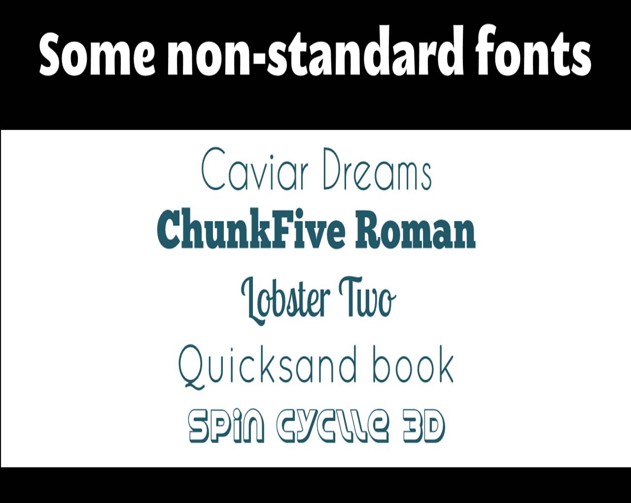
Examples from FontSquirrel
I use Megalopolis Extra in loads of presentations, along with Aller, Caviar Dreams, ChunkFive Roman, Quicksand Book, and Pacifico. You need admin permissions to install fonts on your PC, so if you can't have that permanently at work, try and get it for a couple of hours, go onto FontSquirrel, and go mad downloading interesting fonts. Once you install them they install across the Office Suite, so you can use them in Word as well. Try it!
(NB: An alternative to FontSquirrel is DaFont, which I've heard people recommend, but I can't vouch for it as I've never used it myself.)
Remember to save your PPT as a PDF when using non-standard fonts! Otherwise when you come to present on a different PC without the fonts installed, it will almost certainly go horribly wrong.
Some guidance around fonts - generally it is thought that you should use a maximum of 3 fonts per presentation (although as with all 'rules' around presenting, feel free to break this one if you have a good reason), and my personal minimum font size is 36 for slides.
Font-pairing is an art I feel like I've not mastered at all, but would like to - I found the following (albeit very brief) presentation helpful:
