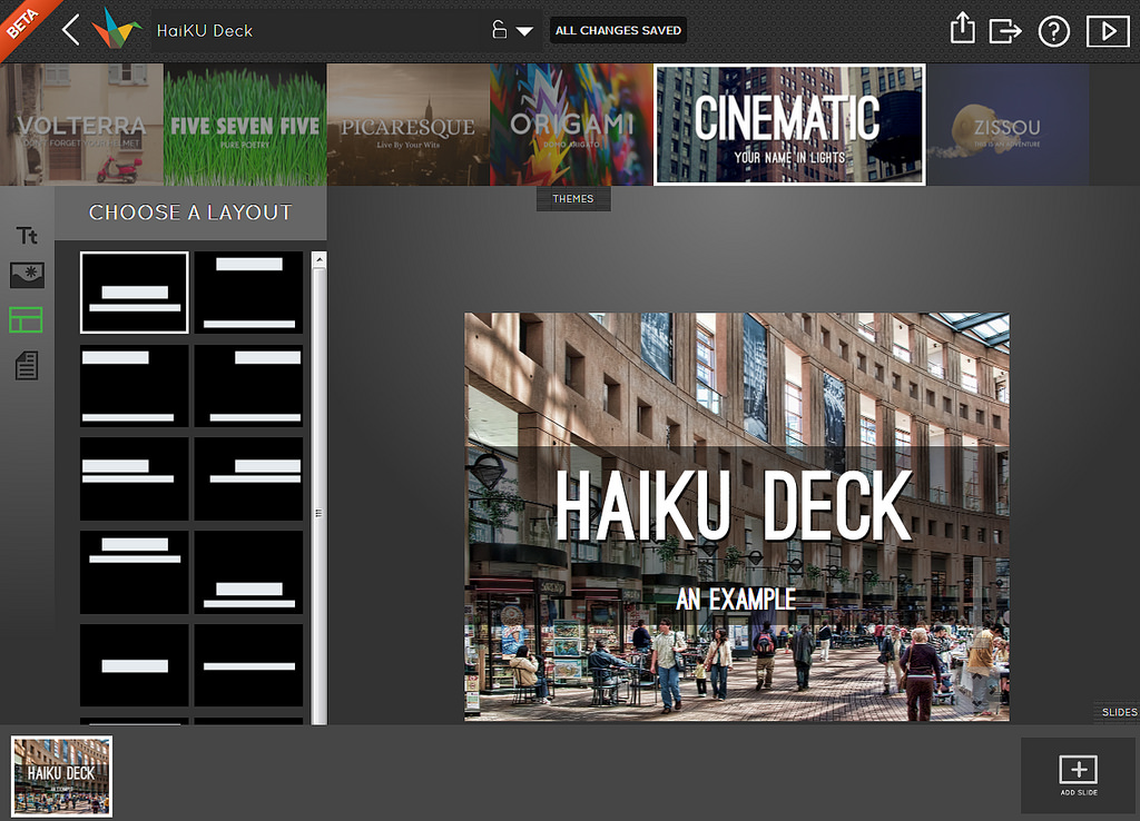
Day 3 of Presentation Tools Week. (See the previous posts on Fonts, and on Haiku Deck.) Today, a more complex tool.
Canva (canva.com)
Canva, like Haiku Deck, is an entirely self-contained alternative to PowerPoint. It's more complicated than Haiku, but with the added complication comes more flexibility and more style too.
I haven't found it quite as intuitive to use as Haiku, and it's based on a freemium model which encourages you to purchase images for $1 a time, but it can be used with the decent supply of free built-in images and the results are excellent. There's also a wealth of insight into what makes design work, available as part of their tutorials. I love learning that sort of thing; sometimes it turns out there's a reason to back up something I already do, and sometimes I end up completely changing what I do to something more effective...
Canva does a whole load of stuff besides slides, and I like the distinctive design feel that runs throughout their products. We'll focus on presentation-making today, though - here's what the slide design view looks like:
On the left are various extremely stylish and useful layouts. I don't know how well you can see in the pic but the very first layout at the top-left, and the one below it, have a sort of criss-cross fence effect over them - that denotes that the picture needs to be purchased (for $1). Images without the criss-cross effect, like the one in my example slide, are free to use. Like Haiku Deck, Canva uses filters to allow a uniform feel to your presentations and make it easier to write directly onto slides - you can see I've got the filter options open above, and there's plenty of filters to choose from.
I think Canva versus Haiku is the classic effort versus reward conundrum - with Canva you need to put a lot more effort in, but you get a lot more out if you do. My only reservations with it are that the templates are literally for one slide at a time (whereas Haiku templates are for the whole deck) and it's a bit fiddly to build your own content until you get used to it. As with Haiku I think this tool would be more useful for conference presentations than for internal infolit materials, although [this an update from the original post] you can use your own images (e.g. screengrabs) in Canva, which I previously hadn't thought possible - thanks to Danielle for pointing this out in the comments!
I feel like I don't want to spend too much time learning a new system if there's a chance I'll end up needing to pay for just the right image (which I'm unwilling to do, as there are so many great sites out there for freely available images). I actually think it's a great business model though, and I think Canva gives a lot of itself away for free so you don't HAVE to pay, which is great considering how contemporary and chic the templates are.
If you LIKE good slide design but don't feel like you know where to start in achieving it, Canva does a lot of the hard work for you and gets you a lot of the way there. Here's an example of a Canva slidedeck uploaded to Slideshare:
If you sign up for Canva and like using it, check out the aforementioned plentiful (and genuinely useful) design tutorials. If you've used Canva and like it, please leave me a link in a comment so I can see your presentation! I'd love to see what Information Professionals are doing with it.
Tomorrow on the blog it's Prezi, but not as you know it!


